We love all our projects for different reasons, but there’s nothing quite like starting a project completely bare to the studs and walking it through to completion! Today we are talking about a condo build-out we got to do a couple years back, our Ellis Boulevard project. The client downsized from their previous house and brought over a select few furnishings and art to be incorporated. We worked together with the builder to select finishes, window treatments, hardware, and lighting throughout the space and furnish the living area. Being able to touch every room helped this project feel united from entry to the primary bath and every space in between.
Project Reveal: Ellis Boulevard Condo
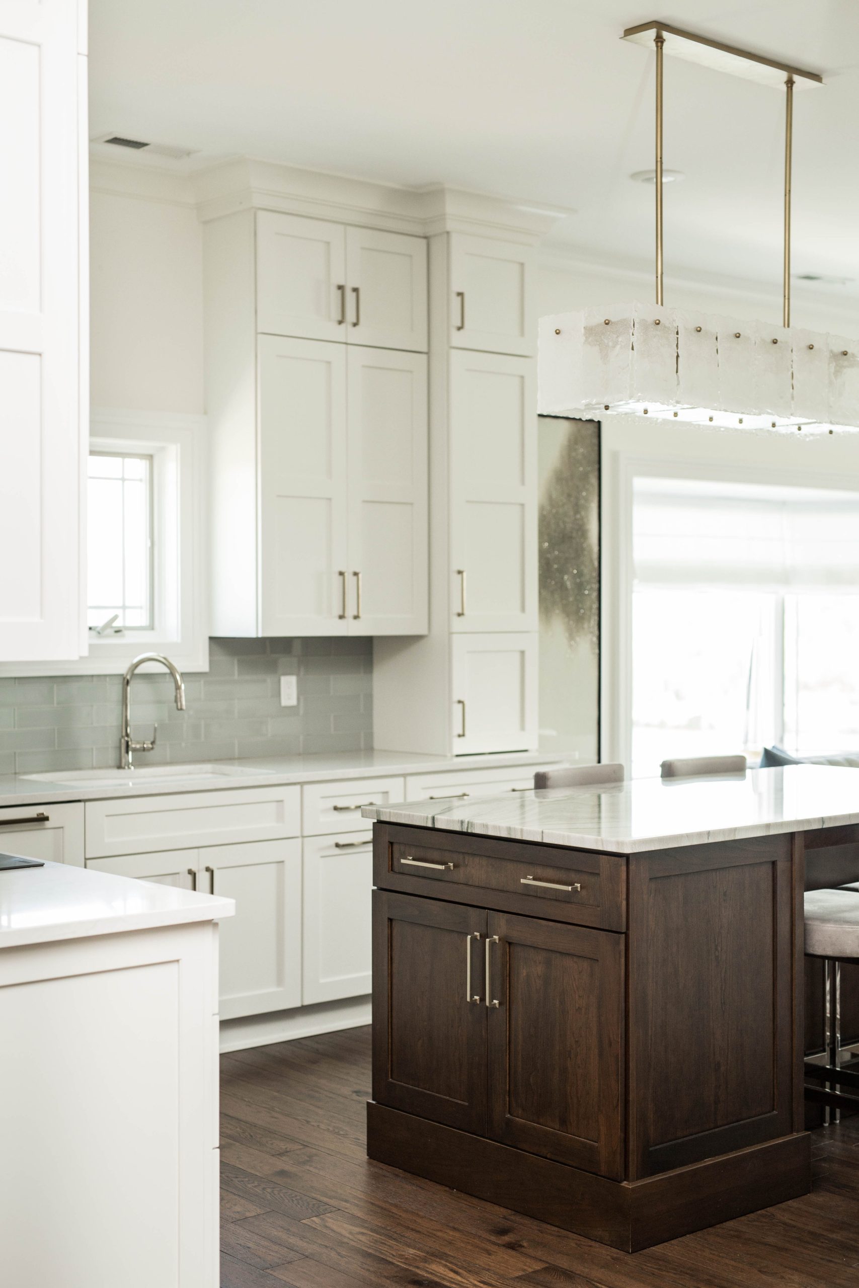
The Kitchen
It may be a white kitchen, but with these ceiling heights and that trim, it is anything but boring. The island steals the show in the middle of the small but mighty kitchen with its dark wood, open leg table feature, and stunning quartz, making the perimeter it’s trusty supporting character. The chandelier over the island takes it all up a notch from polished to glamorous.
Let’s talk about what makes this kitchen feel a cut above a standard kitchen, thanks to Garman Built. It’s the use of vertical space and the custom-feel of integrating the cabinets all the way to the ceiling with some generous crown molding. Not to be outdone, the island boasts its own thick base molding, making it look less like kitchen cabinets and more like a hefty piece of furniture built into the space.
It is also carefully chosen finishes that focus your attention on some key areas, letting others recede– striking countertops on the island, simpler stone on the surround. Boldly-stained wood on the island, white cabinets on the surround. Simple shaker cabinet profile but integrated appliances, and a custom hood. We collaborated with Garman to move the right pieces in place so that nothing but the stunners break up your visual focus. And what’s more, the kitchen WORKS for the client.

BEFORE

DURING

AFTER


The Living Room
Let’s set the scene. We kept the paint from the kitchen to the living area the same bright white to keep the light pouring in the generous windows and sliding glass doors bouncing around. The roman shades around the bay window cut a pretty picture framing the window in crisp white folds. They, like the drapes, let light through while retaining privacy when desired. The drapes surrounding the sliding glass door overlooking the river run floor to ceiling in a neutral burnout-look textile.
For the furniture, we worked off an unexpected but still fresh cool blue pulled from the client’s existing rug. We customized the most charming tailored sofa to fit perfectly in front of the bay window. We love it’s channel tufting, smart-looking seams, and quirky little legs. Paired with it, a stone blue leather armchair with diamond tufting on the side. It and the matching ottoman feature silver nailheads around the perimeter and look like the classiest little place to put your feet up. We can’t wait to see how this piece patinas and wears into a heirloom kind-of chair.
We tied all the neutrals and light, muted blues together with a few matching velvet pillows and a feature greek key patterned lumbar. Simple, polished, done.


The Primary Suite
In the primary suite, we largely focused on the bathroom finishes and feel, while adding a final touch with linens in the bedroom. Undoubtedly, the feel of this space is polished, leaning into glamorous, but maintaining some restraint. The glamour comes out in the brass and polished nickel hardware, the lucite stool legs, marble counters and tile, and teardrop pendant over the seated makeup vanity. It gives off warmer and cozier vibes in the prep & sink area, then cooler and fresher vibes in the shower and WC room, while still feeling like the finishes flow into each other seamlessly.
And can we just admire that bold marble pattern on the floor? It feels modern and timeless all at once, and is placed to make a statement without overwhelming the room. We love that the shower tile then pulls all shades of marble from the floor but employs simpler lines and less contrast to give the eye rest. And who doesn’t love a classic border in tile?
But this space is also practical. A double vanity on one side with a seated vanity opposite it, bouncing the light around and still delineating zones. His and hers sinks, because if you can, why would you not? Plenty of storage. A separate room for the shower and WC, keeping steam at bay and separating spaces for multiple users. A tiled niche just the right size for their shower needs. Larger format tile with fewer grout lines to balance out the smaller tile on the floor. Need I say more?
The bedroom was furnished by the client, but we were happy to add a touch of Hollywood glamour to the linens. The simple white duvet & matching shams feel very luxury hotel, with a triple stripe border that nods to the lines of the bed frame. The glamour comes in with the lush purple velvet lumbars and an exquisite black jungle scene velvet pillow. This color scheme ties into the existing black & floral rug, and while bold and fun, keeps a restrained placement that doesn’t overwhelm the room.

DURING

AFTER


The Guest Bath
When it comes to the guest bath, we took the same feel and simplified it into more muted tones and a grounded feel. We repeated the mixed metals, the same hardware and plumbing. But we employed different shapes in the marble floors, light sea green walls with grey tones to compelement, a variation on the shaker profile on the vanity, a stone counter with some deeper tones, and handmade shower tile that adds texture.
Our favorite feature is the two-tone marble hexagon floor that boasts an in-lay look and taps into the brown tones of the adjacent wood floors. A close second is the soft-curved mirror that looks like it was made to have a little sconce tucked in the top!


Other Details
In the rest of the condo, we choose the rich brown wood flooring and the unique modern doors to coordinate and keep the look polished. We added simple white woven shades in the guest room and to top it all off, a stunner light fixture in the entry. Its understated glamour everywhere you look and we think it’s just right for our clients!


We approached this project to help the client to customize this build-out to their needs and to take it up a notch to feel more like them- polished. Whatever your style and need, we can work with you to make your home feel more like you.
