Pro Tip: How to Mix Patterns In a Space
Ever tried to pull fabrics that you love together and can’t figure out what is not clicking? Does it feel too busy? Maybe you have beautiful fabrics but when you put them together they just don’t shine. Ugh, we feel you. We have started building many a palette that doesn’t pan out or is missing a key piece. There can be a vast number of reasons your pattern-mixing isn’t working, and so we’re here to give you some guidelines on how to mix your patterns in a space!
It’s helpful to think of your design process as creating a filter for what gets selected and what gets rejected. At the top of your filter is your key elements–maybe its the sofa fabric, maybe its the drapes in double-height space, or maybe it is an incredible rug you fell in love with. Then from there you make decisions based off of that. What goes with your sofa fabric? What do you need to balance out a patterned drape on one side of the room? Every decision you make narrows your filter to be more specific, which is so helpful when there are thousands of products at your fingertips.
To develop a palette, you have to have a starting point, selecting your key elements. You can either start with:
1. The largest expanse of fabric in a space (often a rug or a sofa!) If you plan on having a rug in a space, that can be a great place to start for building your palette. Going bold or simple here will have a huge impact on the space. It is a helpful thing to decide early as it can be difficult to find a patterned rug that fits the scheme after the fact. Same goes with the sofa– unless you are doing custom, you may not have the biggest selection of patterns or colors.
2. A showstopper fabric, which can be either the boldest fabric or the fabric you most love. This fabric is what you want to be the focal point, so make sure the rest of your decisions support that idea and get in line to be supporting actors.
After this, you can start building out your palette in reference to these key elements.
Elements of Pattern Mixing
Color
Start with a color scheme. Color schemes work well with anywhere from 3-6 colors. Generally we try to have 2 primary colors with the rest as secondary. Primary colors are the ones we hang the whole room on and repeat across the space. Secondary colors are often found as accents or mixed in with primary color patterns.
A helpful thing to have in a palette is a pattern that incorporates all the colors in your scheme. This can be hard to acheive, though! Generally, incorporate one pattern with multiple colors, then have a few patterns with only one or two colors, and then you can add solids to tone things down if desired.


Scale
This is the sneaky little factor that is often not known. What helps create an intentional look in a room is having a mix of the four elements:
- Large Scale
- Medium Scale
- Small Scale
- Solids
This allows for complementing–someone has to shine and someone has to support. If you keep all the patterns at a similar scale it can look muddy and cluttered and the patterns fight for attention. Mixing the scale of patterns in a space does wonders! Aim for only one large scale, which tends to be the attention stealer.
Contrast
When deciding how bold or simple your pattern is, think about the contrast. Are there are dark darks and light lights? This would be high contrast. Are the colors muted and similar in tone? This would be low contrast. The ultimate contrast in a pattern would be black and white, and then the other end of the scale would be a pattern with a tone-on-tone palette, like a beige and a light tan.
High contrast will draw your eye quickly and feel edgier, while a more muted color combo will create more a calm and informal feel. Consider this when you are choosing your mix of patterns, and if you have a lot of high contrast, try to limit your number of patterns and tighten your color scheme. A room can handle a higher quantity of muted and tonal patterns as they have a better blending quality.


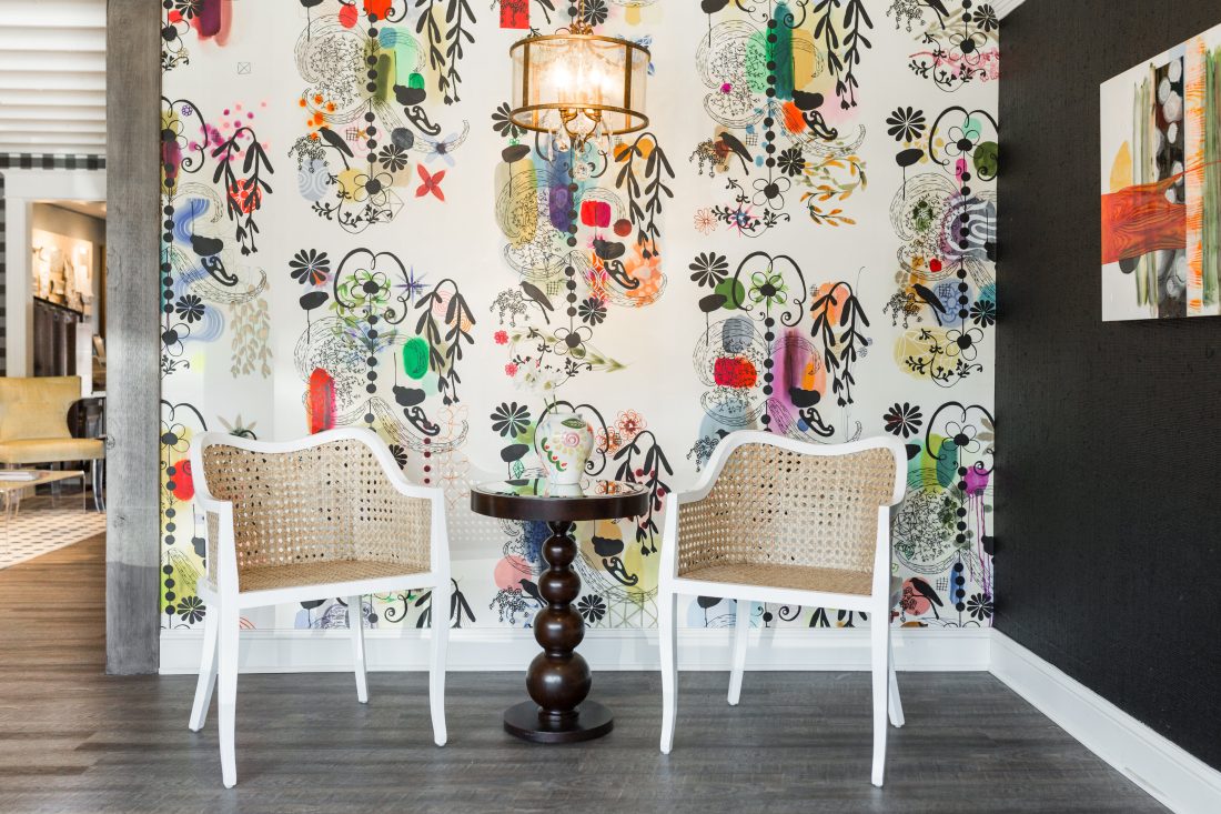
MODG Project
Theme
Identify the theme you are aiming for in your space. What are your key elements like? How would you describe the pattern? Floral/botanical, geometric, ethinic, organic, linear, animal print, chinoiserie, toile, tailored, or a mural? Try to find coordinating patterns in a similar vein to keep a room feeling cohesive.
But there are some combos that mix styles that are winners! A favorite combo to balance out your patterns is to use a floral, a pattern that reads as a stripe (has a linear motif) and a pattern that reads as a dot. You also could try a chinoiserie with a little animal print added in, or pair a toile with classic florals. Tailored fabrics lend well to a showstopper organic pattern, and let’s be honest, is there ever a time a stripe was a bad idea?!


Balance
If you have a very complicated and busy pattern, it will dominate. Keep others more simple around it to let it shine and not compete. If you are going for a more maximalist look and like to do pattern on pattern, keeping the color palette tighter and the scales mixed becomes more important. This keeps a “busy” room from going into full chaos.


So there you’ve got it! Keys to the kingdom, as it were, when it comes to pattern mixing in a space. Hopefully you’ll take a few of these guidelines with you when you start pulling together the palette for your next space. Better yet, call us in, because we know it can get a bit tricky to get the combo just right sometimes.
Thanks for tuning in,
