In lieu of spring popping up all arounds us, we are talking about using pastels as neutrals for Mood Monthly! We have seen this trend hiding around, but are excited to talk about how to understand the principles of this style and incorporate this look into your home. We’re seeing colors like blush, periwinkle, lavender, and mint colors on walls, furniture, art, and décor. While greens and pinks make up the most common wall colors in this style, the most common denominators in pastel styling are blues, ranging from French to powder blue. But let’s break it down to understand a few different ways these colors are used and some guidelines to help you achieve a “pastel as neutral” look yourself.
Mood Monthly: Pastels as Neutrals
Pastel walls, neutral styling
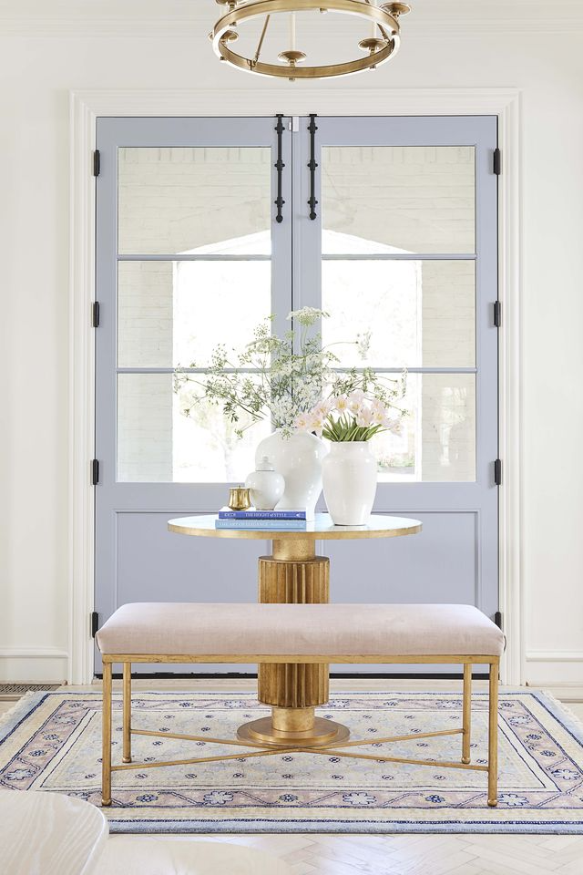
The most obvious way to interpret a pastel into a neutral is to paint the walls or use a wallcovering in a pastel and then neutralize other elements to keep it calm. To add this much color in to a room and still have it feel peaceful and neutral requires some intentional simplicity and well-placed wood, white, taupe, or black tones. You’ll notice below that the rooms don’t feel intense or punchy, but mostly border on the line of calm and bright. A good rule of thumb here is to pick just one color to pair with your natural and neutral elements. The more accent colors are added the punchier the room gets.


")

Neutrals with colored undertones
A way to come on a little more subtly if you’re color shy, is to choose a neutral grey or beige with a strong color undertone. You can see below some purple, pink, green, and blue tones pulling from the main paint colors. Its a fun nod to color which can allow you to then style with more pastels or stay in the neutral zone with furniture and décor if you prefer.


Neutral rooms, pastel styling
A fun, easy way to introduce pastels as neutrals is to pair pastel decor and furniture pieces with lots of neutral pieces, creating an overall calm and quiet palette. Think window coverings, pillows, rugs, art, or bedding as your room’s color canvas and paint in your pastel accordingly. Make sure to have a higher ratio of natural colors and textures than pastels in your room.
")


GET THE LOOK
[show_boutique_widget id=”1052989″]

Thanks for tagging along on our spring palette exploration. Hope you are inspired to think of pastels in a whole new way.
