Project Reveal: Spring Grove Residence
Working hard to juggle all our projects has left little time for sharing them all with you, but we have a back log of work and would love to invite you to walk through each project with us. Are you ready for a Project Reveal?!
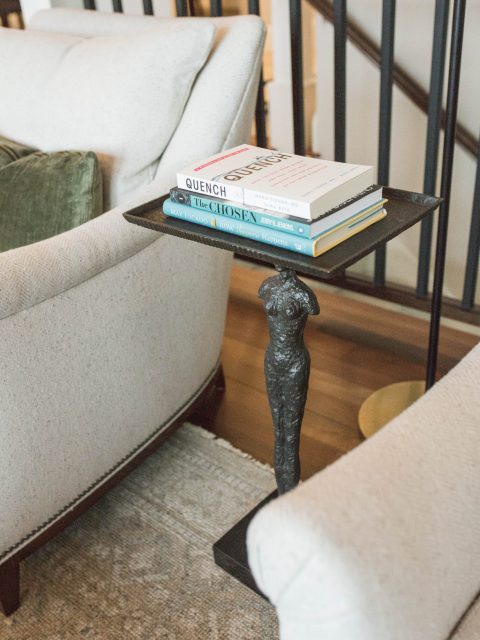
Today we are sharing our Spring Grove project with you, which was a renovation of the living room, kitchen, dining room and a few touches in the entry and sunroom. This project is a case study in light renovation with maximum results. The house has a totally new identity and feeling, but the layout and built-in features remained similar, while finishes, furniture, and lighting were all reimagined. We refreshed paint throughout and refinished floors to give all the good bones of the house new life. We used neutrals layered with muted color and a variety of textures to create a warm, natural look that feel elevated, but not too precious.
The Living Room
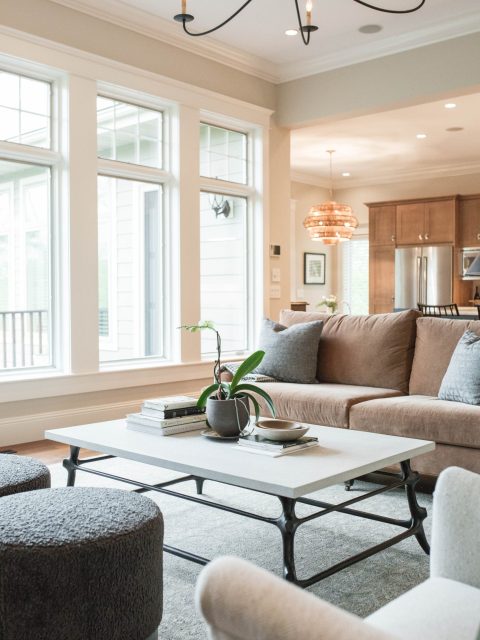
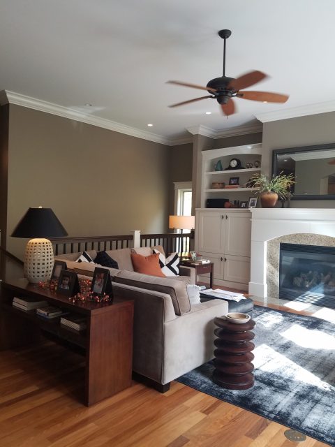
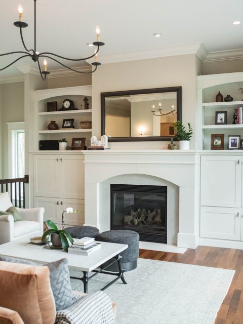
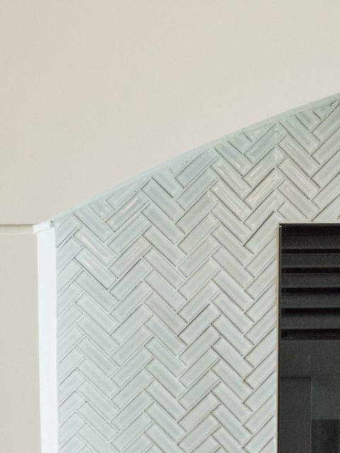
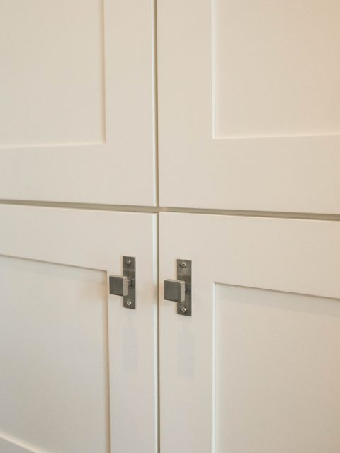
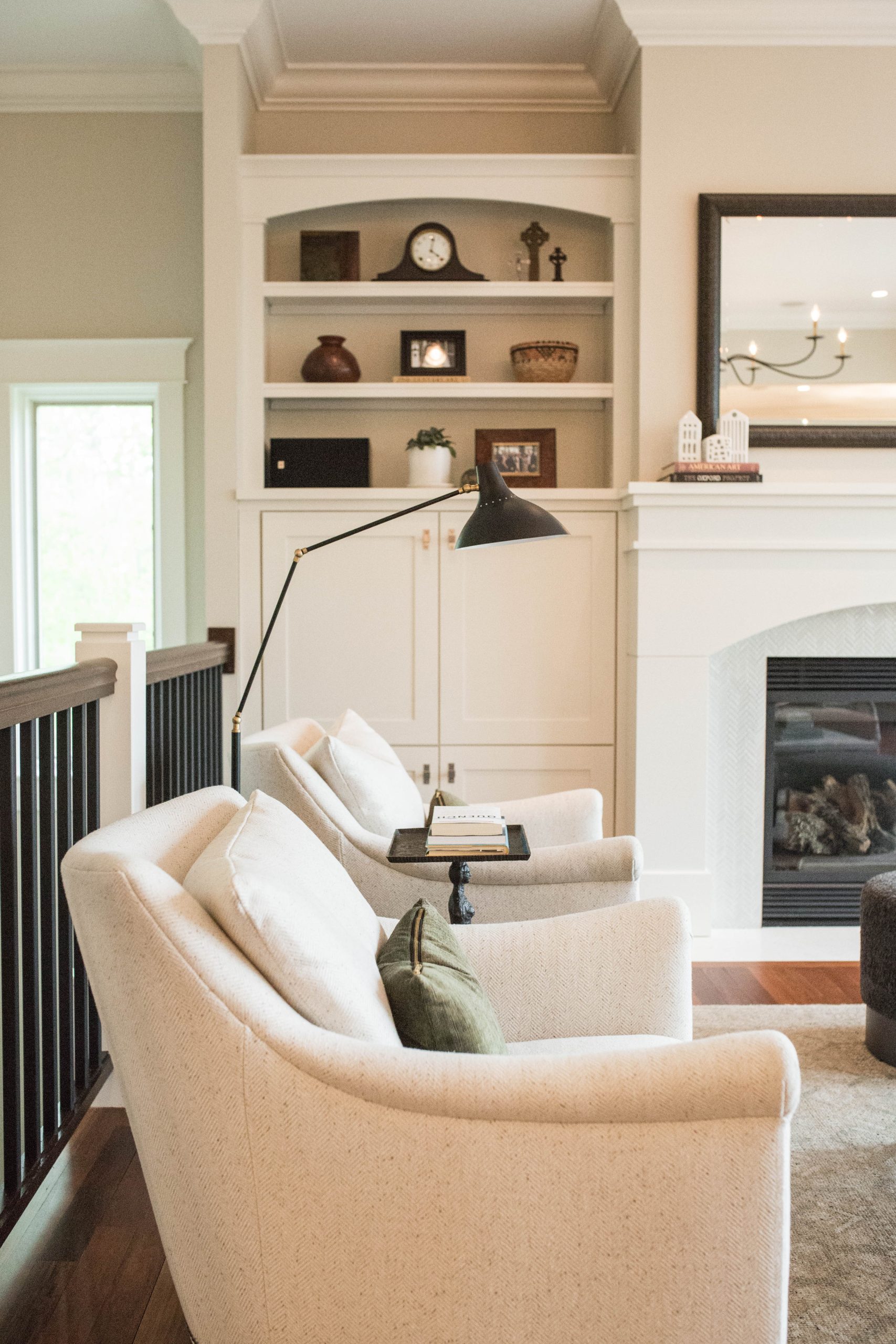
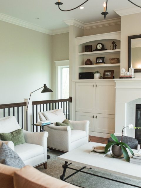
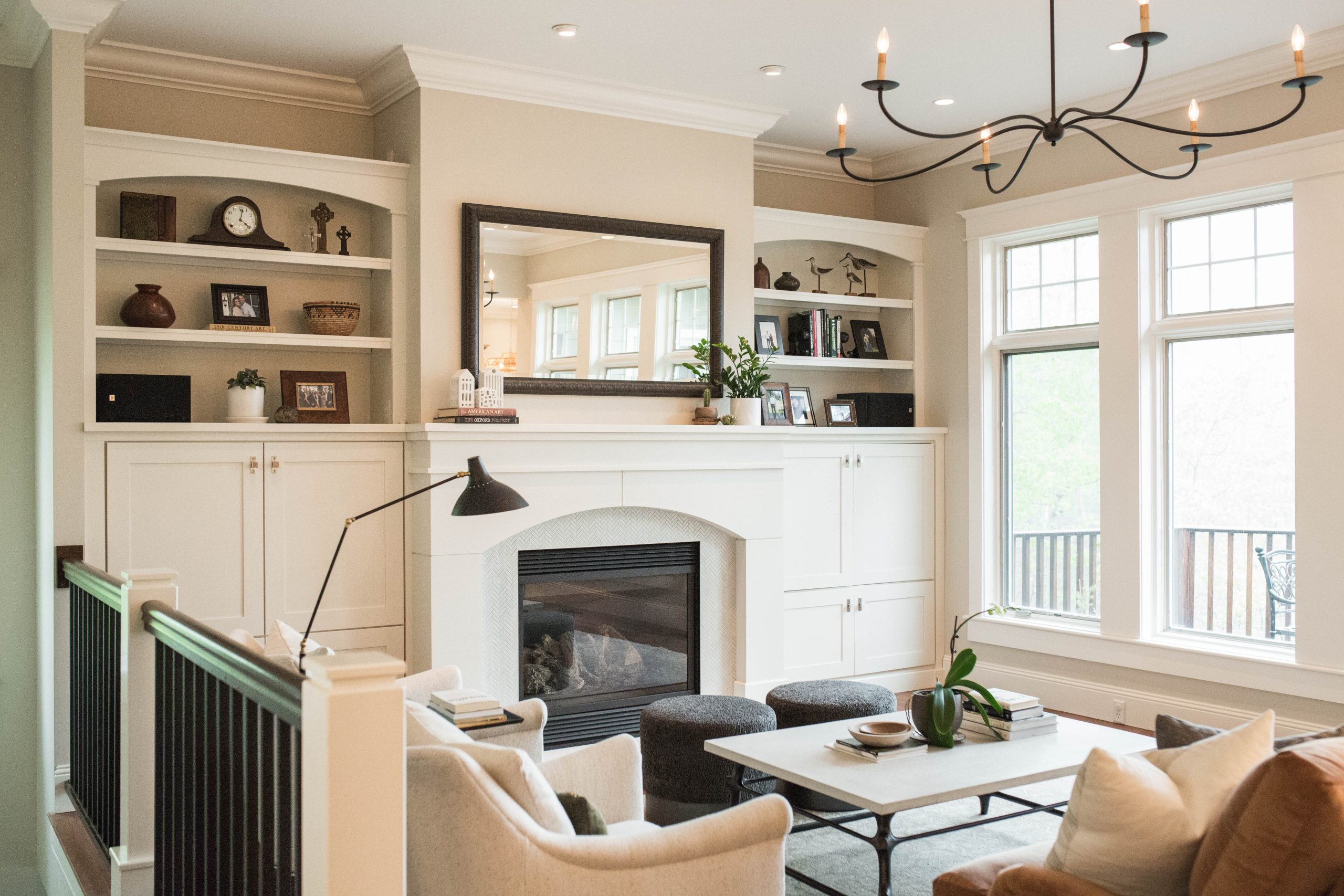
We kept the built-ins to maintain storage and function for the client, but we gave them a facelift with new hardware and a lovely herringbone tile fireplace surround, allowing this wall to make a new statement.
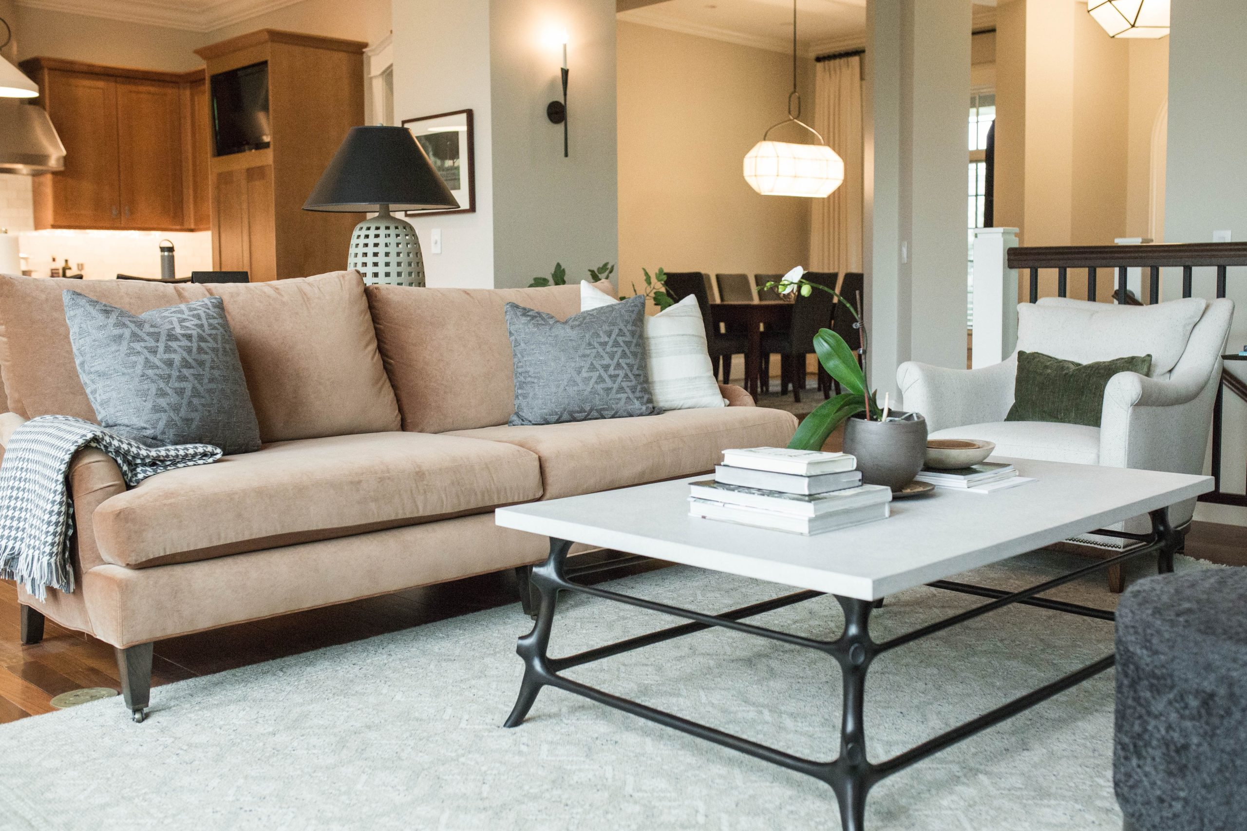
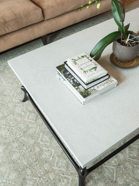
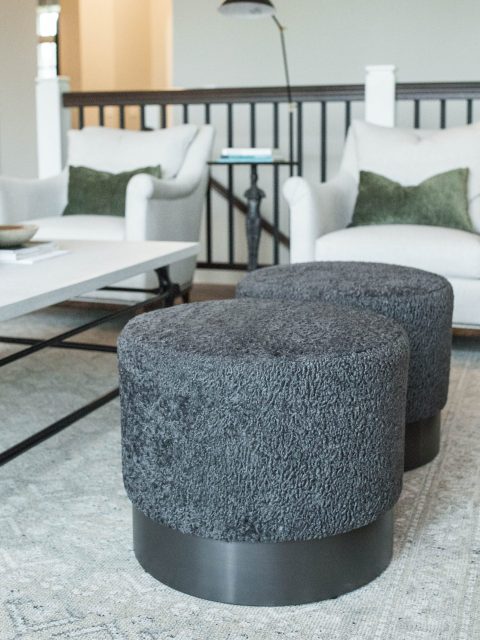
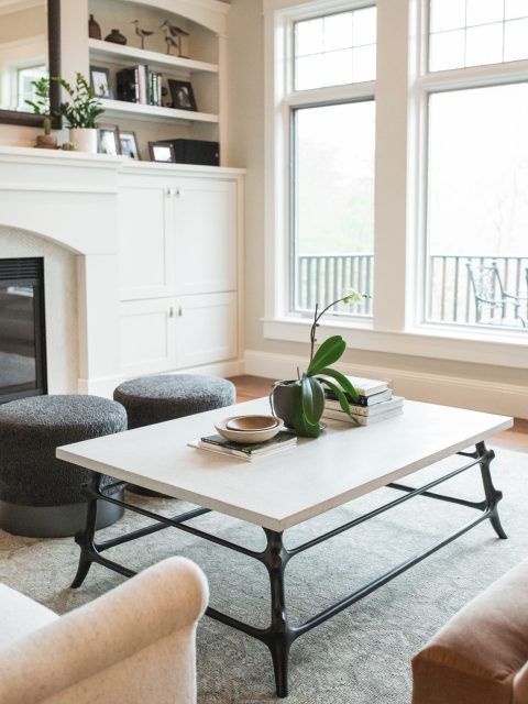
We reimagined the furniture layout to bring more circulation to the space, and the pieces were selected to look layered and yet approachable. New paint freshened the space, and we crowned the room with a sleek, simple chandelier for a layer of elegance.
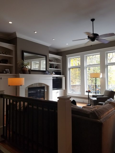
BEFORE
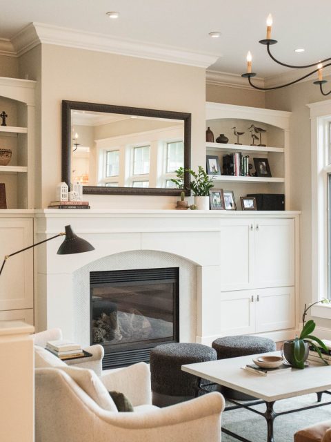
AFTER
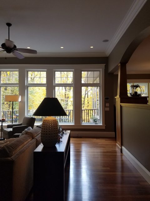
BEFORE
AFTER
BEFORE
AFTER

The Kitchen
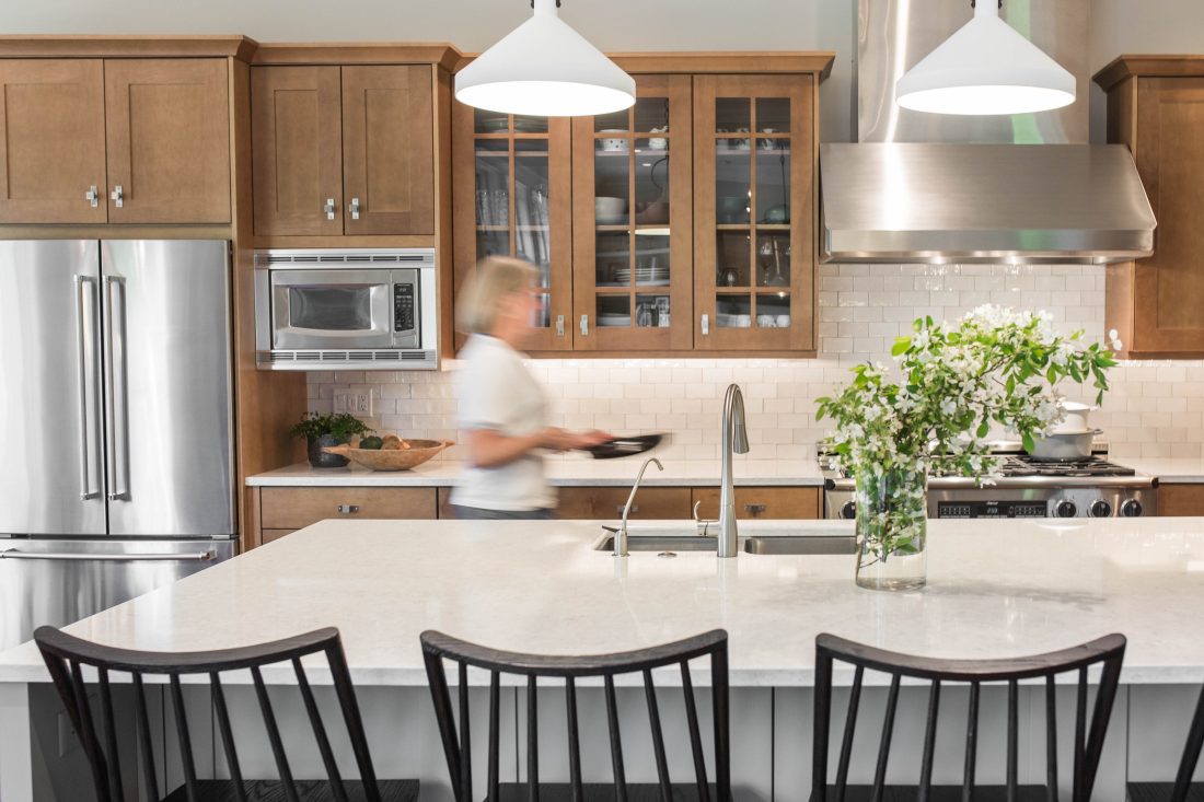
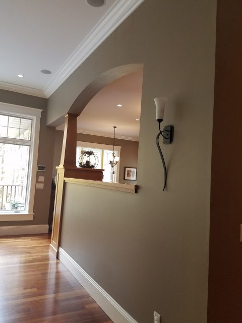
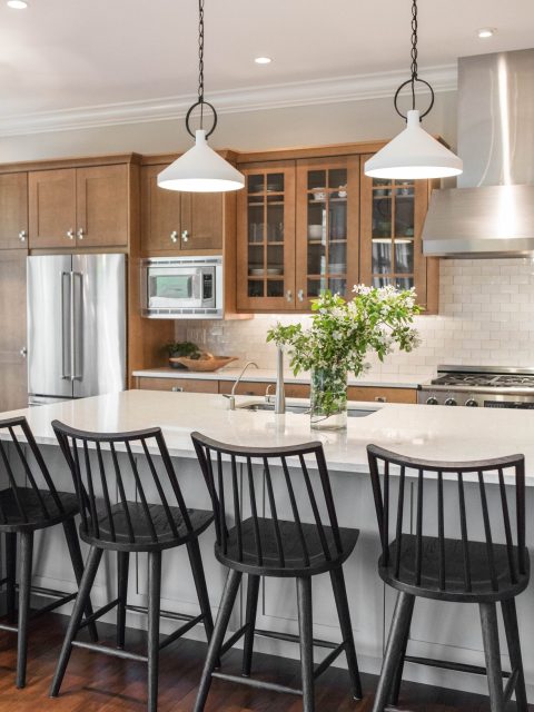
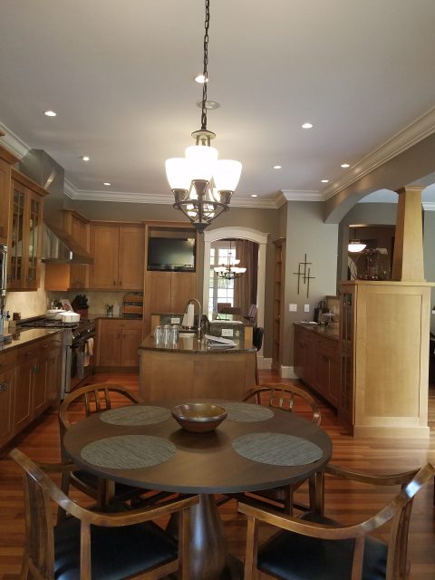
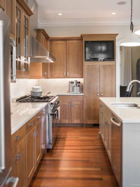
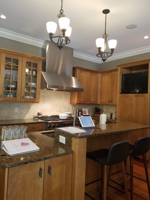
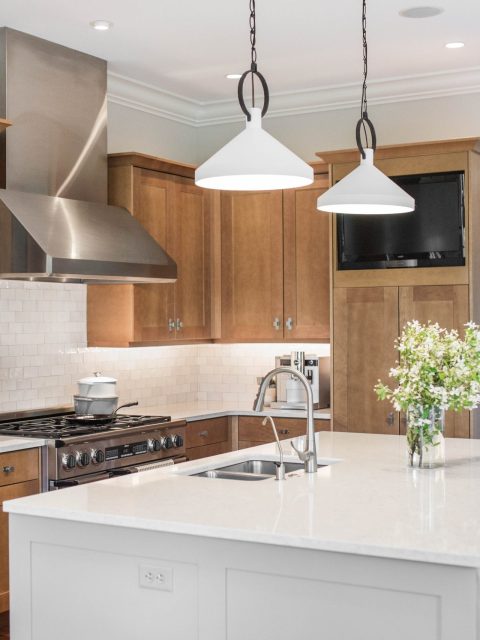
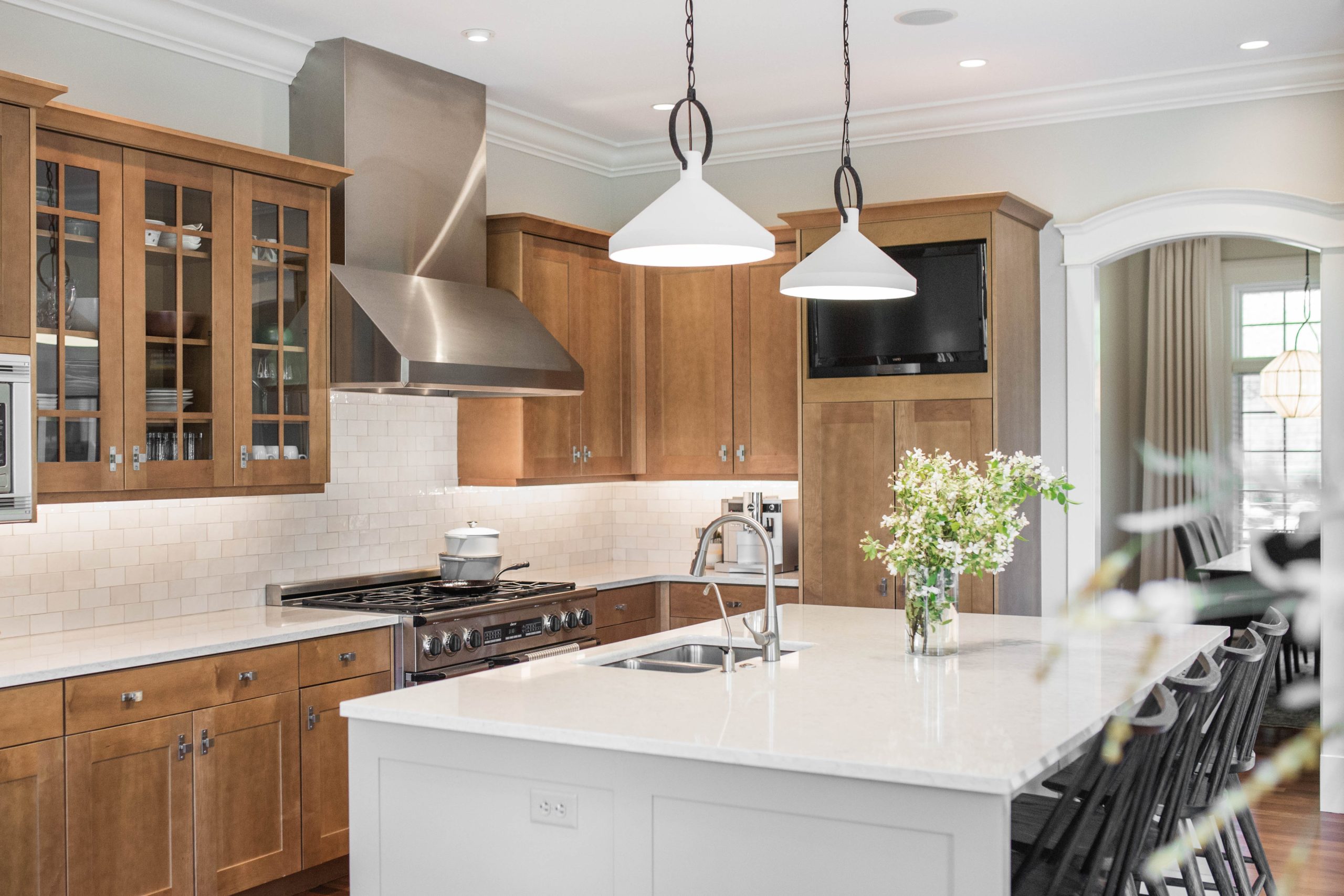
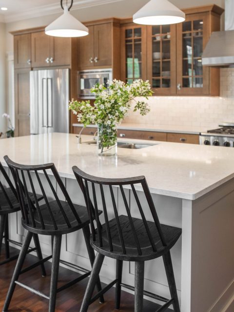
We opened up the kitchen to the living room by removing the partial wall and cabinetry separating the two spaces. Eliminating the wall meant eliminating some cabinetry and countertop space, but we added more into the island as it was reconfigured and expanded. The island now reaches farther across the space with one counter-height surface and creates great circulation around the kitchen and into the adjoining spaces.
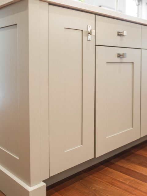
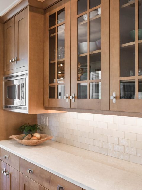
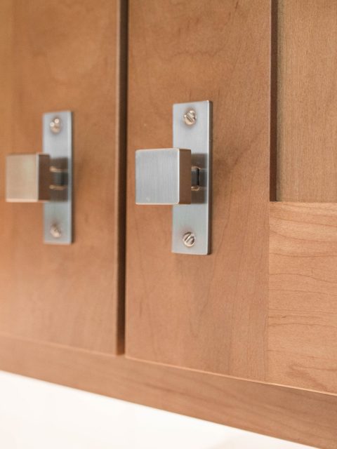
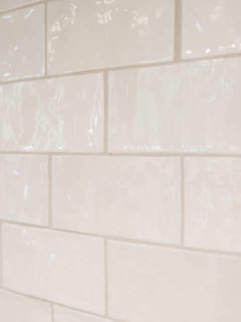
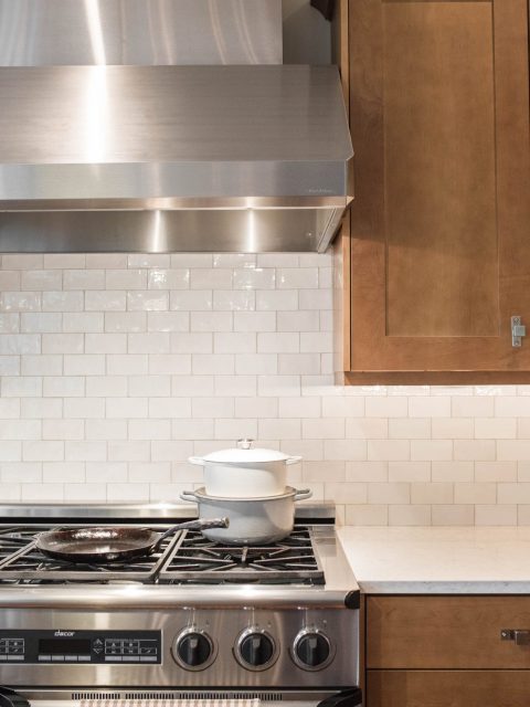
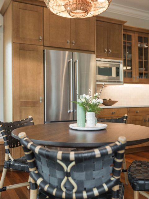
While we designed the island to stand apart with a warm grey paint color, we kept the perimeter cabinetry the same warm wood tone. We lightened the wall color and replaced the hardware, making the same cabinetry feel fresher and bolder. The dual-tone wood and grey kitchen we then layered with new quartz countertops and a handmade tile backsplash for a dose of contrast and depth.
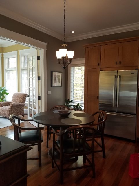
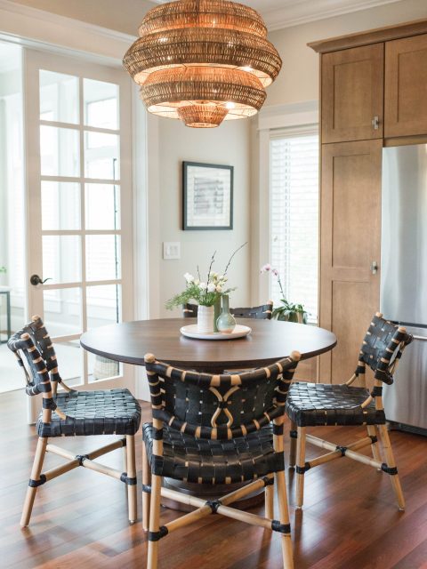
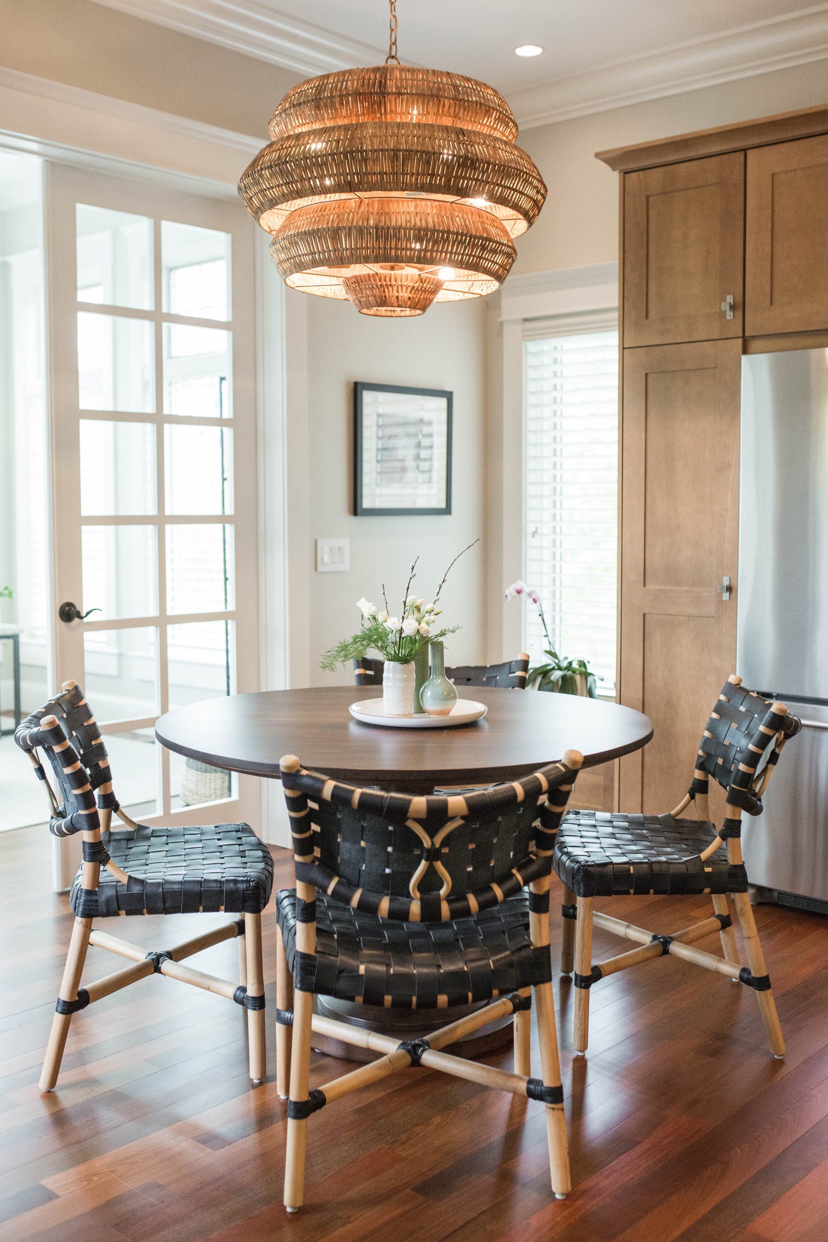
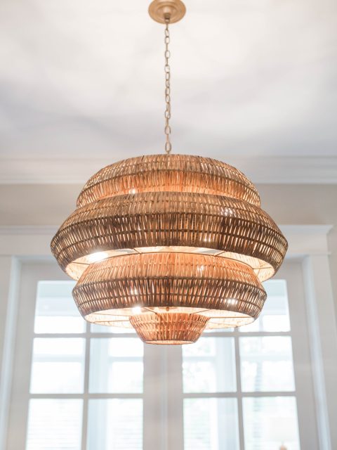
We selected the lighting over the island to tie into the living area chandelier with sleek feel but a nod towards the traditional, and the woven eat-in dining pendant added a punch of fun while retaining a natural feel connected to the cabinets and floors.
BEFORE
AFTER
BEFORE
AFTER
BEFORE
AFTER
BEFORE
AFTER

The Sunroom
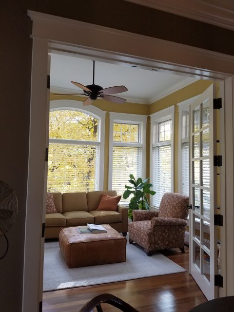
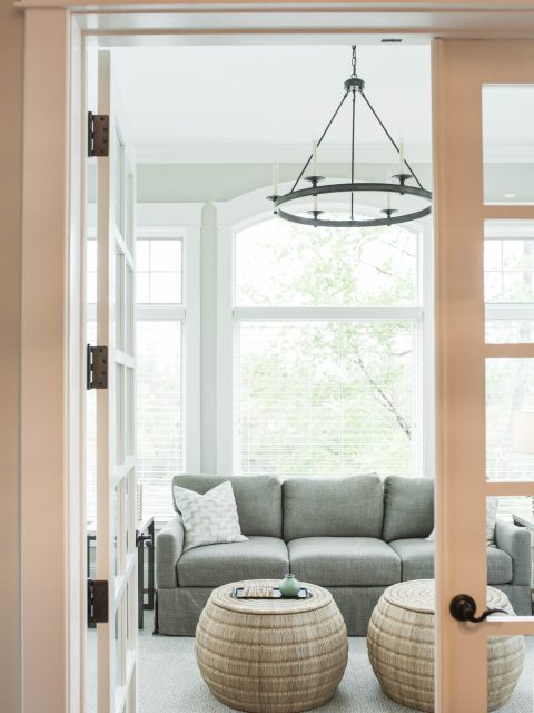
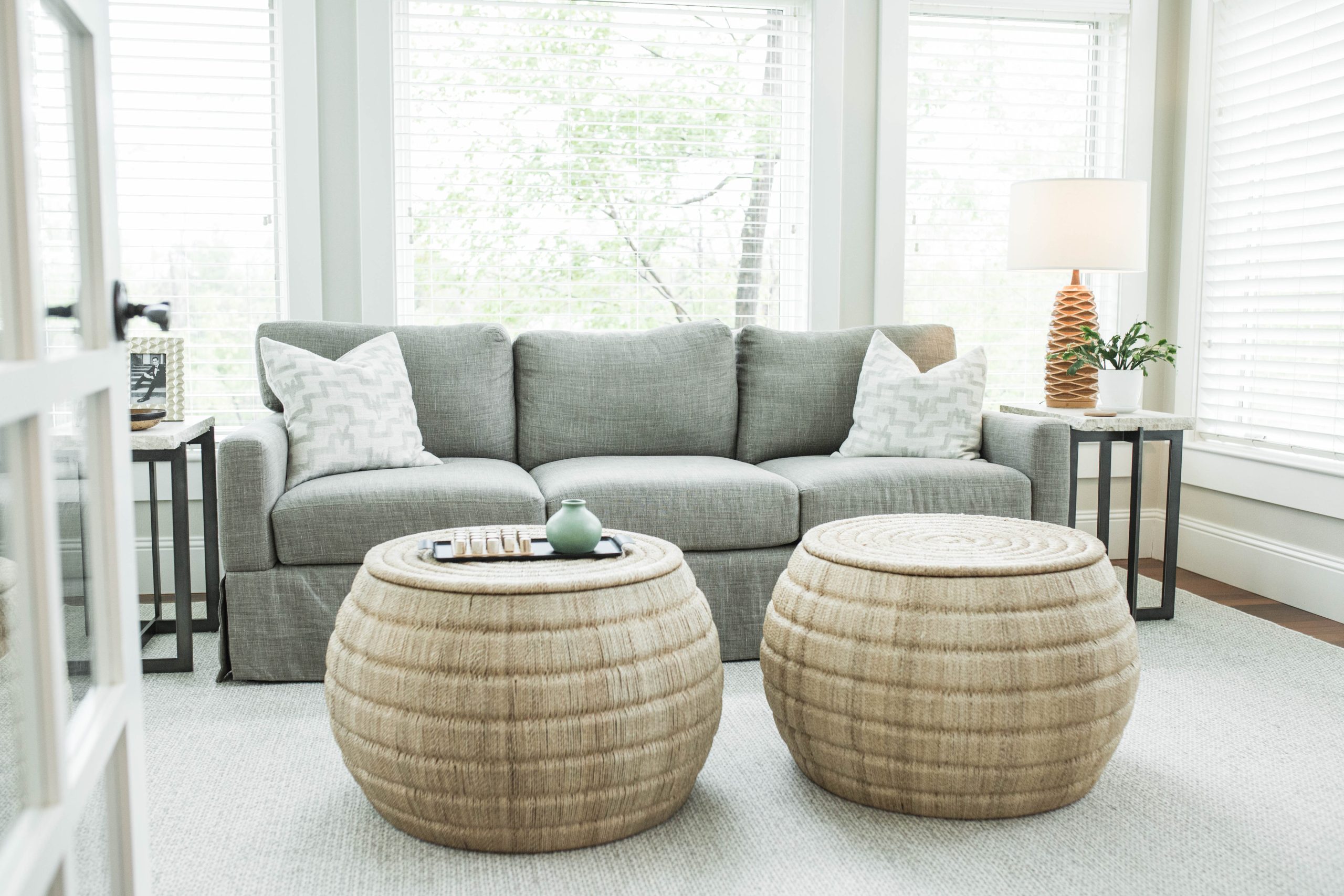
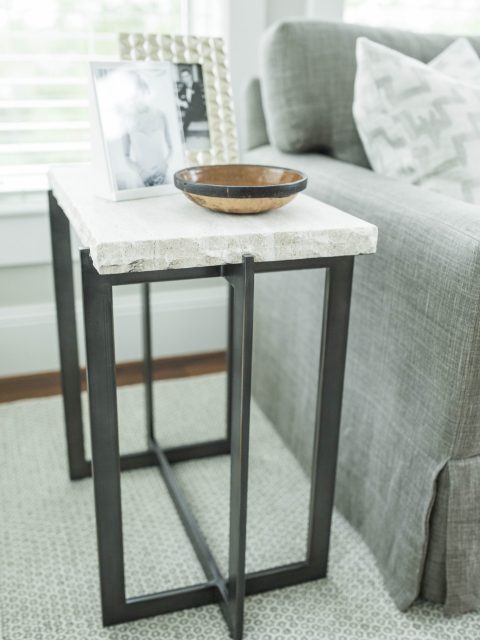
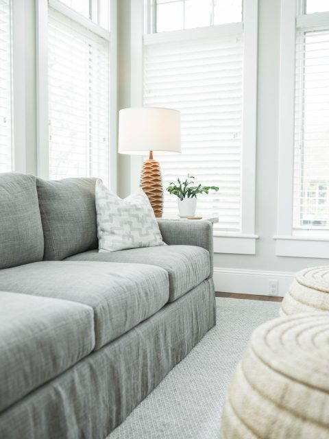
This fun bonus space was designed be flexible for socializing or watching the grandkids while cooking. We added fresh light paint and another candelabra-style chandelier to keep it blended with the rest of the spaces, while more casual and hardy furniture fill out the room for flexible use and imaginative play.
BEFORE
AFTER
The Dining Room
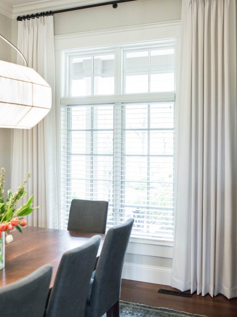
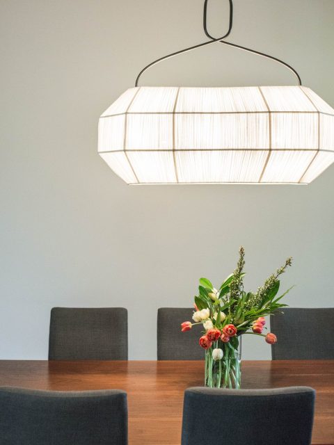
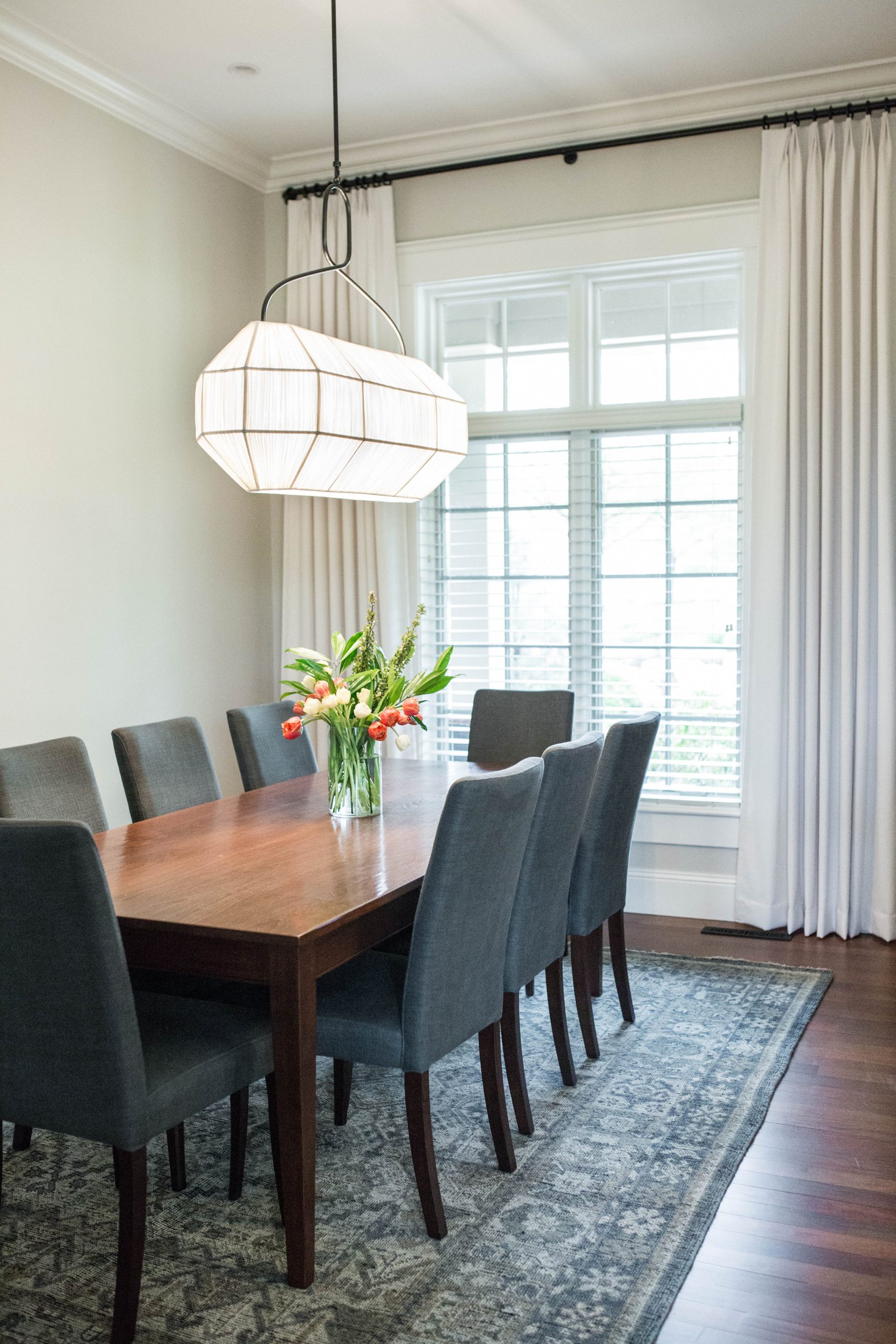
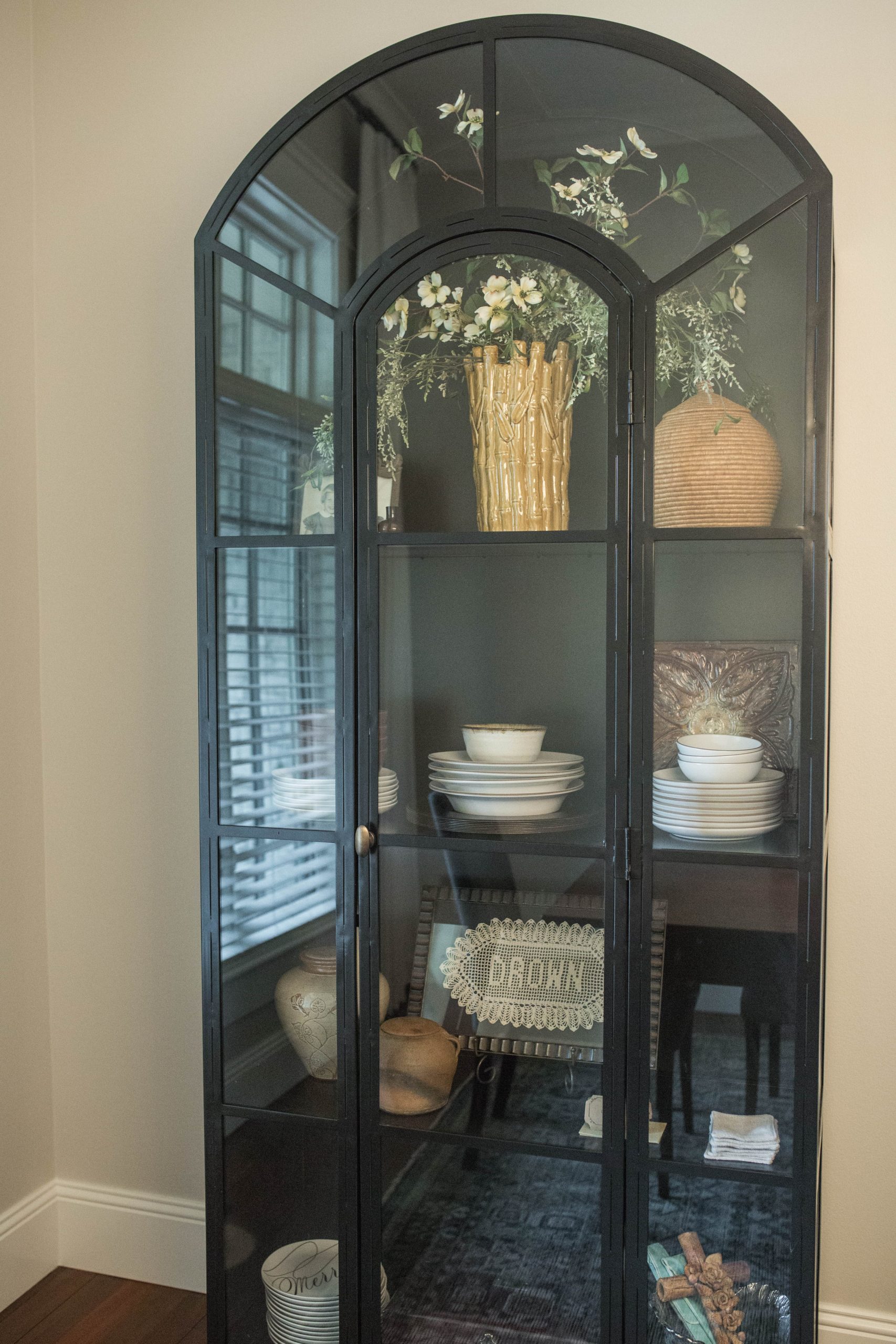
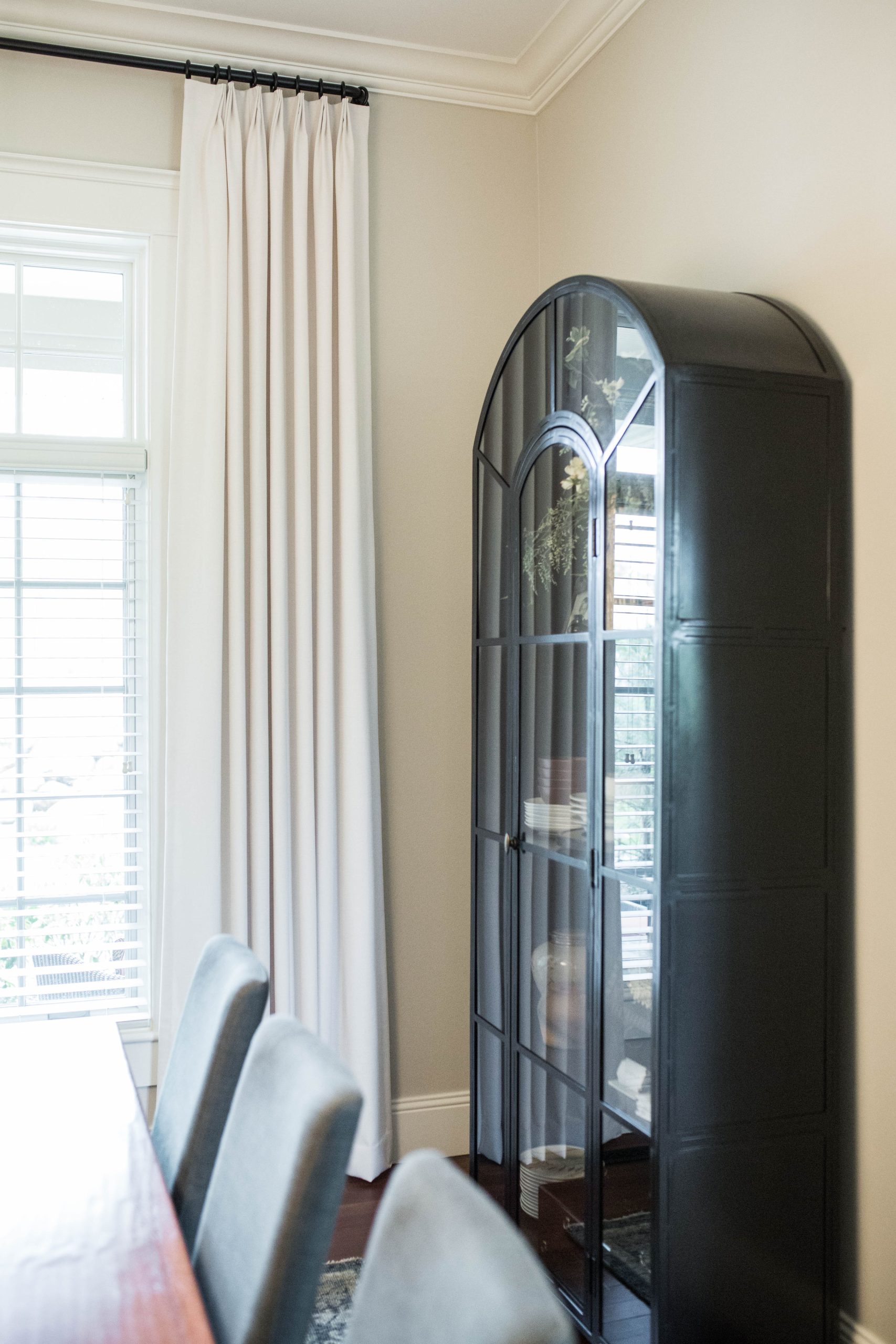
The dining room required the most minimal of touches to make it feel brand new. We painted, hung custom drapes, brought in a new rug, and recovered the existing dining chairs. These elements gave a the space a refresh, and then we layered on some statement pieces to bring some style. We swapped out the existing chandelier for a beautiful soft linear piece that captures the attention and replaced the buffet with a fun new curio-style cabinet to house china and cherished decor together. Now, the room has a fresh feeling and a distinct simple transitional style.
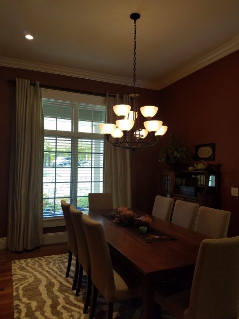
BEFORE
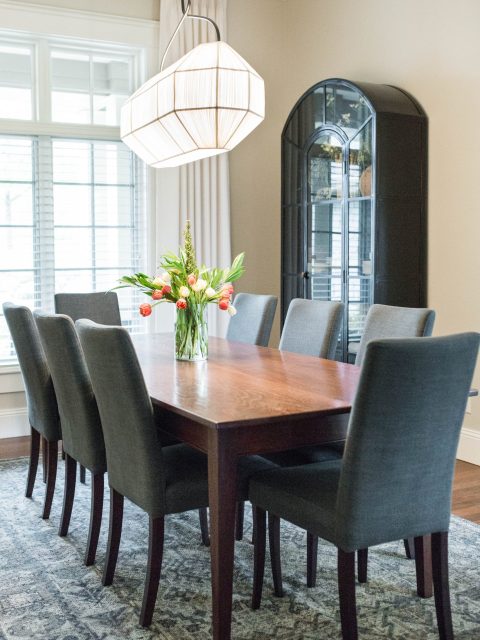
AFTER
The Entry
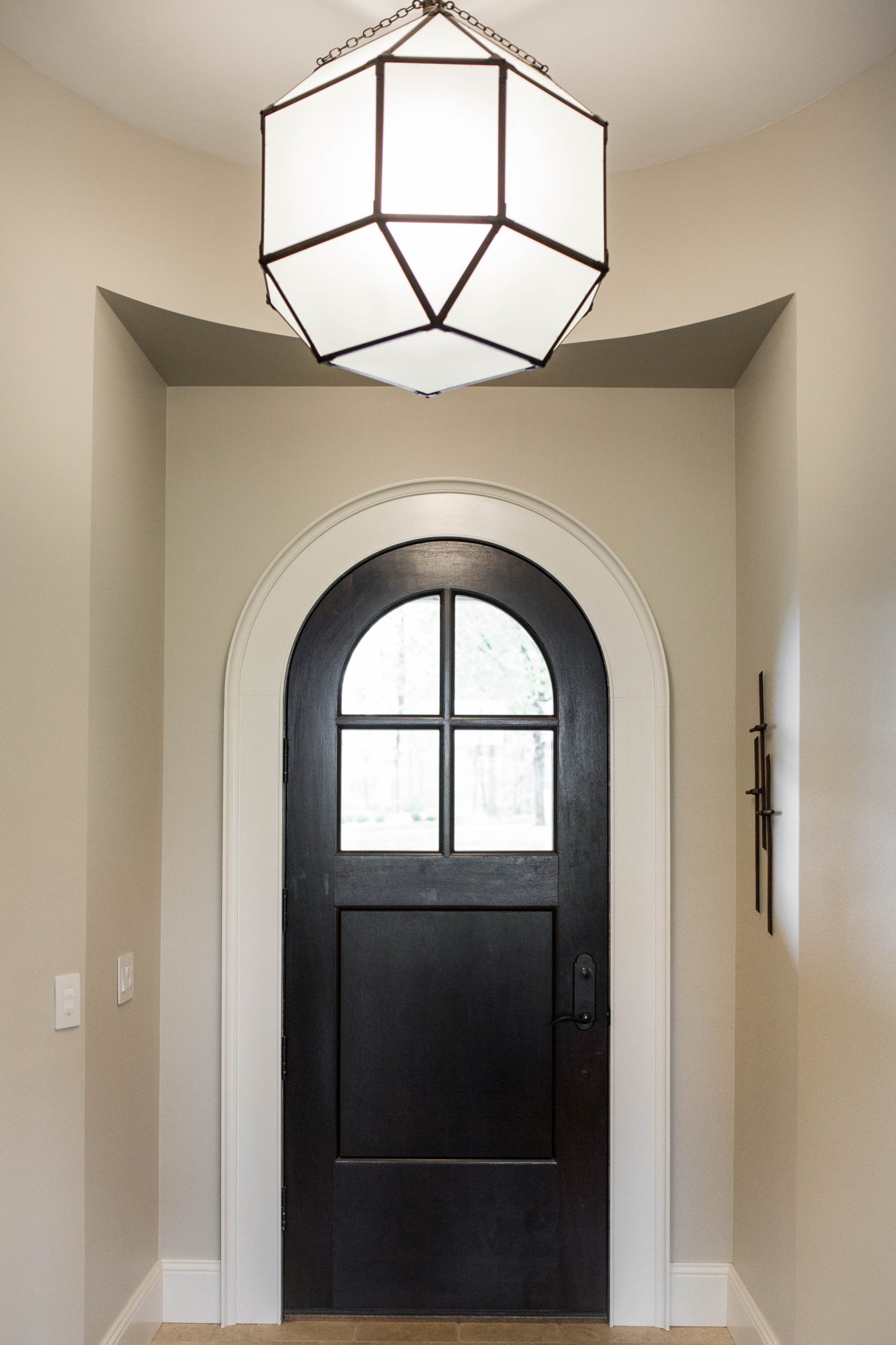
In backwards fashion, we are topping it all off with the updated entry. We used fresh paint and a gorgeous lantern pendant to usher in the whole main floor style, whether you are coming or going.
Turns out, you don’t always need a heavy-handed approach to redesign. In this house, we focused the bulk of the overhaul on taking out a wall to make the flow of the main floor much more functional. Then we found ways to design the rest of the spaces lightly for maximal impact and a unified style.
Whatever your level of need, we’re here for you.


