Project Reveal: East Knoll Park Residence
Slogging through the winter months has us ready for a little inspiration. Project Reveals always help us get excited about the work we are doing as we remember how good the end results are for our clients. Are you with us?! I think you’ll agree that the changes in this space are exciting and in some places, nearly unrecognizable.
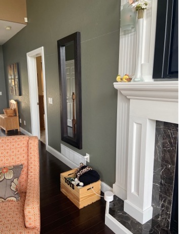
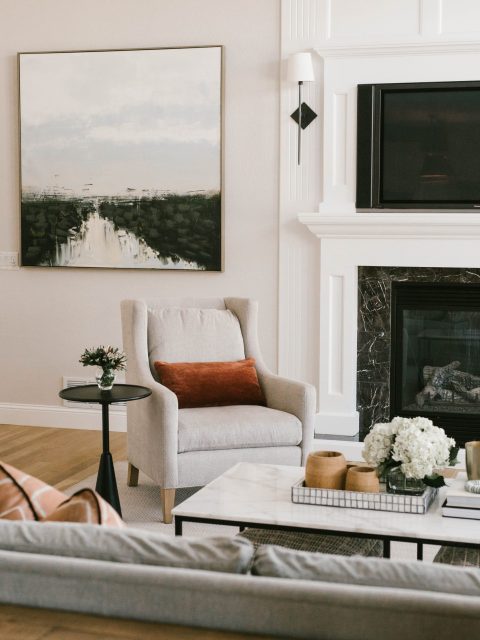
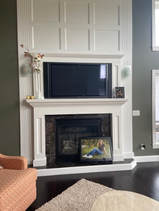
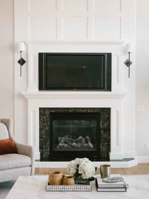
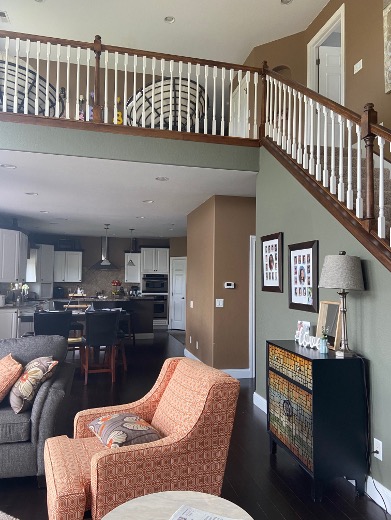
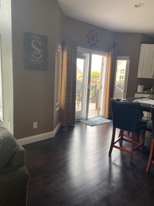
We finished our East Knoll Park project a little over a year ago and we are still loving looking at it! We did some light touches in the dining room and entry, while the bulk of the renovation took place in the living room, kitchen, and powder room. The client wanted a brighter, more modern approach to her darkly-painted first floor, and we obliged. The biggest effect was made by reflooring with a lighter wood and then complementing those with warm white tones and crisp white trim. Layered on top is a sprinkling of fun bright colors and an expertly mixed palette of woods and metals.
Dining & Entry Details
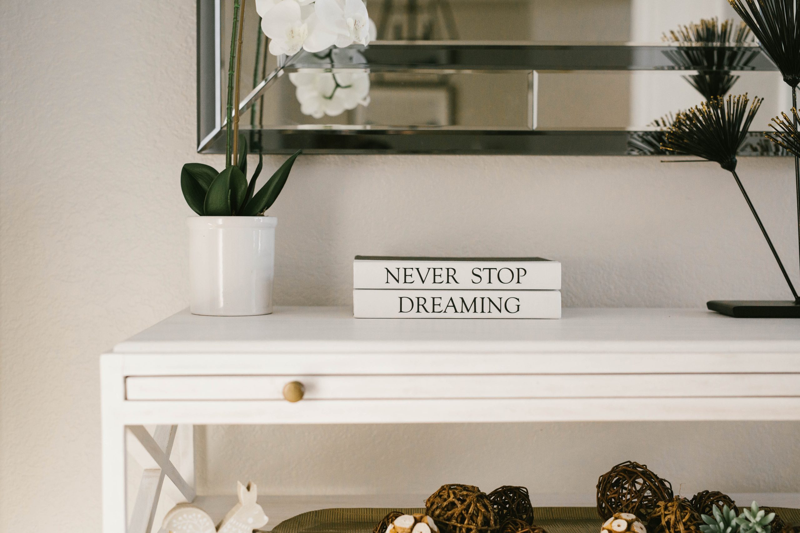
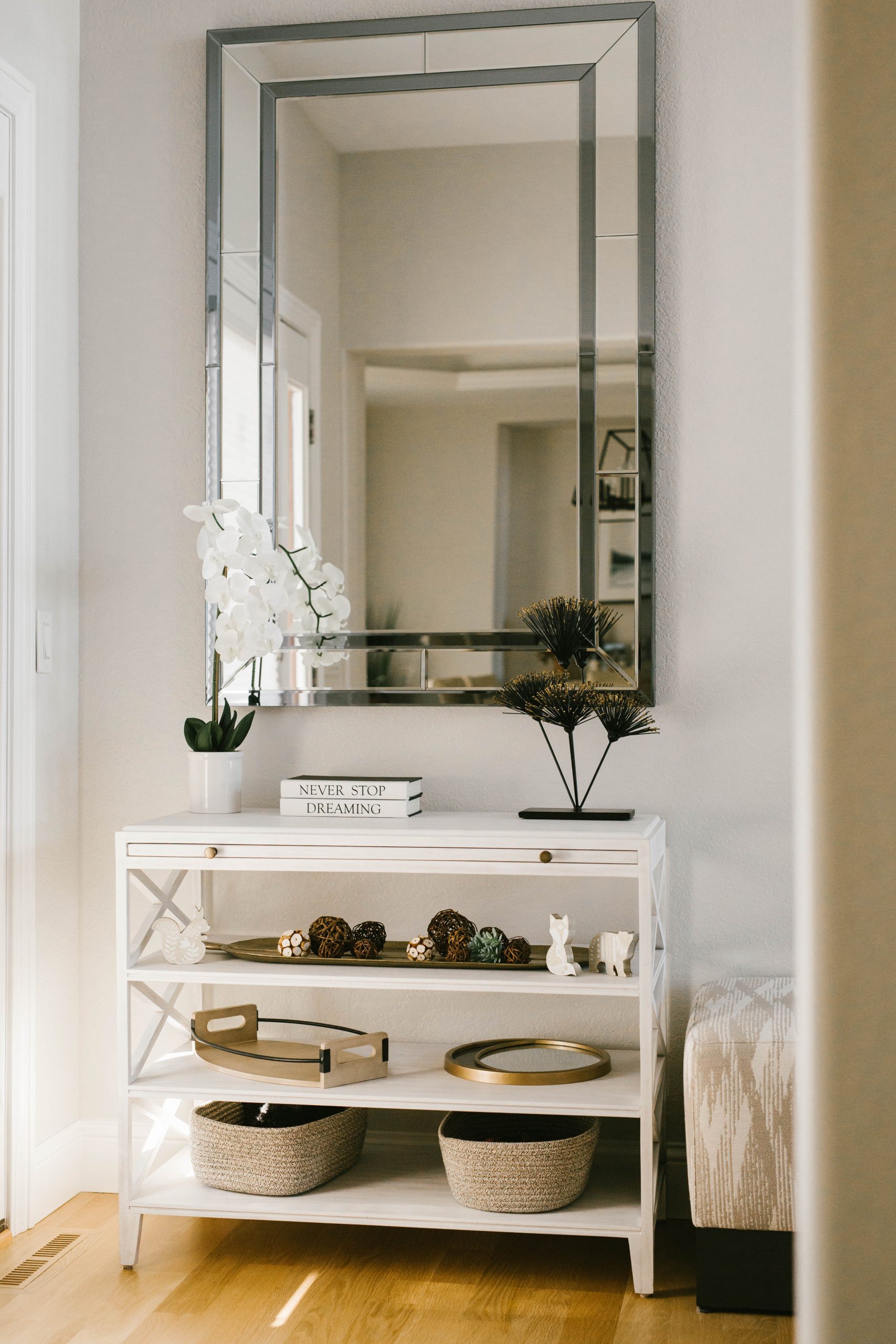
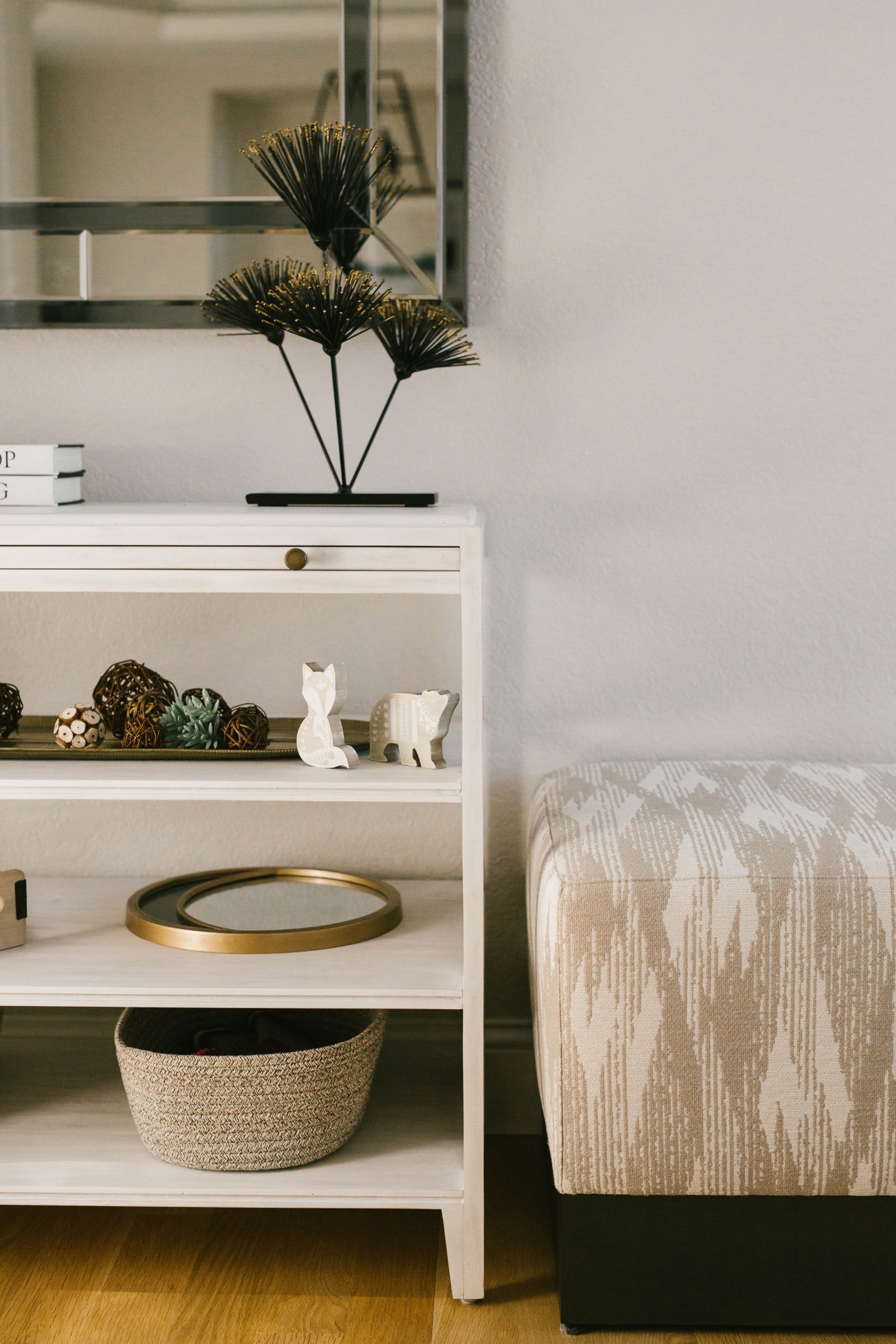
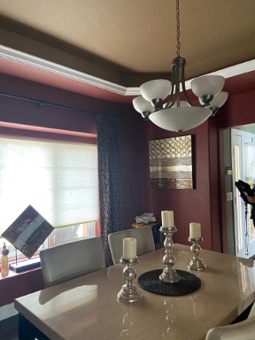
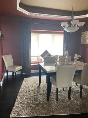
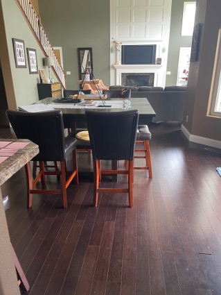
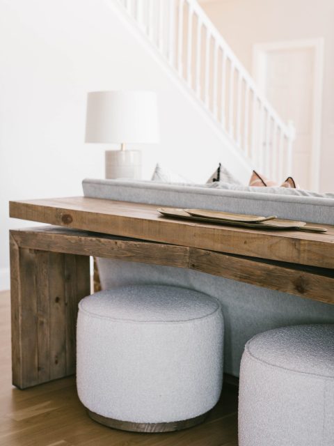
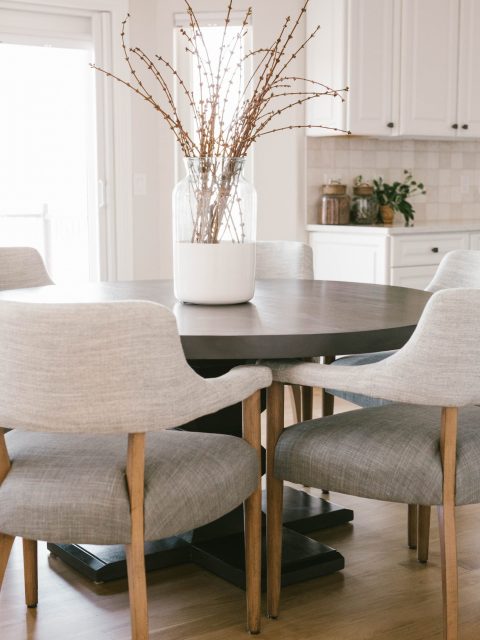
One cannot overstate what a good paint color and flooring combo can do to reimagine a space! That’s really all this entry and dining room demanded to give these two adjoining spaces a whole new lease on life. While there is still room for updating down the road, a few little touches went a long way towards ushering in the main renovations on the rest of the main floor and uniting the palette.
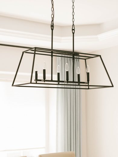
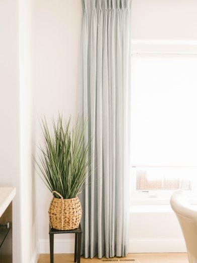
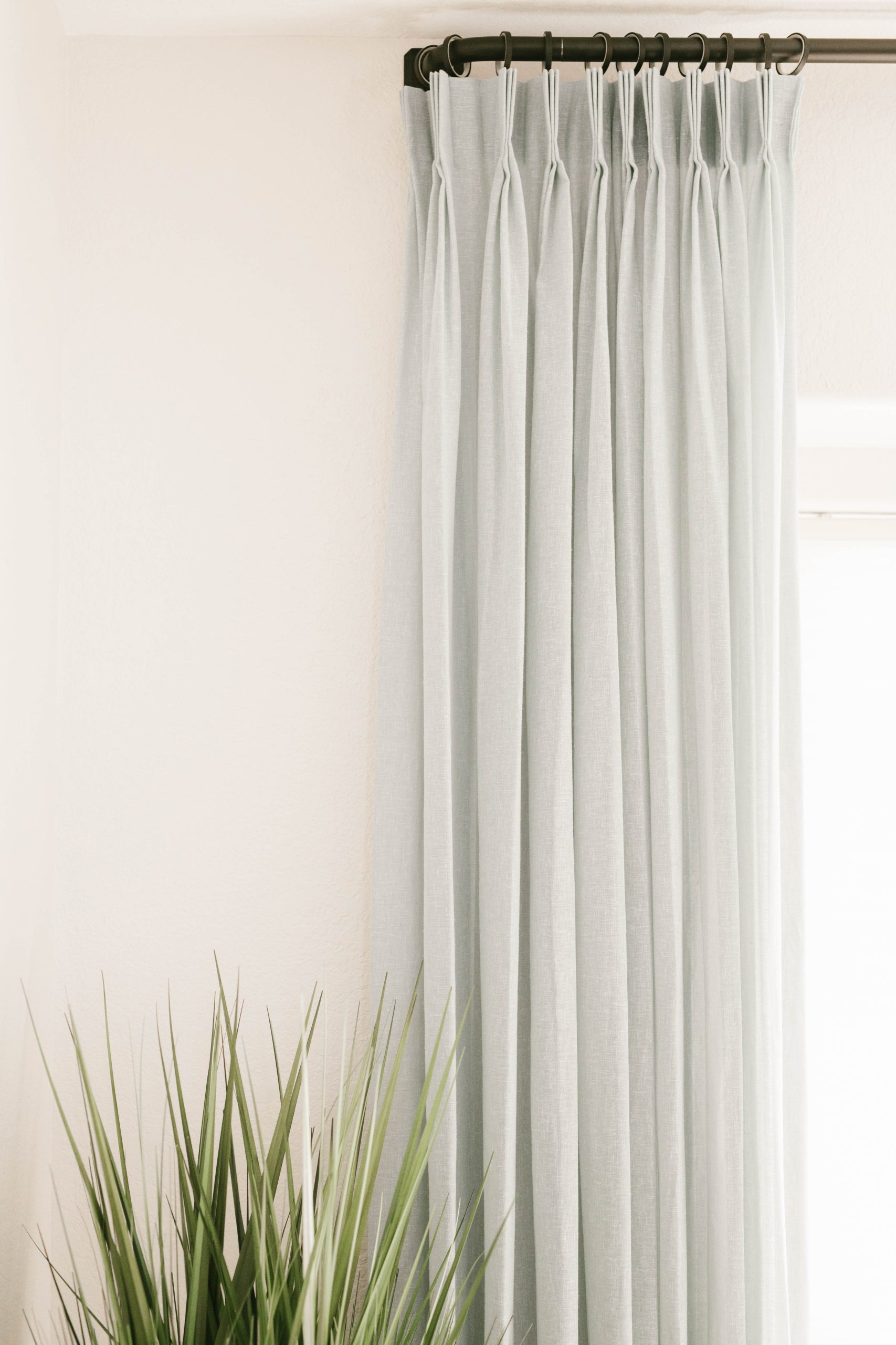
In addition to the paint and flooring, we swapped out the light fixture and added lush drapes in the dining room, then styled out a new console, ottoman, and mirror to great guests in the entry.
BEFORE
AFTER
BEFORE
AFTER
The Living Room
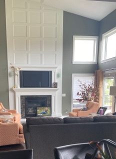
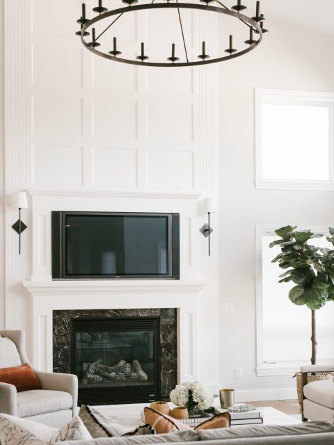
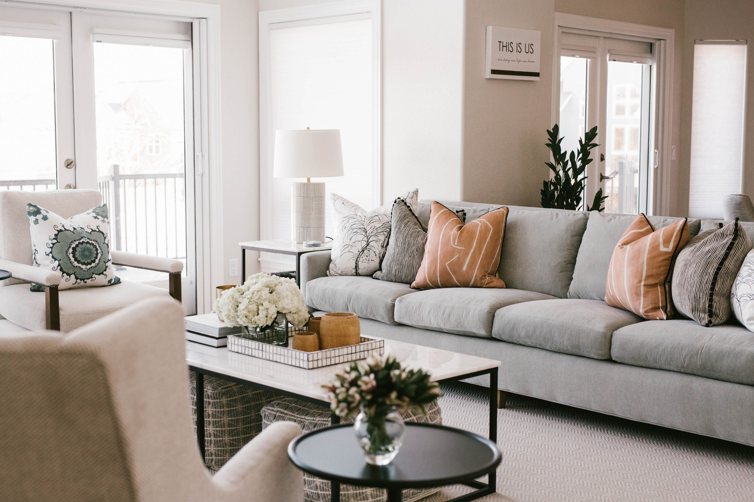
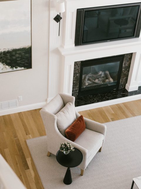
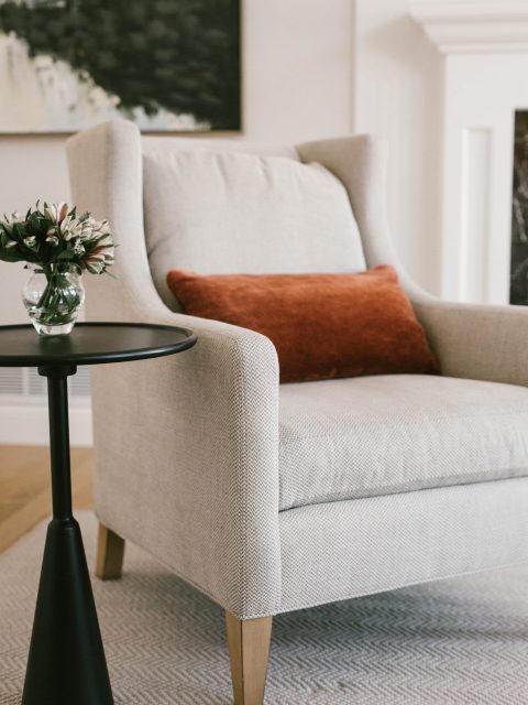
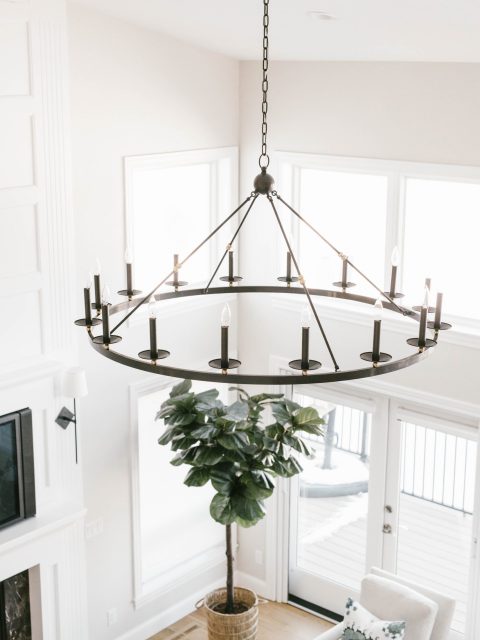
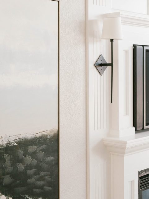
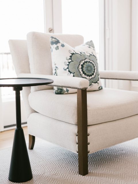
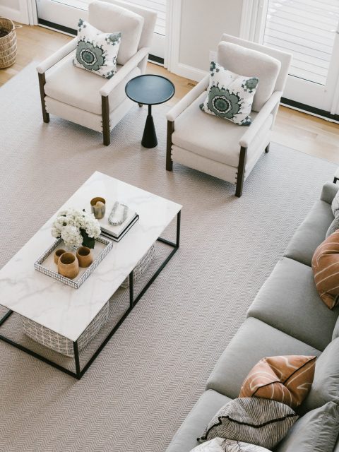
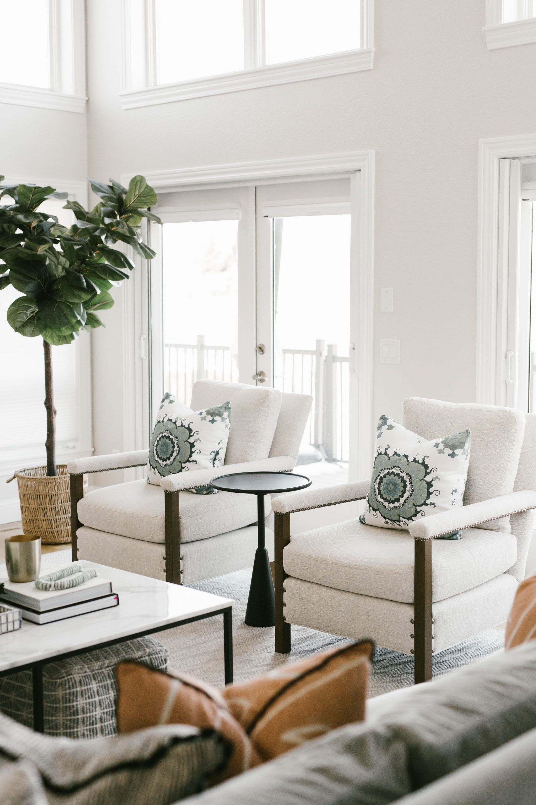
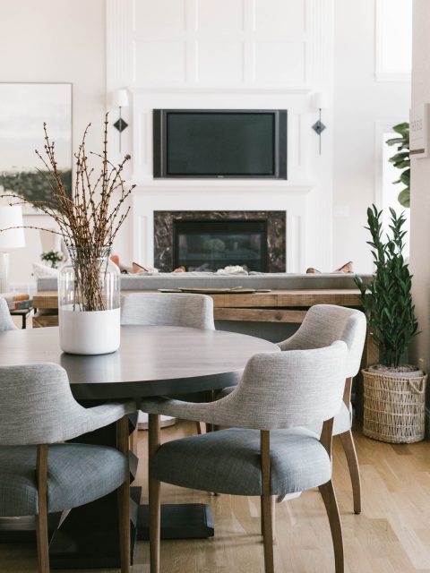
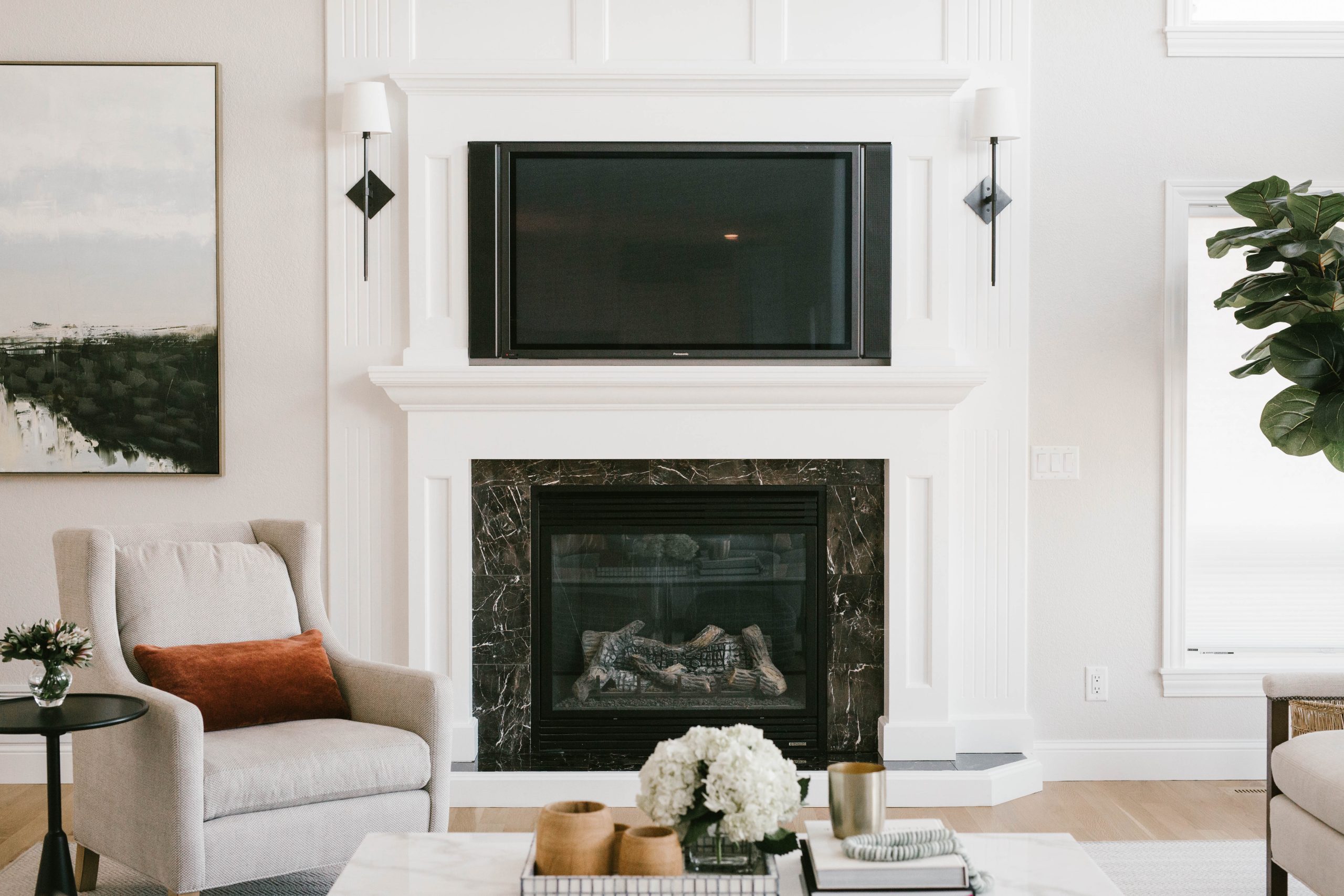
In the living room we brought in all new furniture that leans more transitional, and tweaked the layout towards more openness. The elegant sconces cut a pretty picture on the fireplace surround with a playful diamond-shaped backplate, and the oversized round chandelier draws down to pull together the black finishes around the fireplace and the seating area. We love how adding some modern black finishes around the room turned the existing black marble fireplace surround into a modern stone feature. Removing the window treatments in this multi-story space allowed the full height of the window wall to be felt, pulling out that bright, open feel we were going for.
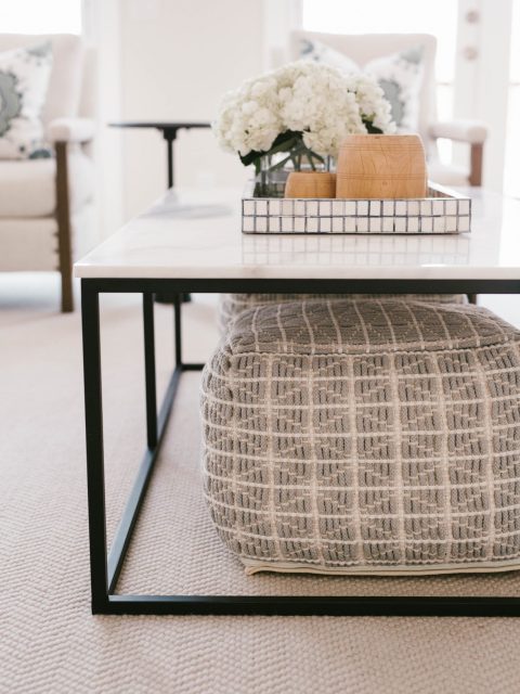
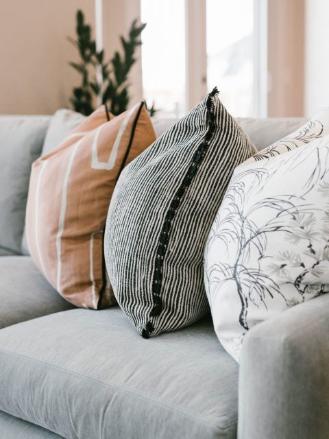
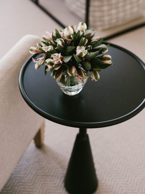
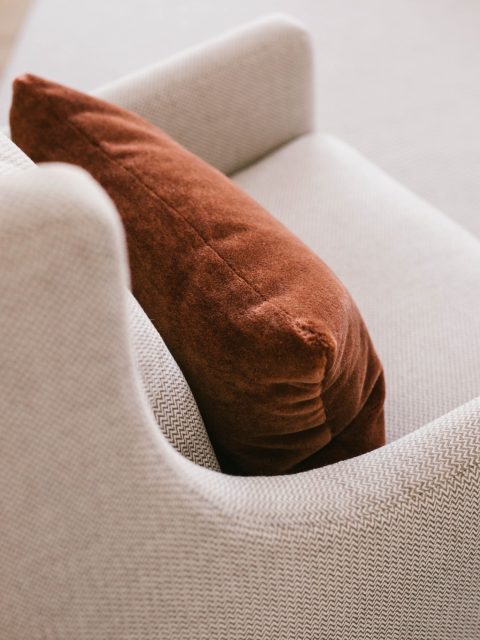
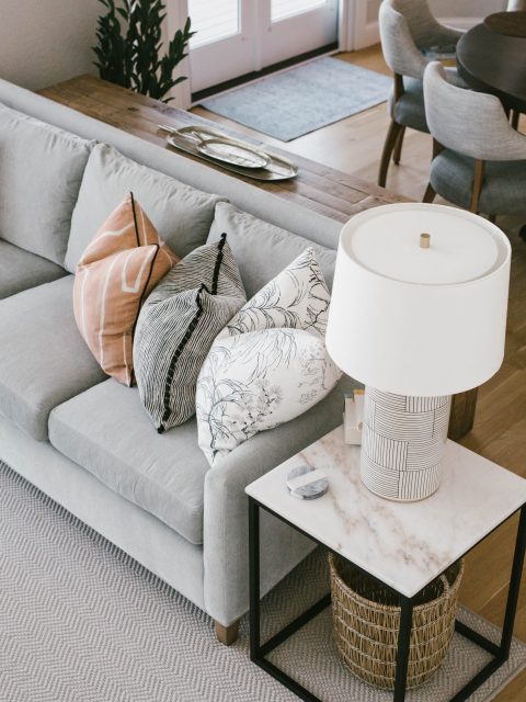
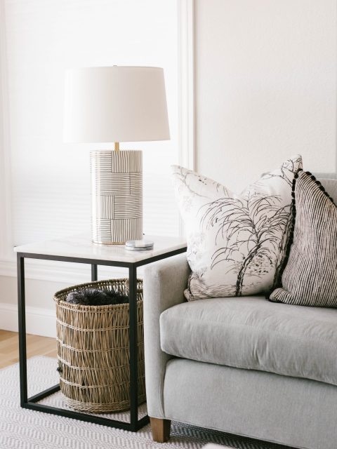
We added a subtle herringbone rug as a base layer for the colorful textiles and art, then placed lamps, plants, pillows, and tabletop decor to layer in depth. What was key to this space was working with the existing tile surround, trim, and windows to build a new transitional space that felt like it related to this house but was an expression of our client’s personality.
BEFORE
AFTER
BEFORE
AFTER
BEFORE
AFTER
BEFORE
AFTER
BEFORE
AFTER
The Kitchen
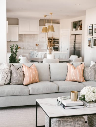
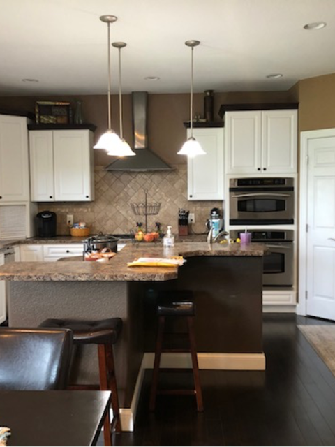
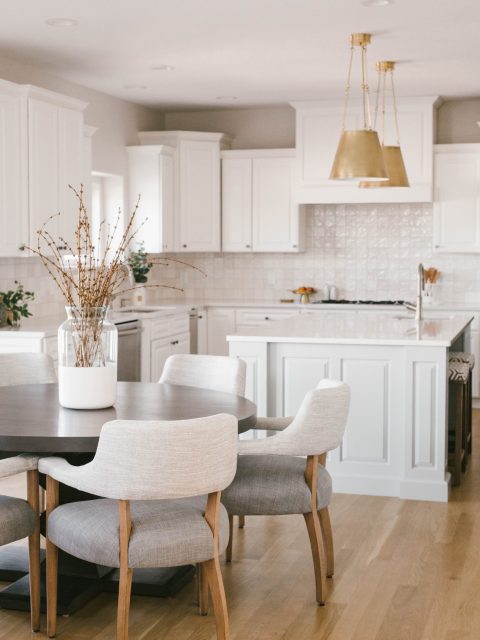
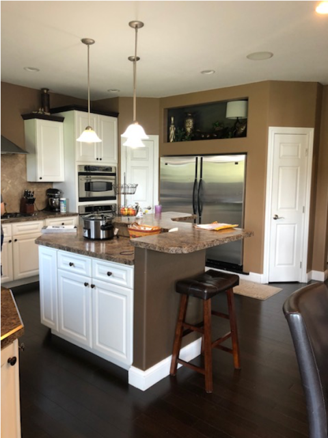
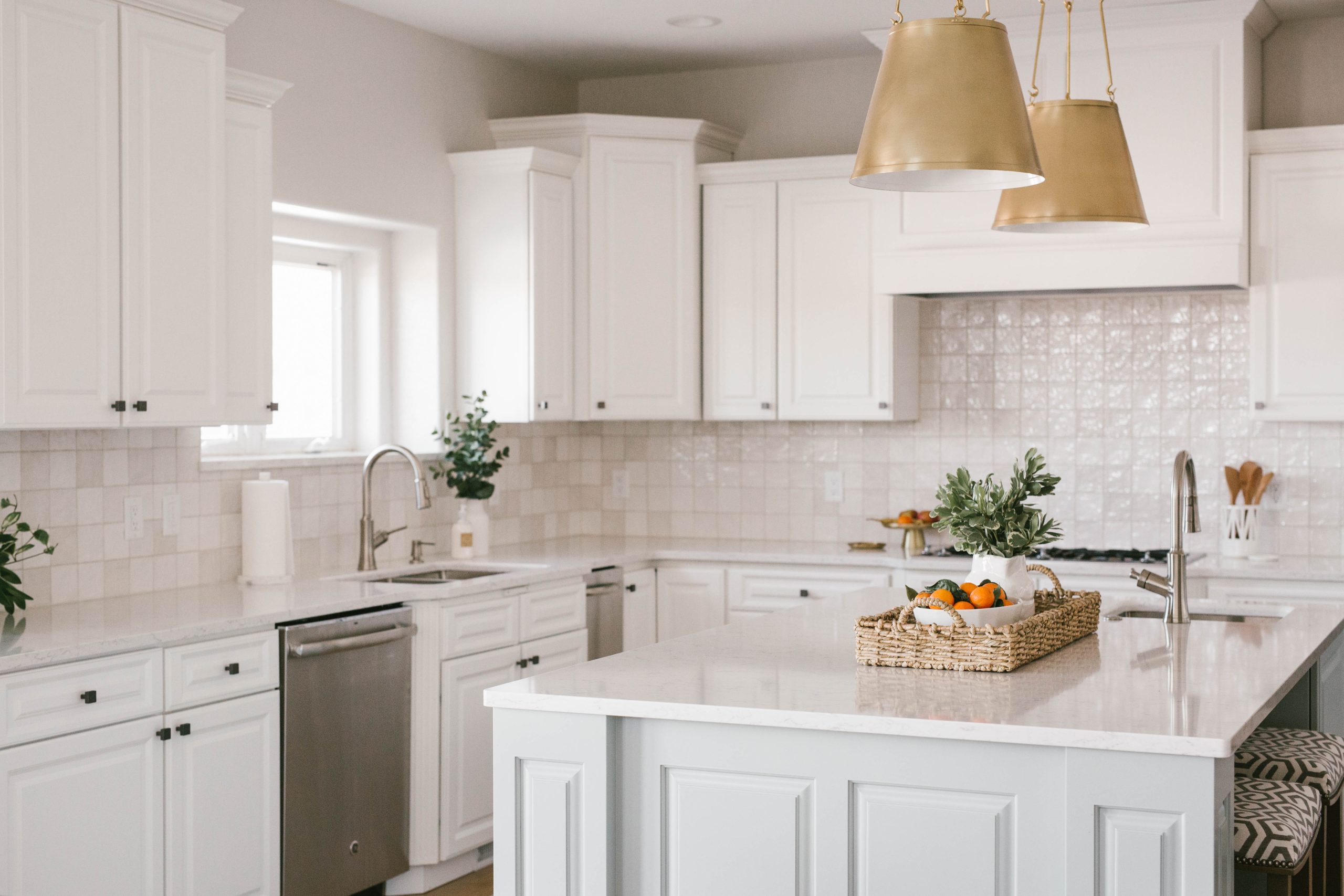
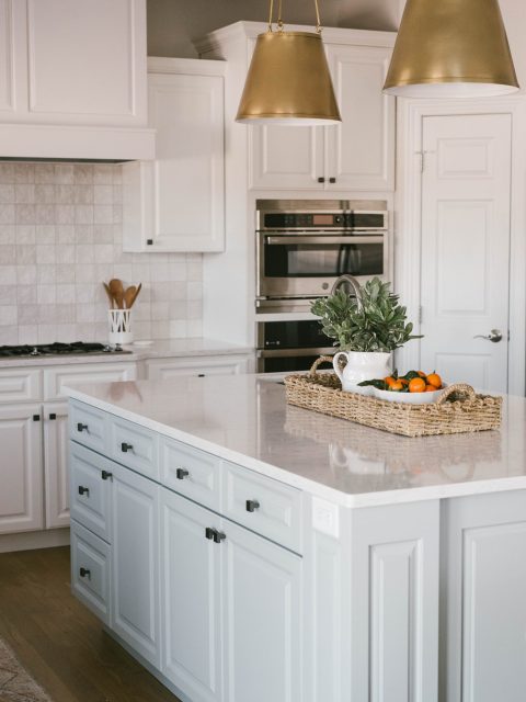
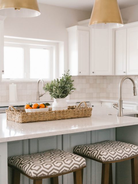
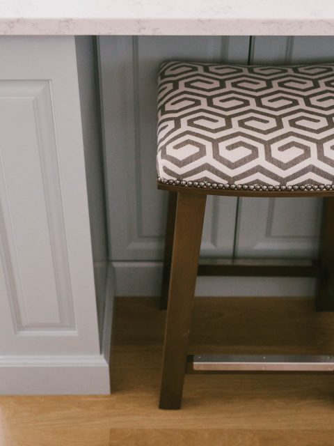
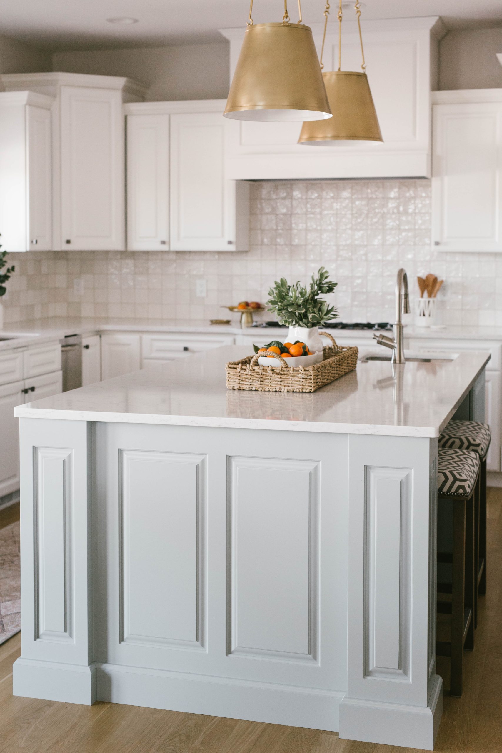
Our efforts were focused on making the most out of what is often a conundrum to our clients: the kitchen. The layout of the perimeter was still working, but the island had become awkward and frustrating to our client. We replaced the double-height counter and S-shaped base with a simple rectangular counter-height island that includes an area for stools to be tucked under. The flow around the kitchen perimeter was kept and the new island gave the client a clearer, bigger prep space right in the middle, and who doesn’t want that?!
Pro-tip: Simple shapes and layouts always age better than lots of corners and angles. So while this kitchen has a more basic format, it is much more functional, easier on the eye, and will withstand the test of time.
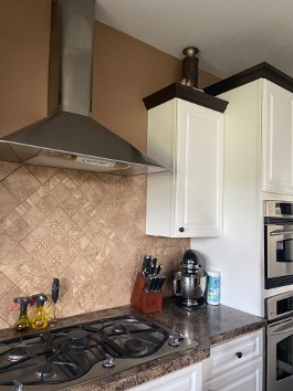
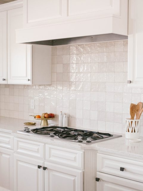
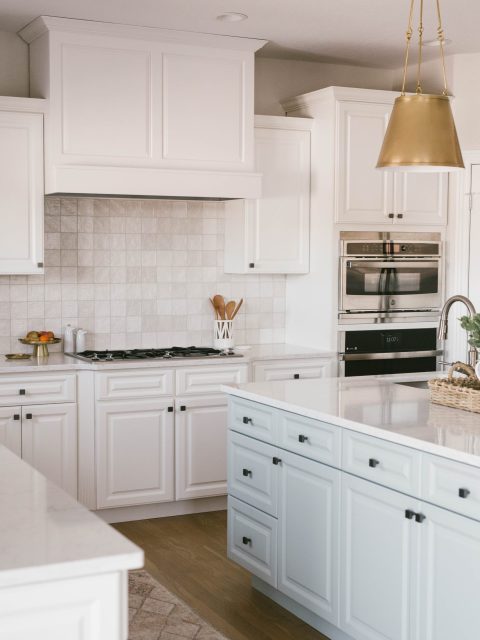
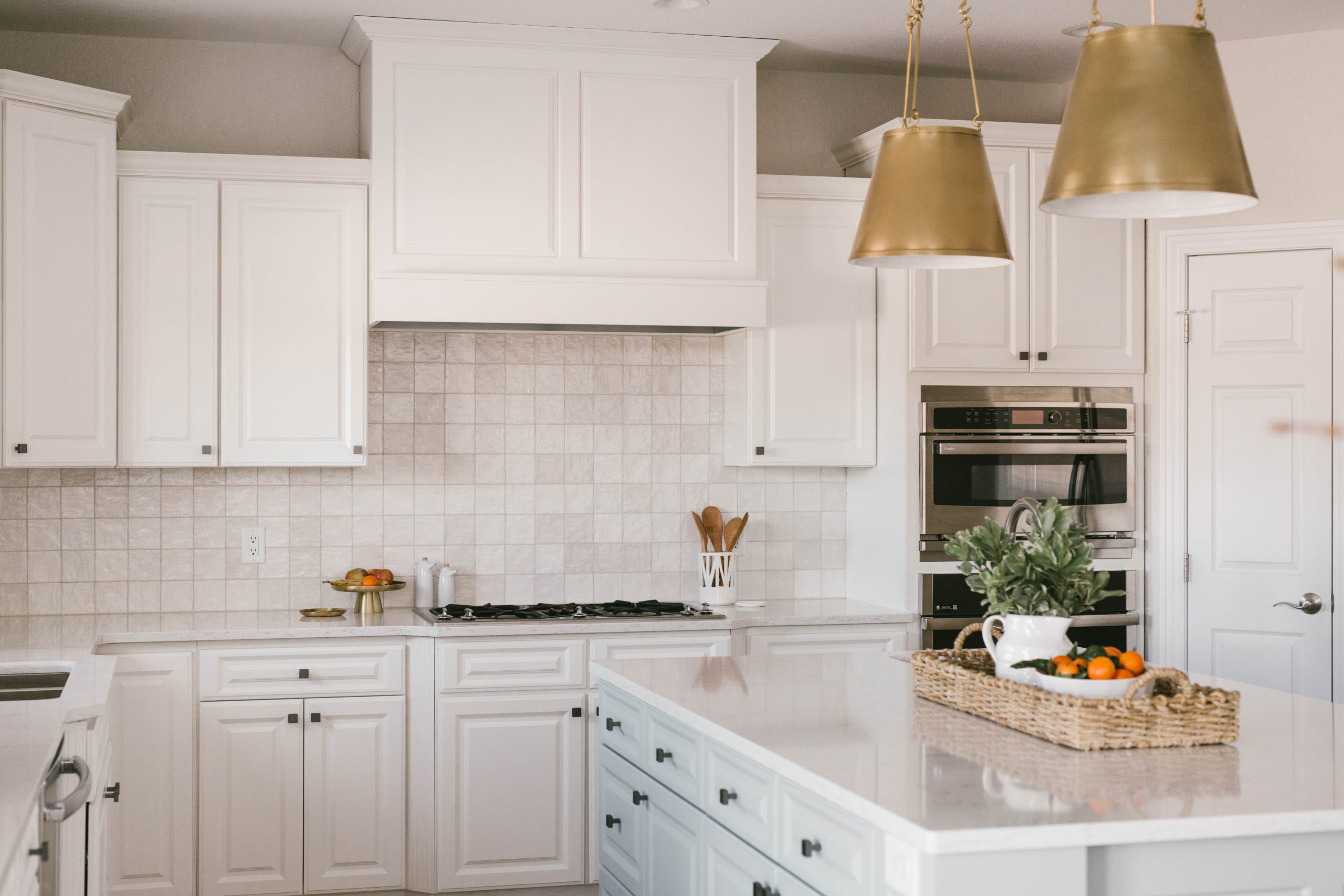
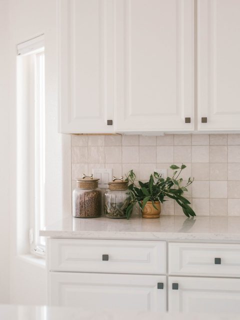
We lightly touched the perimeter cabinets by installing new hardware and painting the cabinet trim to match (you can see before where it was a contrasting dark color). Removing the appliance barn in the corner really opened up the look of the perimeter counter space, and swapping out the stainless vent hood for a custom hood to match the cabinetry went miles for making this kitchen feel elegant. Then we gave the brand new prep island a light aqua color that pulls this space from sterile-white-kitchen-land into fun-and-carefree-resort-land.
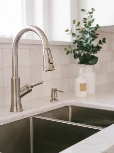
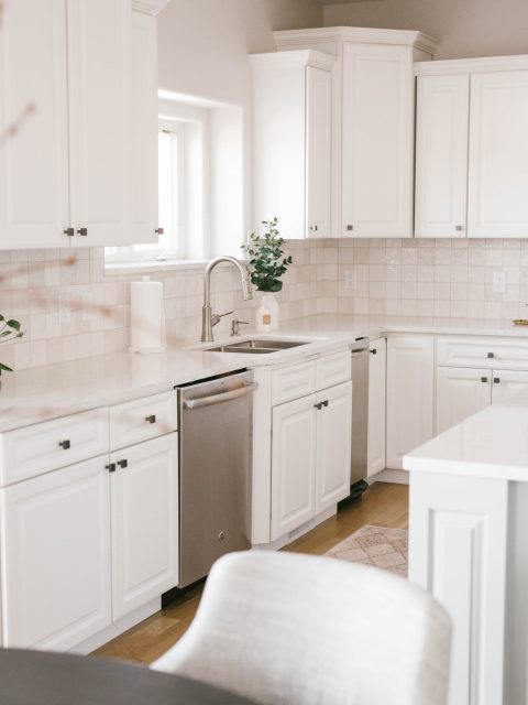
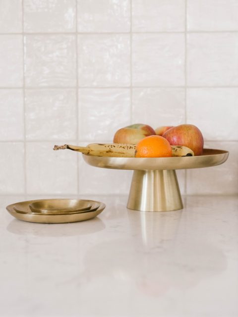
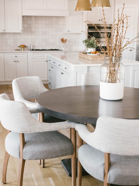
The remaining finishes are the last few pieces of the puzzle to give this whole room a serious wow. We chose beautiful light quartz countertops with subtle veining and a handmade square ceramic tile to layer on more warmth and add depth with variation in tone and shape. The cabinet hardware and plumbing hardware are mixed bronze and nickel, which allows the two bold brass pendants over the island to stand out and pull the warm glow out of the wood flooring.
The overpowering feeling of this kitchen is now bright and warm, and all the finishes melded together to create a peaceful space to cook and gather in.
BEFORE
AFTER
BEFORE
AFTER
BEFORE
AFTER
BEFORE
AFTER
BEFORE
AFTER
BEFORE
AFTER
The Powder Room
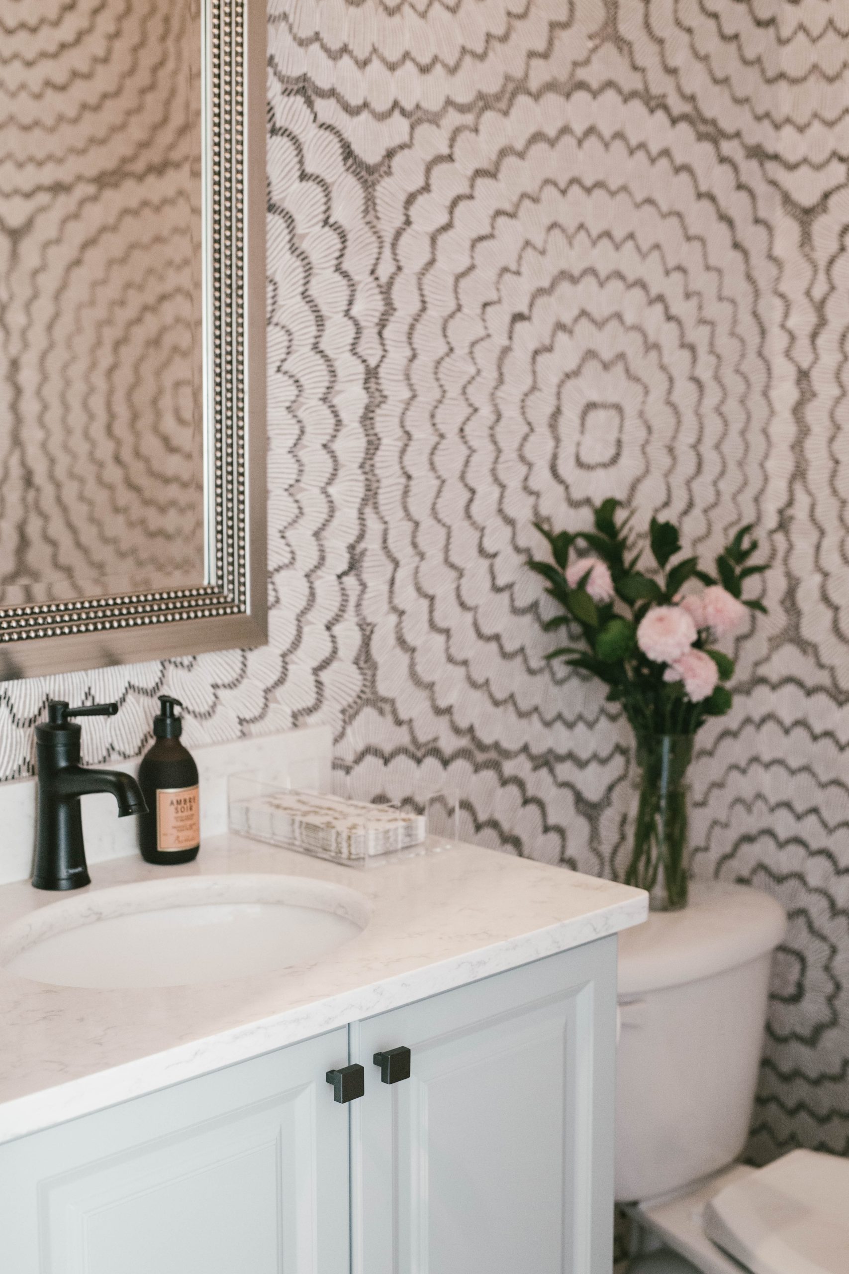
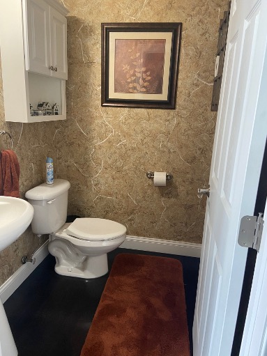
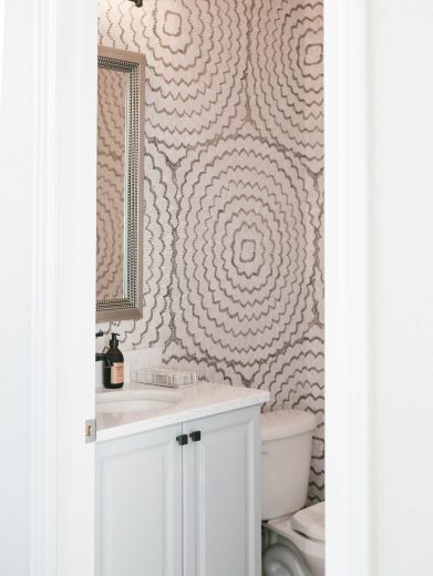
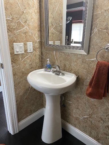
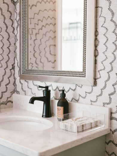
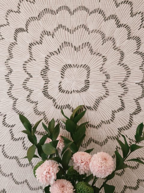
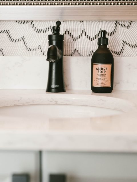
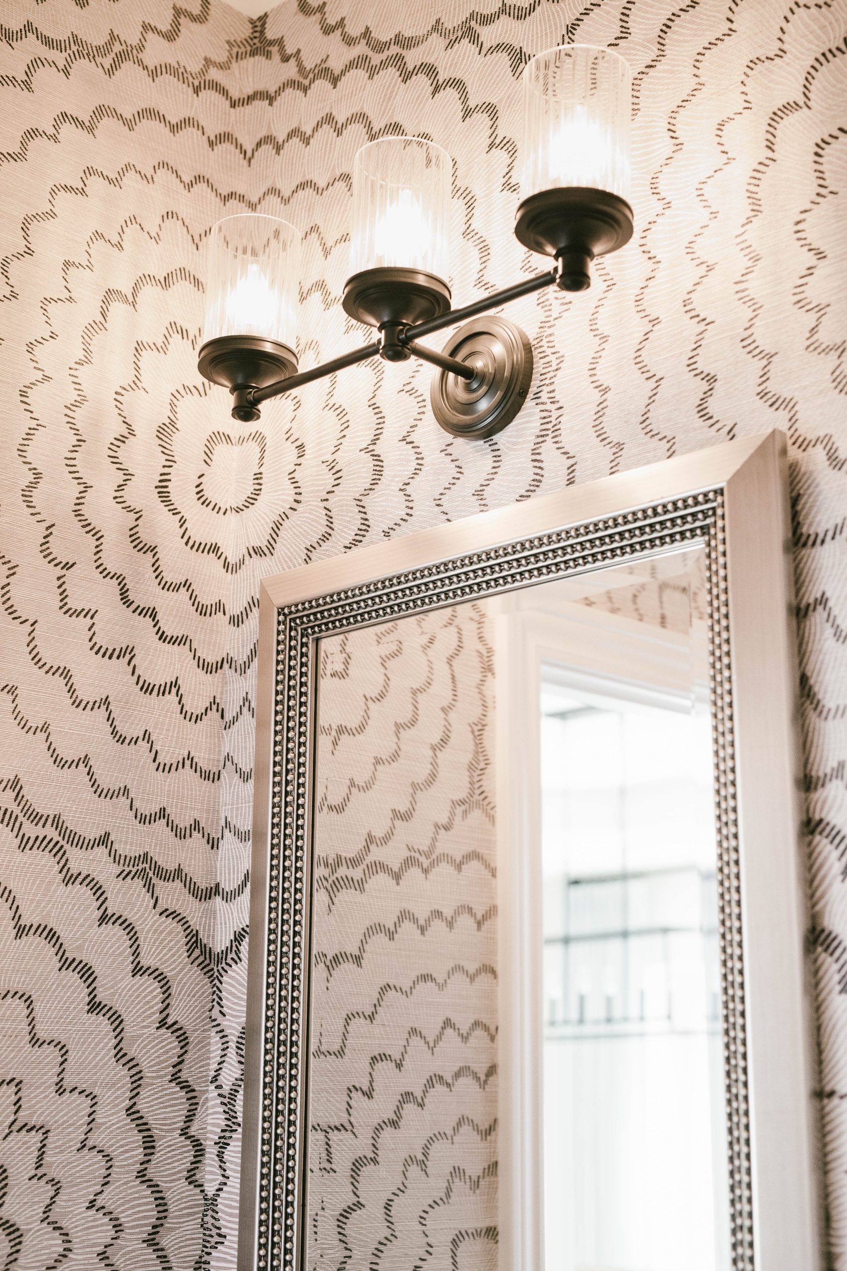
We love to do fun stuff in a powder room, and this room was no exception! We opted to make a big impression with a large-scale floral wallpaper that has a bold pattern but holds back with a muted color tone. While that served as the inspiration, we rounded the space out with mixed finishes of nickel and oil-rubbed bronze, which kept things from looking matchy in a small space. We repeated the paint color from the island in here to draw together the adjacent spaces. Our client needed a little storage in here, so instead of keeping the overhead cabinet above the toilet, we opted for creating storage using a vanity instead of the existing pedestal sink. We feel the space has the effect of a surprise, but mostly a calm and welcoming one.
BEFORE
AFTER
BEFORE
AFTER
While we love a fresh start and the chance to select every finish in a space, often we work with a few fixed elements and create a palette that will either honor and showcase these things or revive and redefine them. The footprint of this renovation was only slightly changed, but the house made a radical shift in identity. Instead of being a simple, dark, suburban lady, she’s a fun, lighthearted gal now, and we love her.
Can’t wait to work on yours next!