Project Reveal: Diamond Ridge Home Office
Its a treat when a past client reaches out to do another space, so when our Diamond Ridge client wanted to amp up her home office, we didn’t hesitate to say yes! One thing we love about repeat clients is that some of the sourcing and design process goes more quickly as we have an understanding of what the client likes and know their space well already. It’s a fun process of continuing to bring the client’s personality to life while stitching together many spaces under one style banner. Go see the client’s other rooms here to get the big picture of how this room fits into their beautiful home and classic + glam style.
The Home Office
Just off of the entry and across from their stunning dining room, this home office was feeling a little dark and dated for the client. Knowing their love of classic lines and glam accents, we pulled together a plan to repeat some elements from other spaces but work them into a calm, cozy atmosphere.
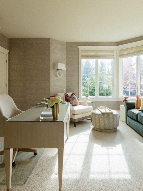
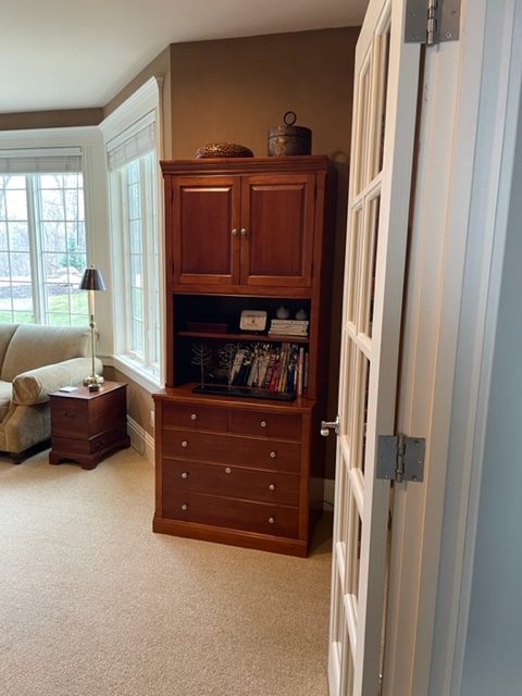
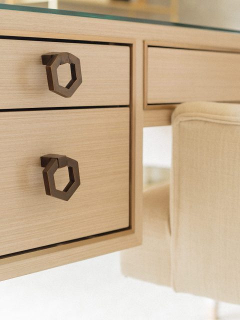
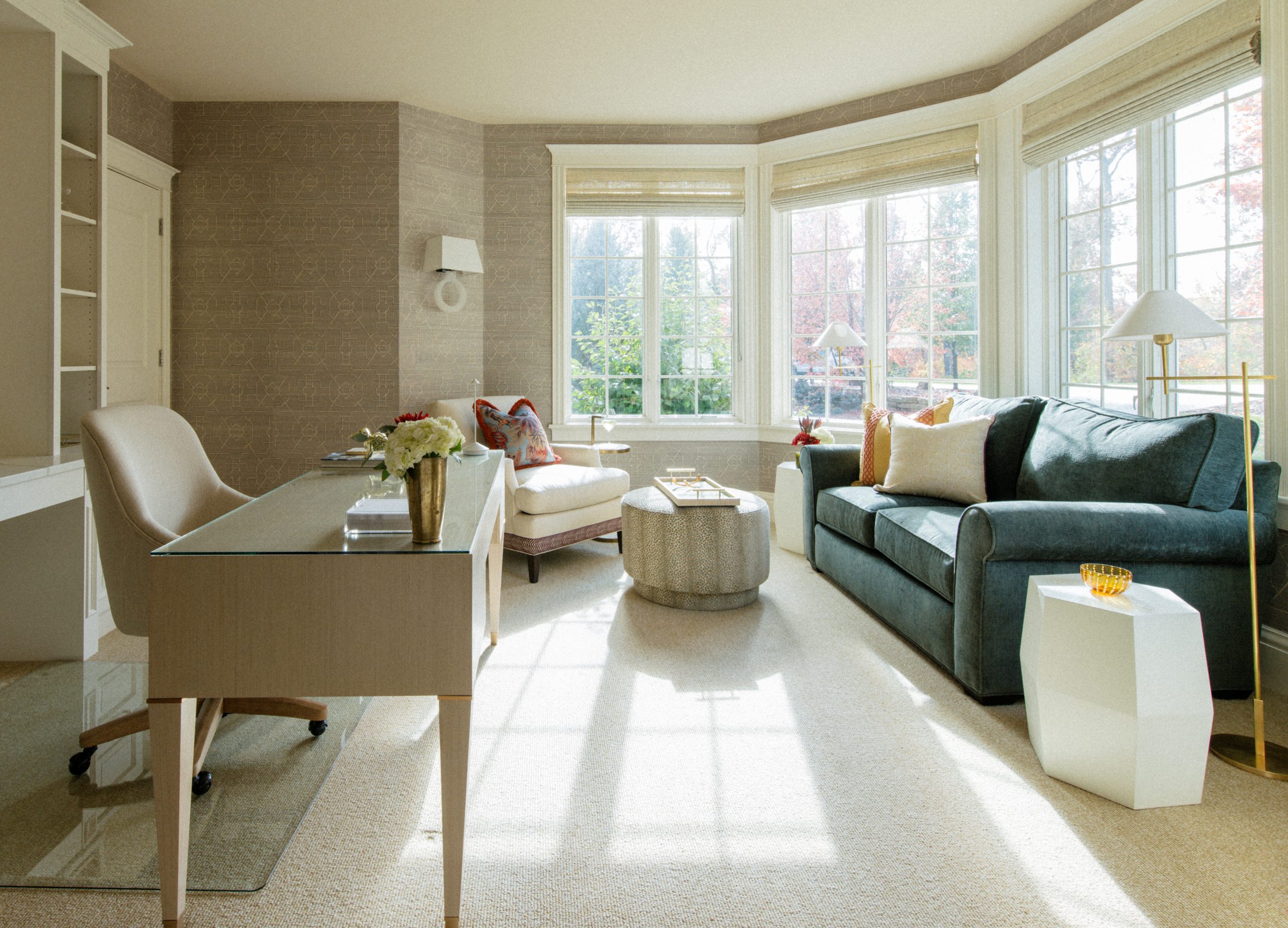
We started by reorienting the desk to give the client a stunning view out the window, and it was also a good way to reduce glare on the screen at the same time. The built-ins were custom made to suit their needs and tie in other previous custom details in their house, with room left in the middle for the client’s art piece (not shown). We selected a stunning free standing desk to preside out in front with the most delicate brass accents. The desk chair functions well by rolling across a piece of acrylic in this fully carpeted room, but a big goal was to keep it focused on coziness.
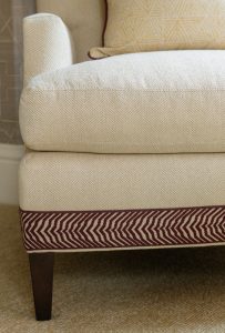
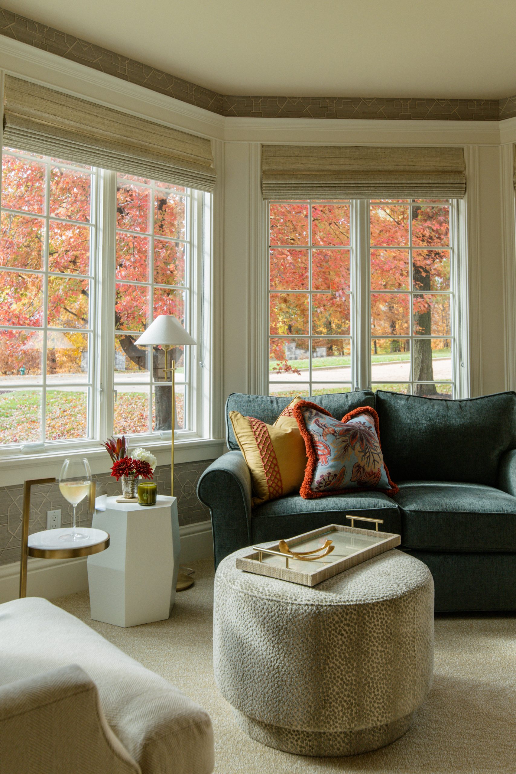
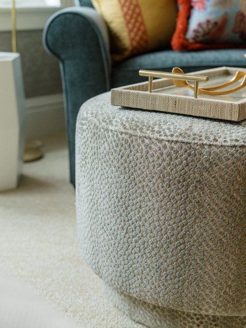
We pulled together lounge pieces to keep a comfy seating area in the window corner that reads classic, but felt more eclectic with colorful upholsteries and trims. Coziness was important, but touches of brass, marble, and linen-textured furniture take the details to a very elevated place.
As you can see in the dining room, they love a greek key pattern, and floral patterns are few and far between in their home. So we found a tonal paperweave wallcovering that felt in line with a greek key to make the areas feel similar but not the same. It also served to create some classic lines in the room in a soft white, really accentuating the incredible existing base, window, and door trim. The creamy trim paired with a light woven roman shade make the windows a feature of the room. We love a window treatment that not only helps with light and privacy, but takes a beautiful architectural element and softens it with fabric.
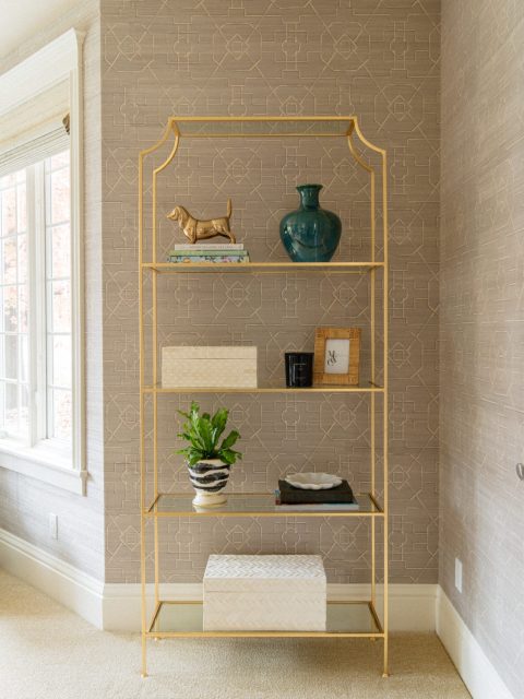
A delicate etagere brought the element of glam to the room, and gave the client a place to display some favorite items stylishly. It may look like a simple piece, but its lines reflect the pattern of the wallcovering, making a (unnoticed, but very powerful) cohesion.
The lighting in the room is layered for flexibility for the client at different times of day and for varied uses. Cans allow bright lighting to illuminate all important surfaces. Sconces add visual accent to the walls but also give intentional soft lighting to the soft seating area. Floor lamps surround the sofa to give off light where its needed for reading or lounging, but also help define this grouping of furniture.
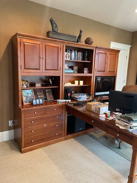
BEFORE
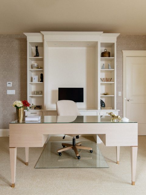
AFTER
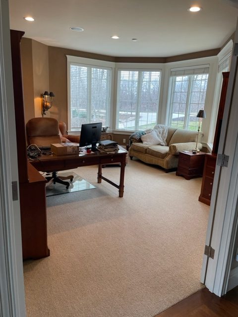
BEFORE
AFTER
BEFORE
AFTER
We loved the chance to bring some new life and functionality to our client’s front rooms, and we couldn’t be happier with how they turned out. Its fun to see that even a handful of years later, the spaces feel relevant and classic!
We’ll leave you with a trim detail of the lounge chair, because we truly believe Charles Eames when he said, “The details are not the details. They make the design.”

