Project Reveal: Country Club Parkway Residence
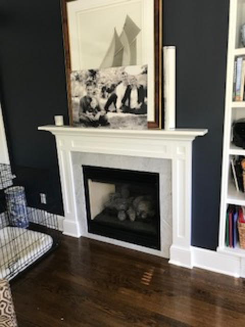
We are reaching into the archives today for a project reveal from a beloved project we finished a few years back! It was a simple, small renovation but it certainly packs a punch. Our Country Club Parkway Residence project was a renovation of the Living Room and attached Den. We took a stately house with good bones- great trim, windows, doors, wood floors, and fireplace surround- and updated it, layering in detail and a cohesive palette while enhancing the character. It was a refined, comfortable redesign that makes it difficult to determine the era it was designed in. Trends are always fun to dabble in, but when you are working with a stately home, character, continuity, and classic elements are always important factors.
The Living Room
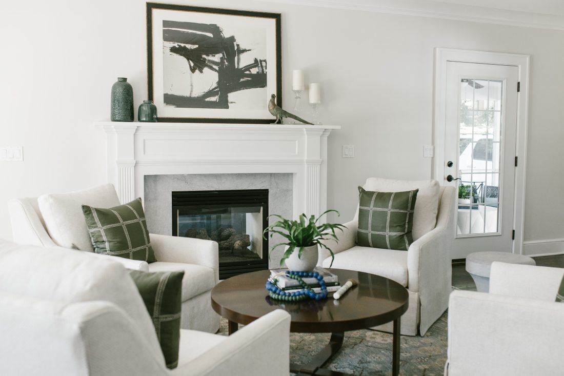
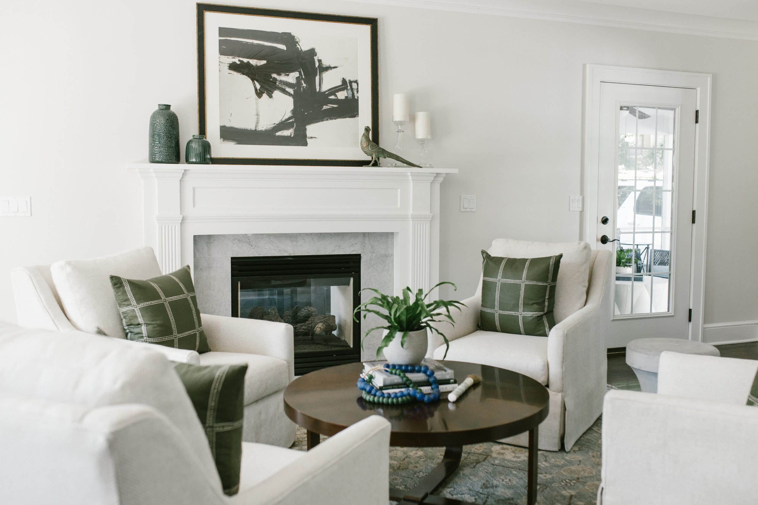
This room serves as a bonus living room to their more casual family room, and as such we designed the layout to serve a different function, a more face-to-face conversational and game area centered around the working fireplace. The biggest challenge was finding a functional furniture layout as the room is long and narrow, not accommodating a standard size sofa.
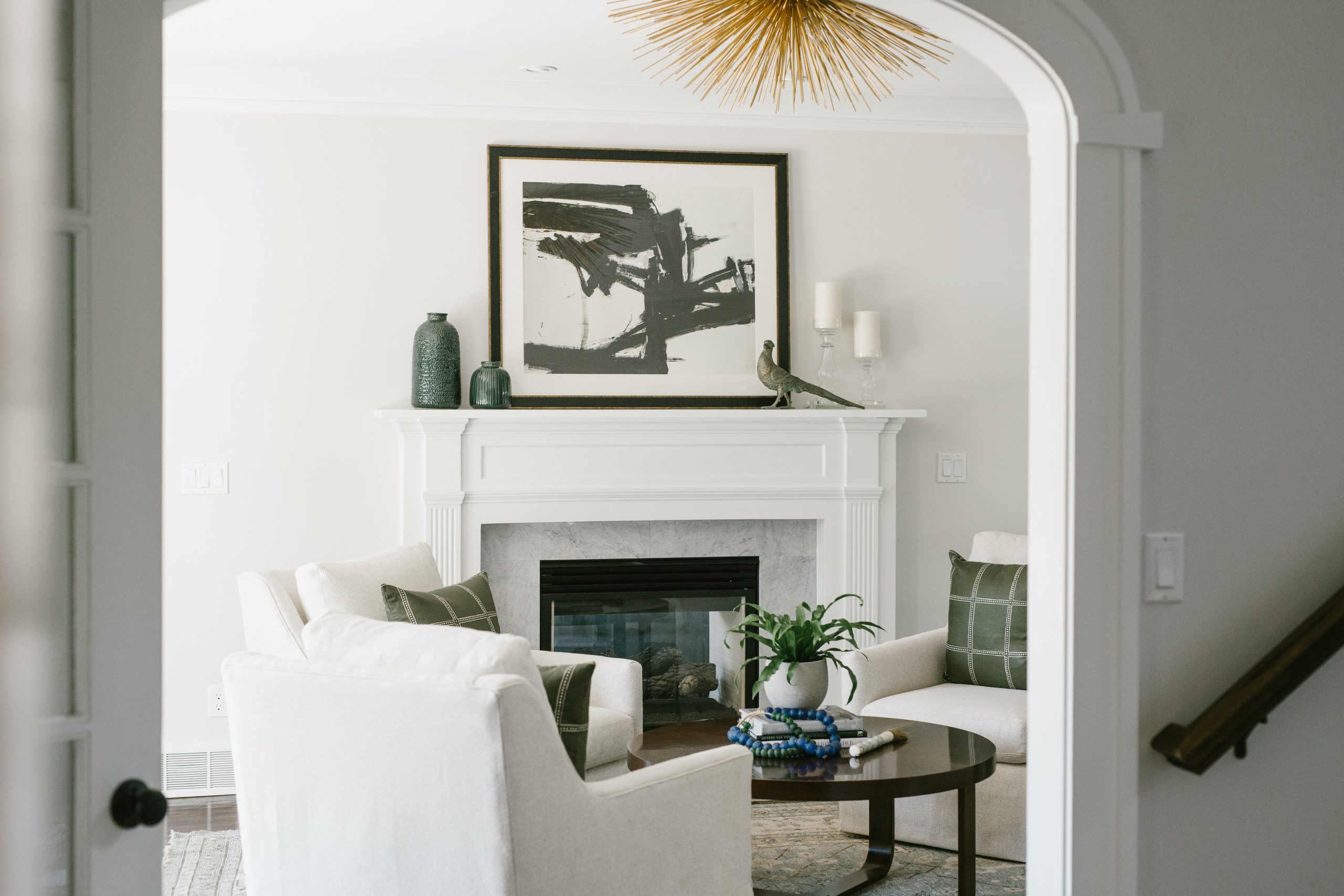
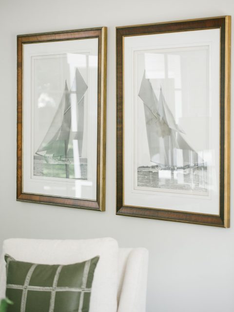
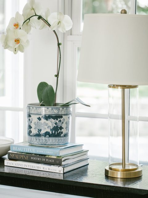
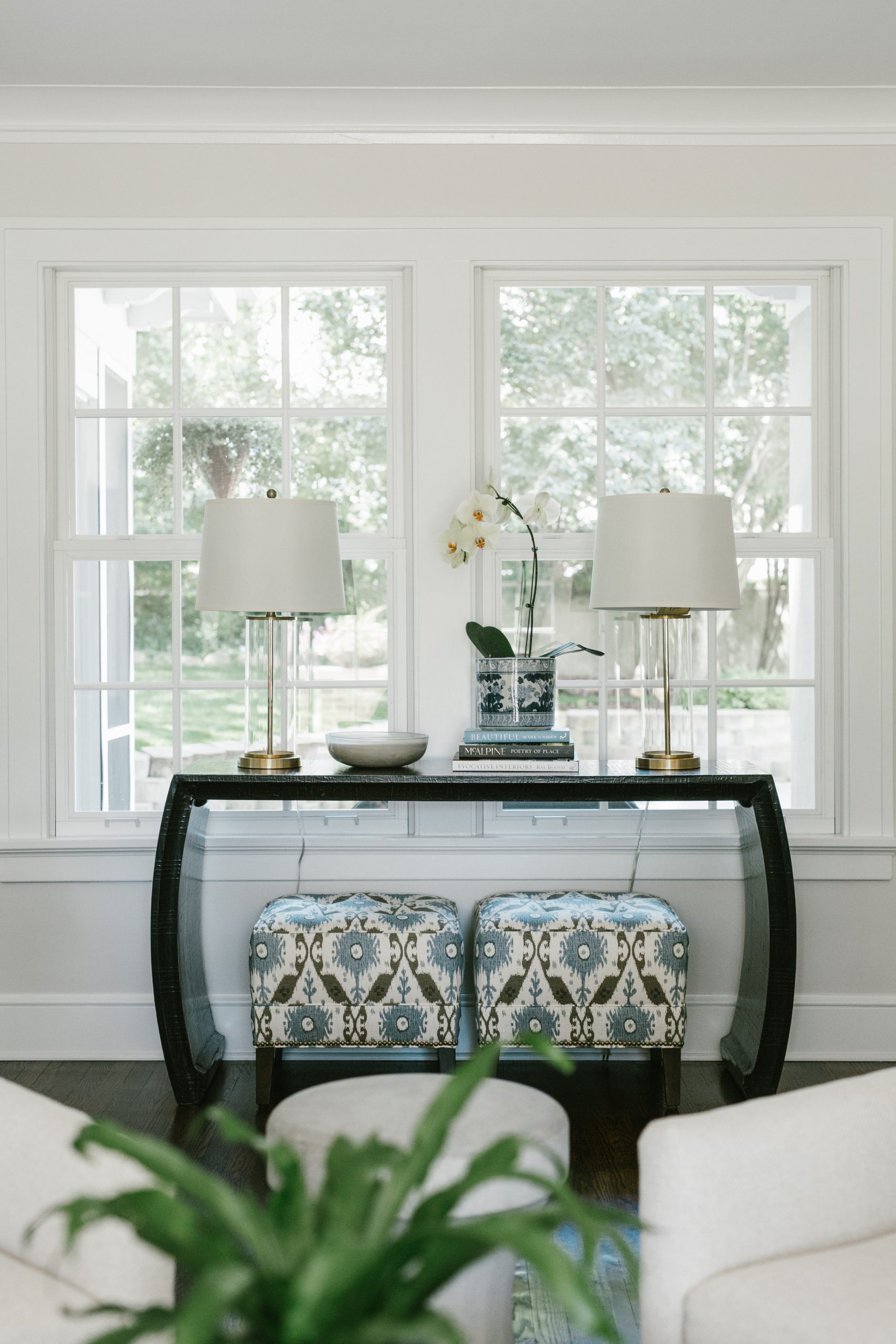
We landed on a layout with 4 swivel chairs around a coffee table, centered on the fireplace. This grounded the fireplace as a focal point, which allowed us to keep the rest of the long room for circulation. As a room with 4 entrances, there were a lot of pathways to keep clear and easy. We filled out the room with some decorative touches to make sure the rest of the space still felt intentional– a floor length mirror in one corner, a console with ottomans tucked under for extra seating in front of a window, and art placed along narrower passageways. The lines of the fireplace tied in with the detail of the door trim, crown molding, and base trim, and and keeping it as is kept this room relevant to the character of the house.
The palette was refreshed into bright whites with touches of blues and greens after lots of years living as a beige baby. The blue-green rug holds the layout and the color palette together (as a good rug always should!) and serves as the foundation for the main elements. Skirted linen swivel chairs are set on angle to surround the circular coffee table, which allows for the most flexibility and movement of the chairs. The dark woods used blend seamlessly with the wood floors, and create a kind of “it was always there” feel to the space. A couple moveable concrete side tables sit between chairs, and the crowning glory, a striking brass flushmount fixture, tops off the room.
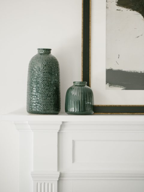
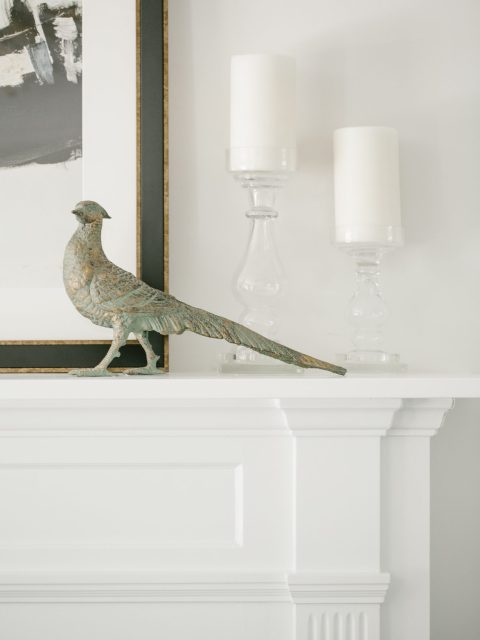
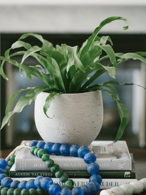
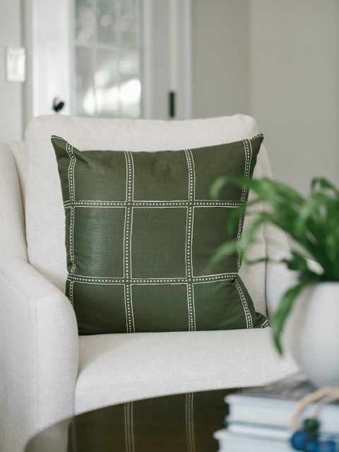
Simple styling in blues and greens rounds out the space to feel intentional but not cluttered, rendering the space crisp and comfortable. In the end, the space feels refined and purposeful without feeling like an unrelated guest to the rest of the house.
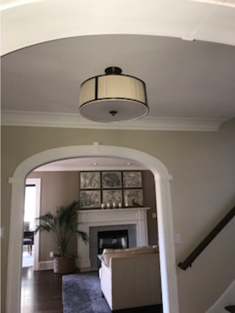
BEFORE
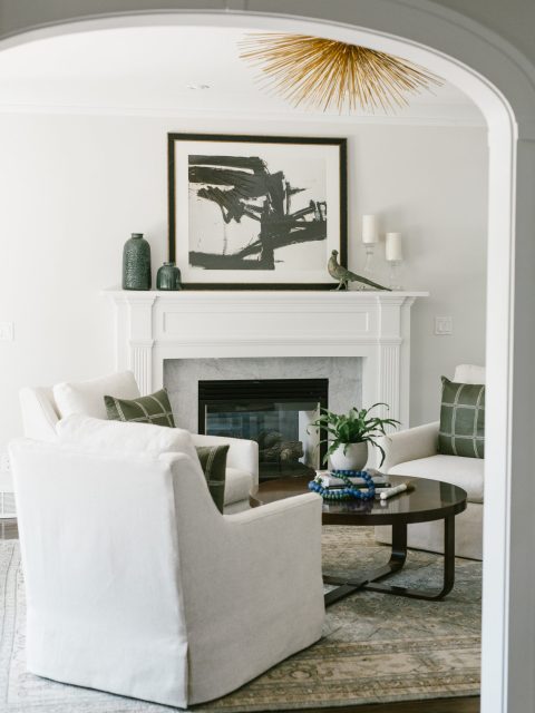
AFTER
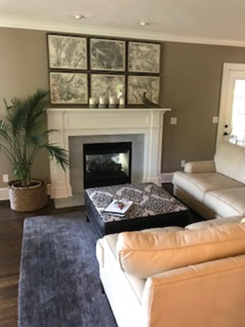
BEFORE
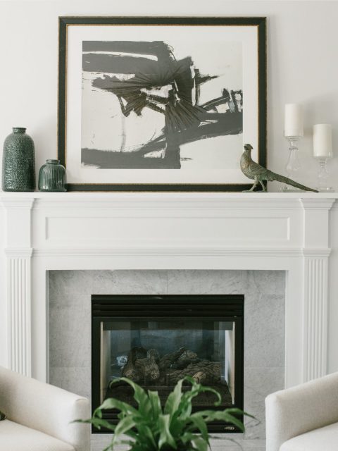
AFTER
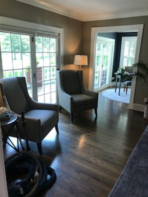
BEFORE
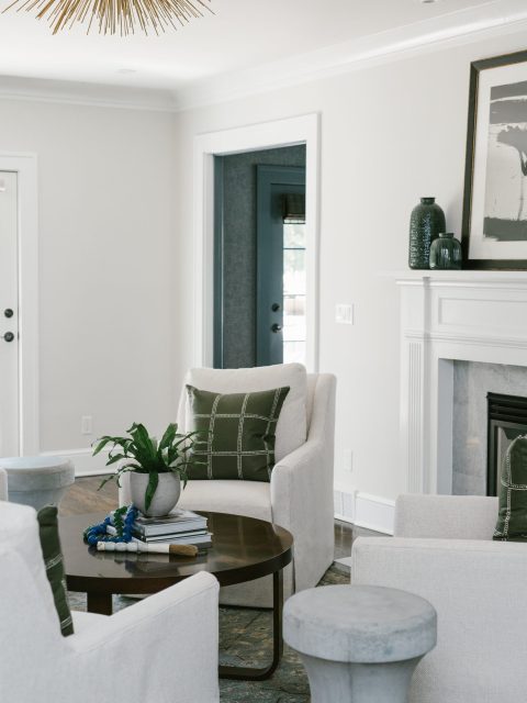
AFTER
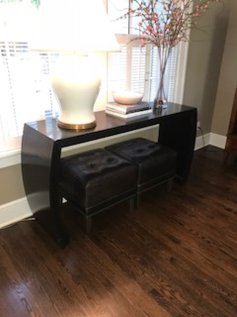
BEFORE
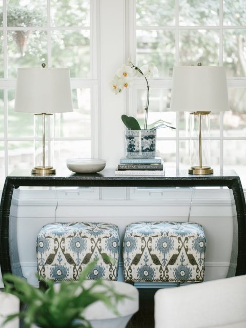
AFTER
The Den
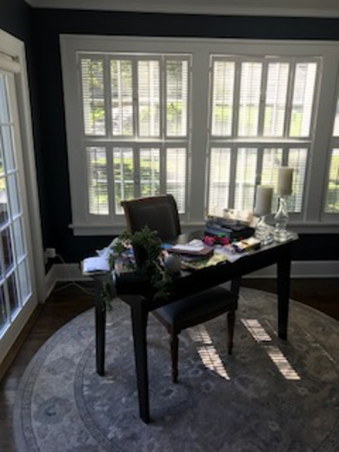
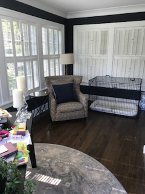
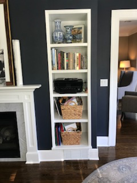
While this room is also narrow, it was a little bonus room the client envisioned as a bit of a man cave. What we love about how it turned out, though, is that it doesn’t lean too heavily into man cave tropes, and so feels integrated with the rest of the house.
It was intended to be a place where a very tall gentleman could sneak away to watch a game, and thus needed a long sofa and a comfy chair. But would you know any of that if if you saw it? No, it says “classy gentleman” much louder than it says “comfy TV room”, although it absolutely is.
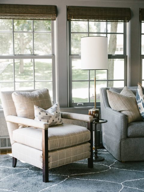
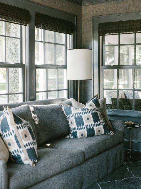
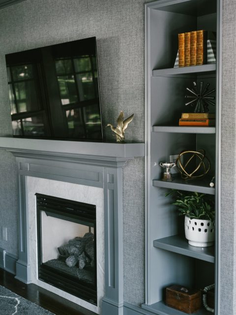
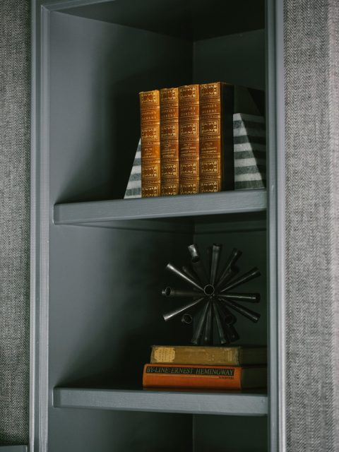
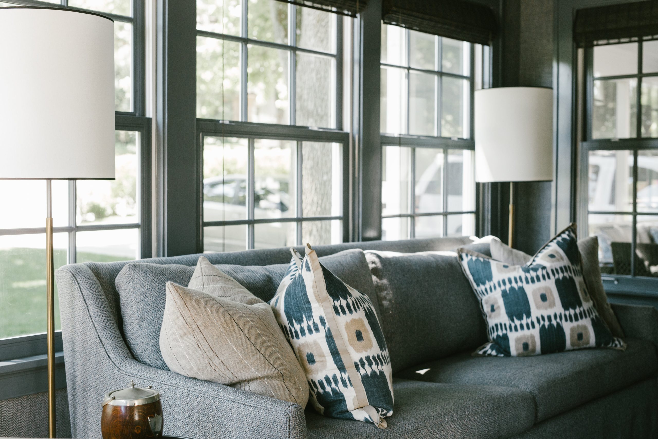
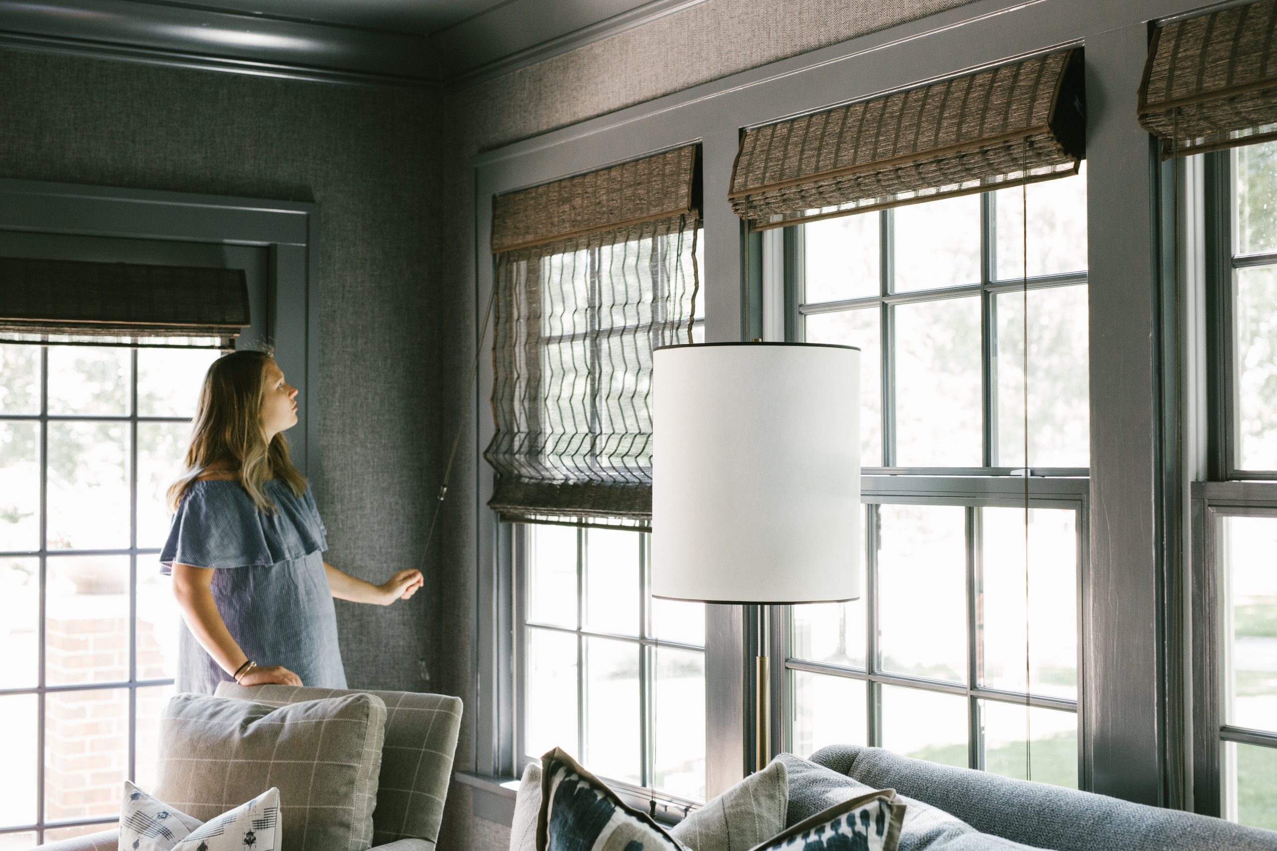
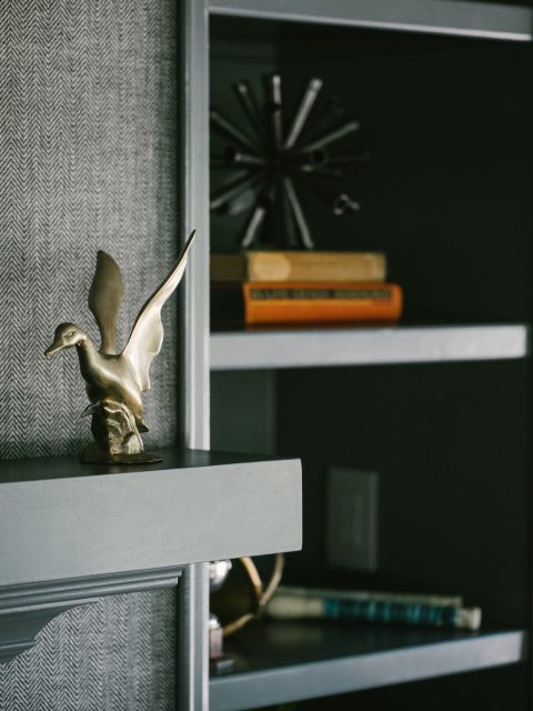
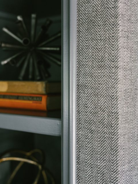
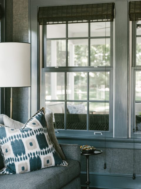
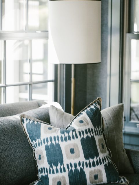
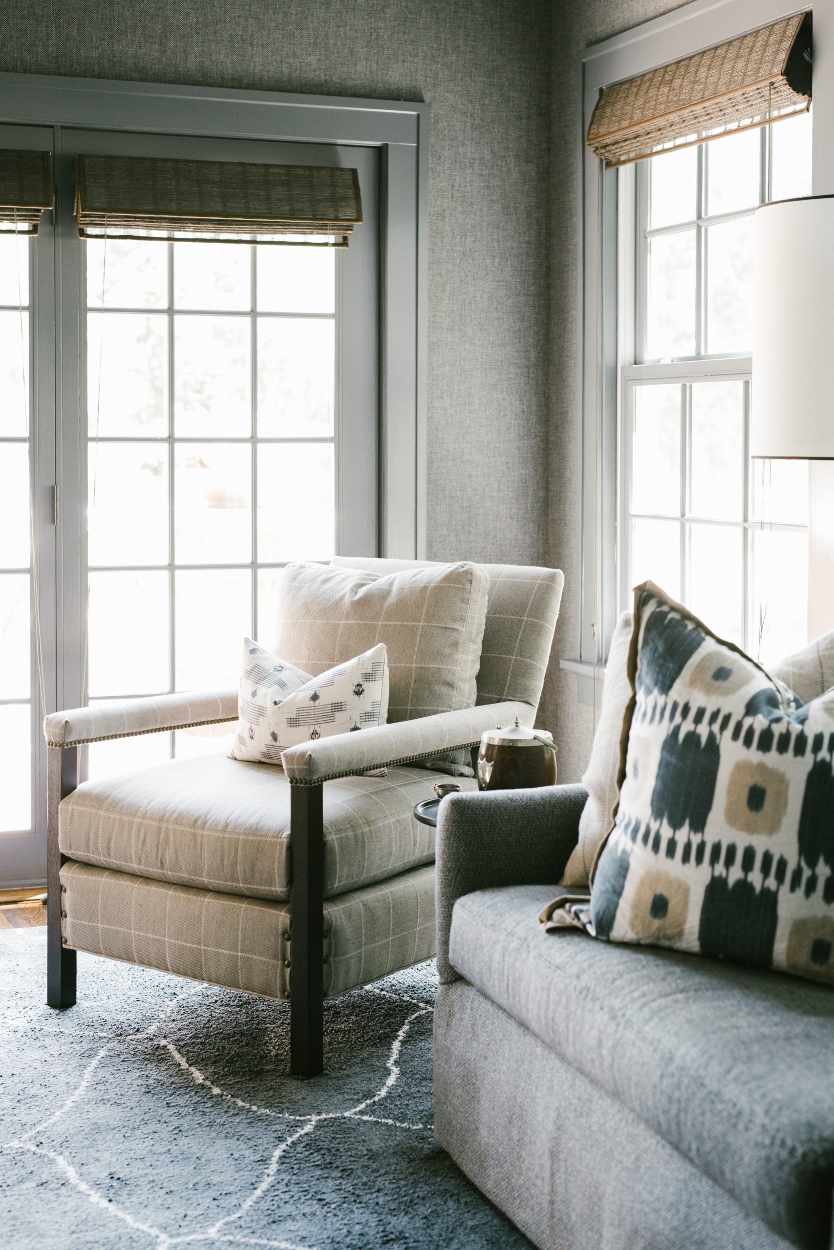
To keep it masculine feeling, we added a dark grey herringbone wallpaper with a tone-on-tone palette, keeping it moody but pared back. The trim was all painted in similar cool grey, which totally packs a punch, and the custom sized rug and sofa were all selected in a coordinating grey tonal range. After that, some natural colors and textures were layered in to the palette via the woven shades and pillows. We added touches of blue in the pillows to pull out the cool undertones of the space and layer in a bit more interest with some eye-catching patterns.
Overall the effect is calm and classy, which suits the house and the client just right.
BEFORE
AFTER
BEFORE
AFTER
BEFORE
AFTER
BEFORE
AFTER


We loved the chance to bring some new life and functionality to our client’s front rooms, and we couldn’t be happier with how they turned out. Its fun to see that even a handful of years later, the spaces feel relevant and classic!
Even if you have a stately home with lots of character, we love finding ways to turn up the volume, add some personal detail, and highlight the beauty of your old gal. Call us when you’re ready!

