Project Reveal: Cottage Grove Woods Residence
You know you have a great client when they buy a house with great bones, but know it can be more and call you in to help make it theirs. We had such a fun time taking a great home and infusing it with this family’s style, values, and needs. What was once a solid house slumped in a dated style, is now a stunner that thrives as a transitional family home.
In our first round of work on the Cottage Grove Woods residence, we tackled a big chunk of the main floor. We chose all over paint colors, flooring, lighting, stair details, and did some big work reimagining the dining room, living room, kitchen & eat-in area, powder room, and mudroom/dirty kitchen.
Let’s jump in and see all the smart details that make this home a workhorse and a looker at the same time.
The Entry
We’ll start at the front entry, where you get the first taste of what kind of home you are walking into. The significant Greek Revival trim work throughout the home starts en force here, so we kept it formal and catered mostly to guests as the family doesn’t use this entrance themselves.
We chose a creamy white as the all-over paint color that flows through the open main spaces to tie them together. The client had some beautiful stone tile they wanted to lay in the entry, so we selected some mid-tone wood flooring that would complement the natural stone and lead into the rest of the main floor.
But the focal point is definitely the circular chandelier with a floral motif that acts as a crown to the open space. It also draws your eye up to that colossal ceiling height, and wow, what an entrance!
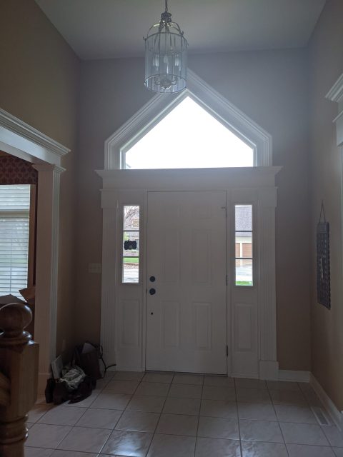
BEFORE
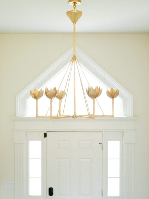
AFTER
The Living Room
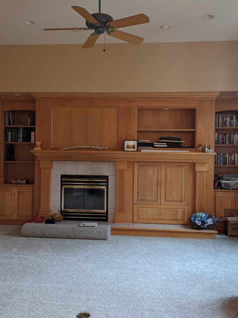
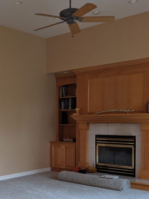
The entry flows into the main living area, where our client was at a loss of how to use the space well for all the family and friends they host regularly. The space held a large built-in honey oak wall with a fireplace off-center and a huge soffit. The client liked the idea of the feature, although it had some unredeemable qualities for their lifestyle (Note: off-center fireplace with a huge openable cabinet to store a massive tv). Since they have a space downstairs that they can watch tv as a family, that was a feature they wanted to remove from the upstairs living, and who can blame them with results like this?
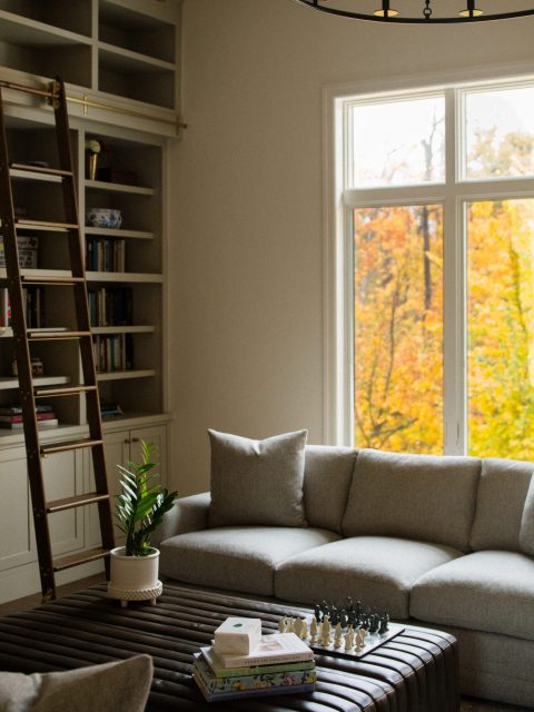
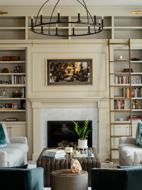
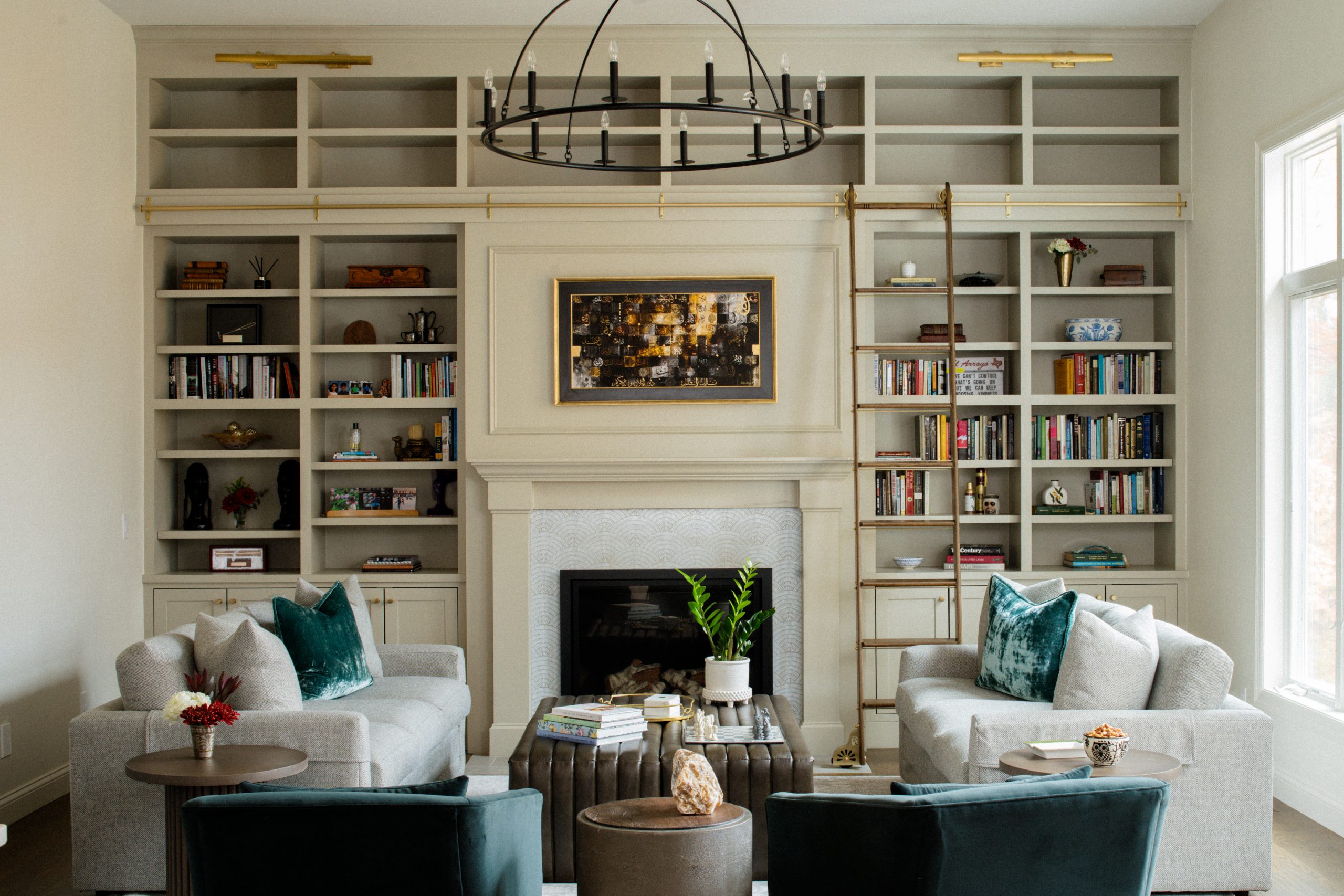
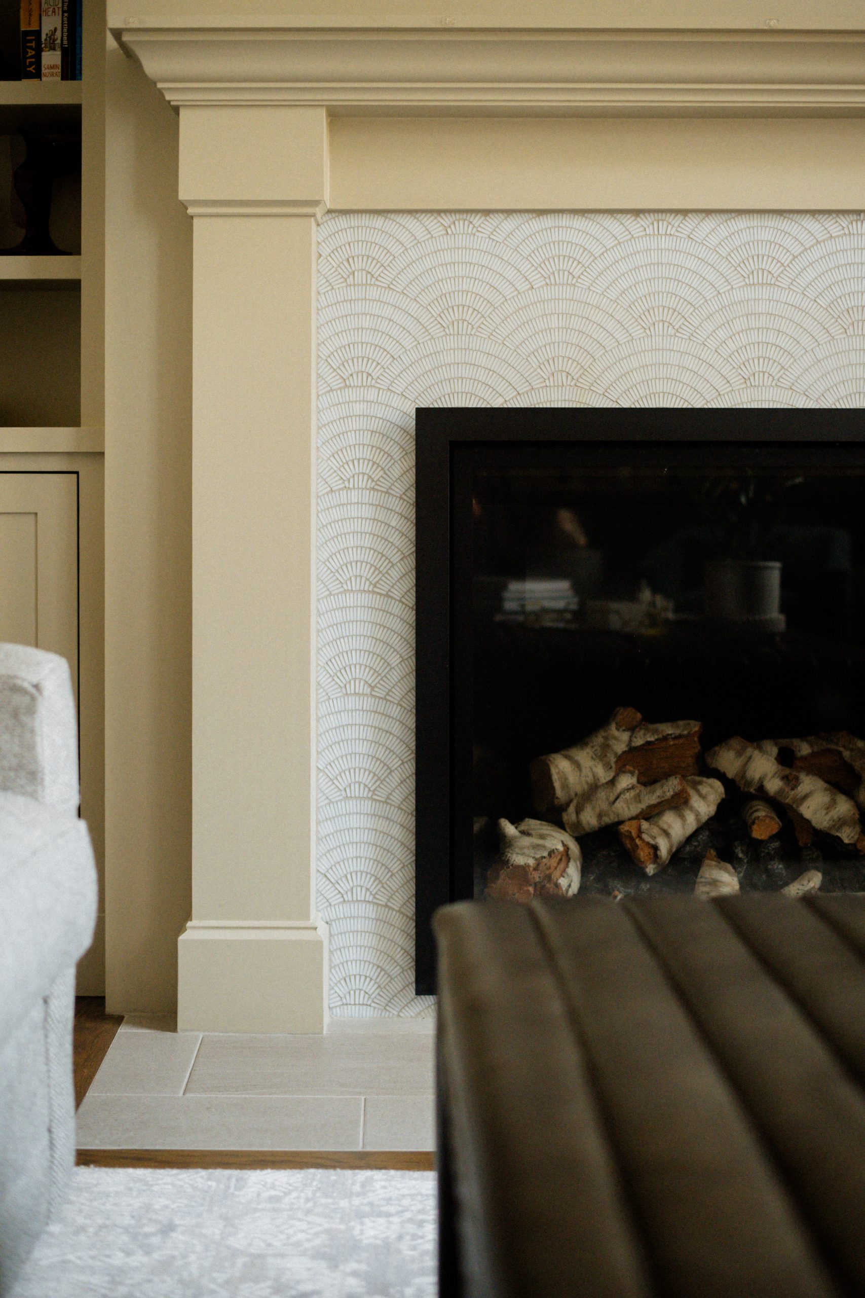
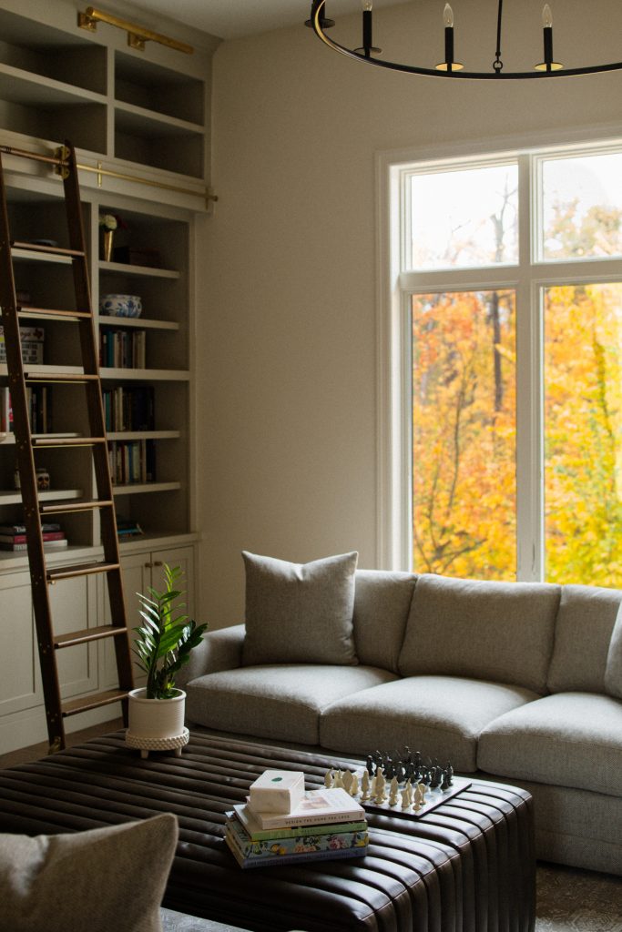
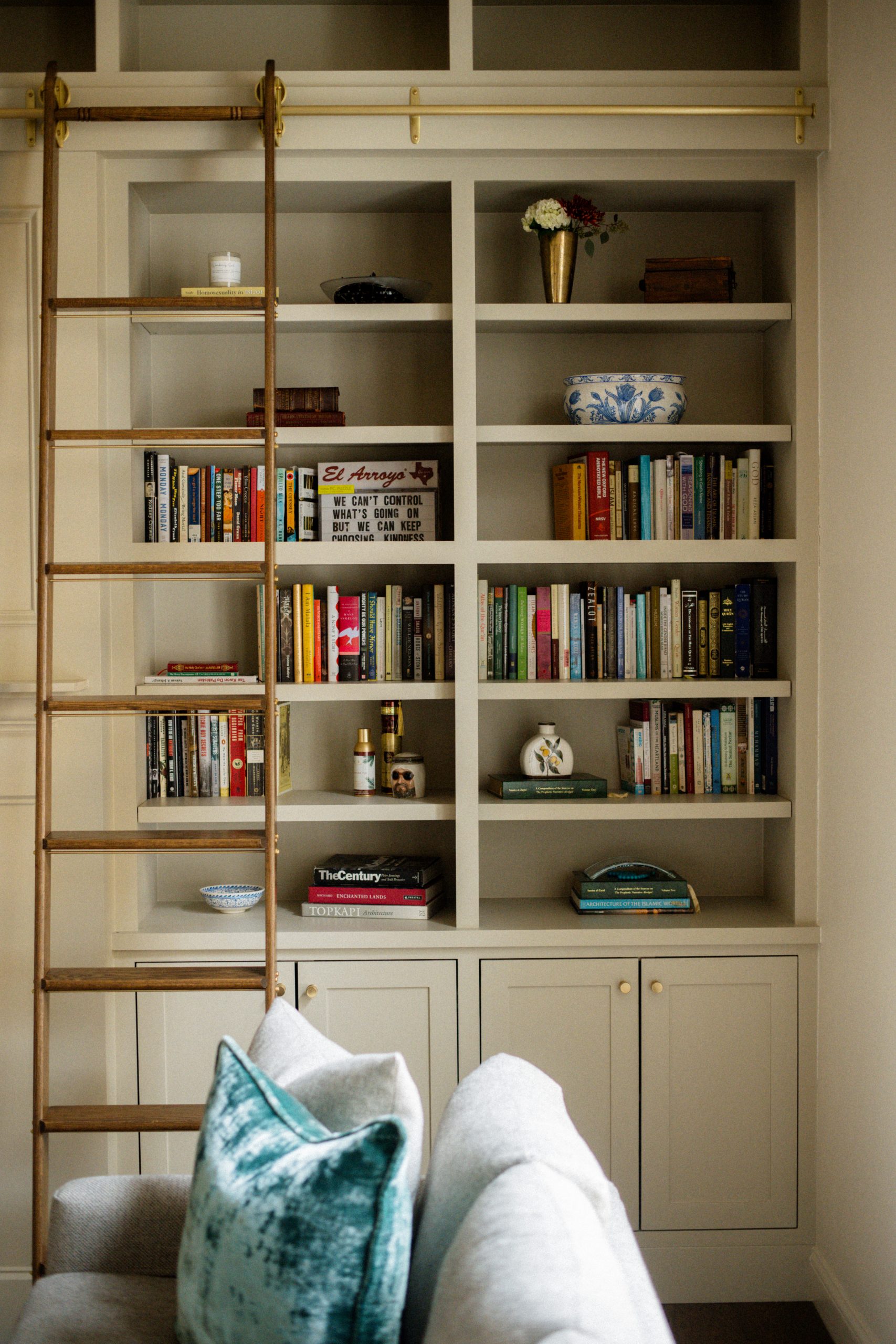
We reimagined their fireplace wall with built-ins up to the ceiling and an old-school library ladder to access them. A centered and updated fireplace with a stunning mosaic tile surround created an opportunity for art above the fireplace to be the focal point. All in keeping with the home’s original trim and the functionality the client wanted. We kept it tonal with the color, doing a taupe paint for a warm wash in the room. It gives just the slightest contrast to the creamy walls.
The goal of the rest of the space was to keep it simple and comfortable, with a touch of refinement and plenty of seating. We selected some large and imposing custom sofas in a performance grey upholstery, while accenting with some deep teal velvet swivel chairs.
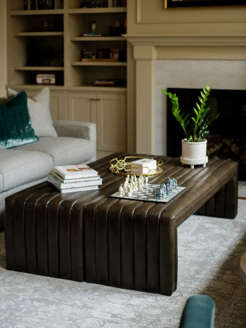
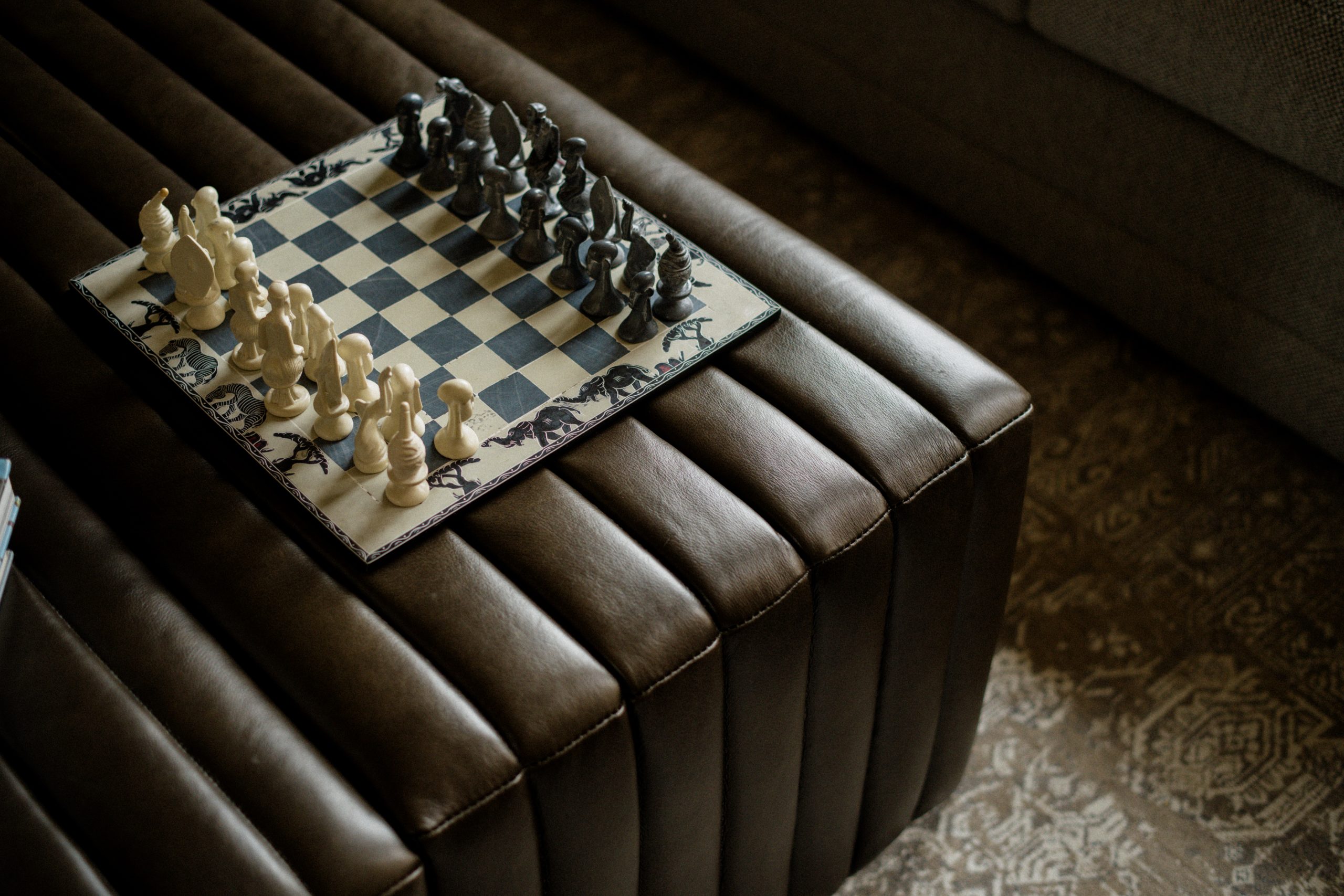
A key component of making this space work was thinking about safety and upkeep with small children. We selected only tables with rounded corners and wipeable surfaces, leaning into some dark wood tones and linear motifs. In lieu of a coffee table, we placed two leather channel-tufted ottomans together to be climbable, sitt-able, and of course, a surface for drinks and other accessories.
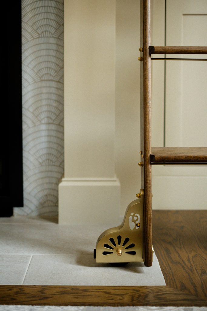
The details are not to be missed! The lighting and hardware provide a level of refinement and tie the living and the kitchen together. The round candelabra chandelier adds a delicate touch of contrast, while the brass hardware and picture lights add a note of elegance that isn’t too precious.
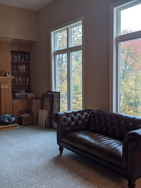
BEFORE
AFTER
BEFORE
AFTER
BEFORE
AFTER
The Kitchen & Eat-In
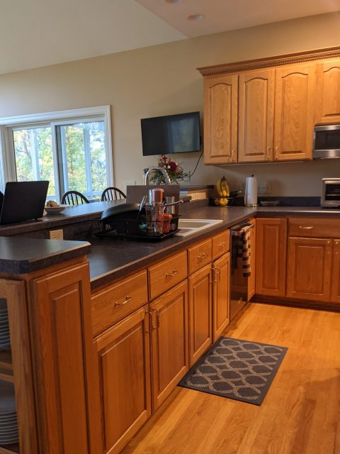
Now we turn around and head into the kitchen, the heart of this home. We started this project focusing on this space, as the clients love to gather their loved ones around good food. We decided the especially important functions for this space were making large amounts of food, seating a lot of people, having the best sight lines to the living room, and incorporating hidden areas for storing dirty dishes.
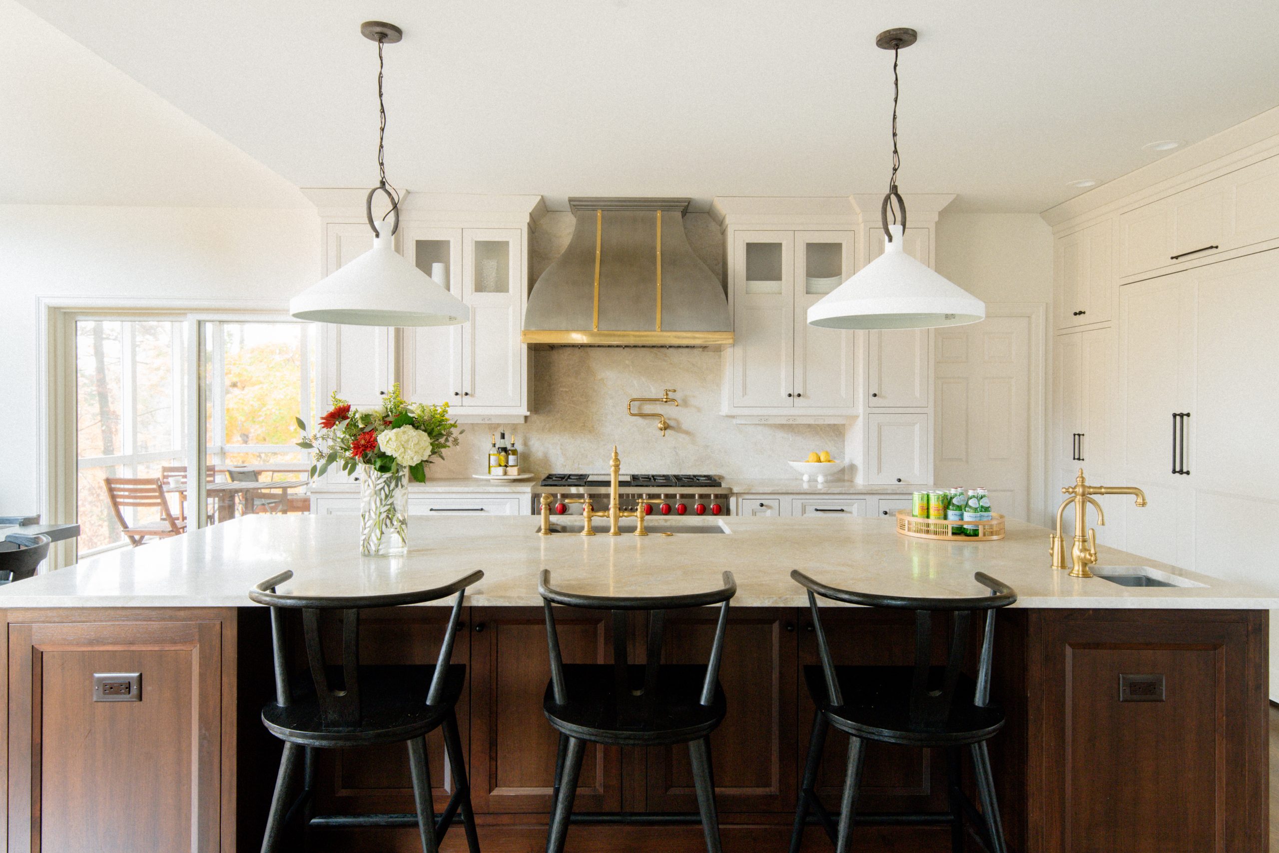
We considered some cabinet refacing and tweaking at first, but ultimately the layout of the existing kitchen wasn’t working. We worked with Cabinet Studio to reimagine the flow, the amenities, and tackle the important process of maximizing the footprint for their needs. We ended up with inset cabinets with a modified shaker profile, striking a solid transitional style –where the kitchen feels modern but has a classic touch that will age well.
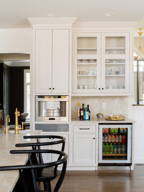
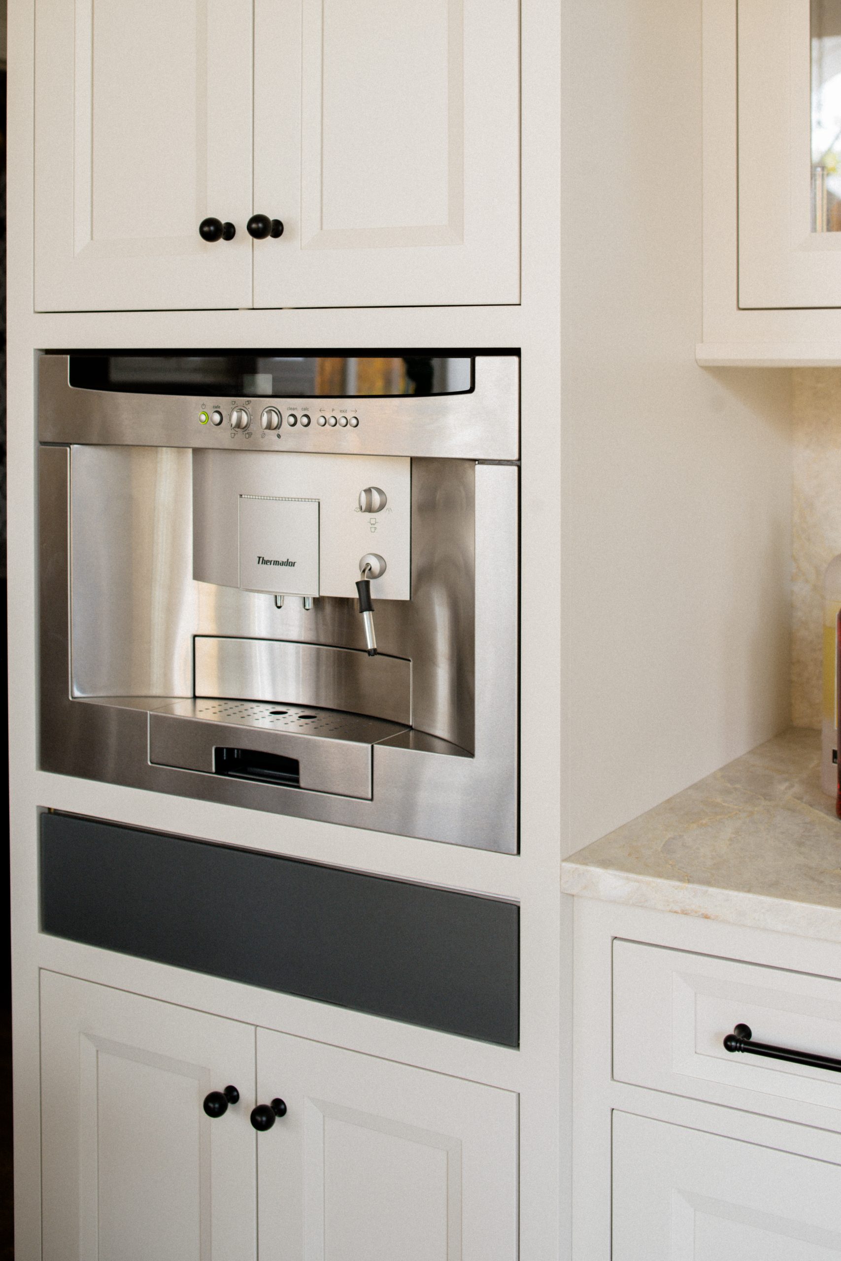
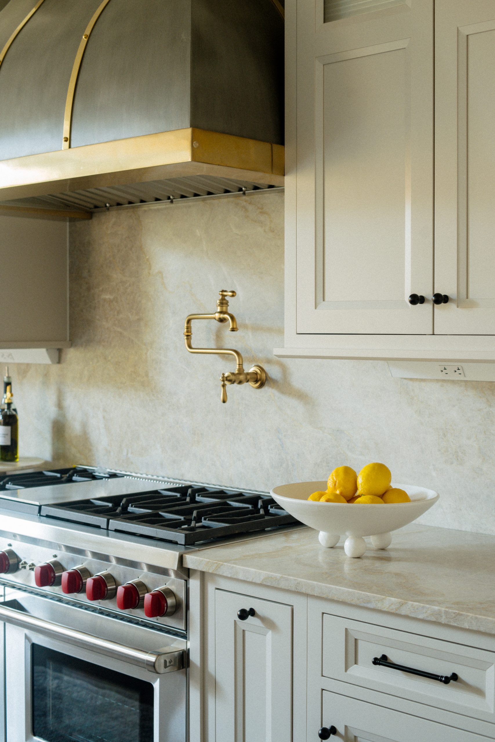
To accommodate their cooking load, they selected a top tier 48″ Wolf range, separate fridge and freezers that blend in seamlessly with the cabinetry, two dishwashers, a warming drawer, and of course a pot filler over the stove. We turned their unused desk area into a beverage center housing their glassware, a drink fridge, built-in espresso machine, and an ice maker. It all makes guests (and children) welcome to grab whatever drinks needed without getting into the flow of the cooking area.
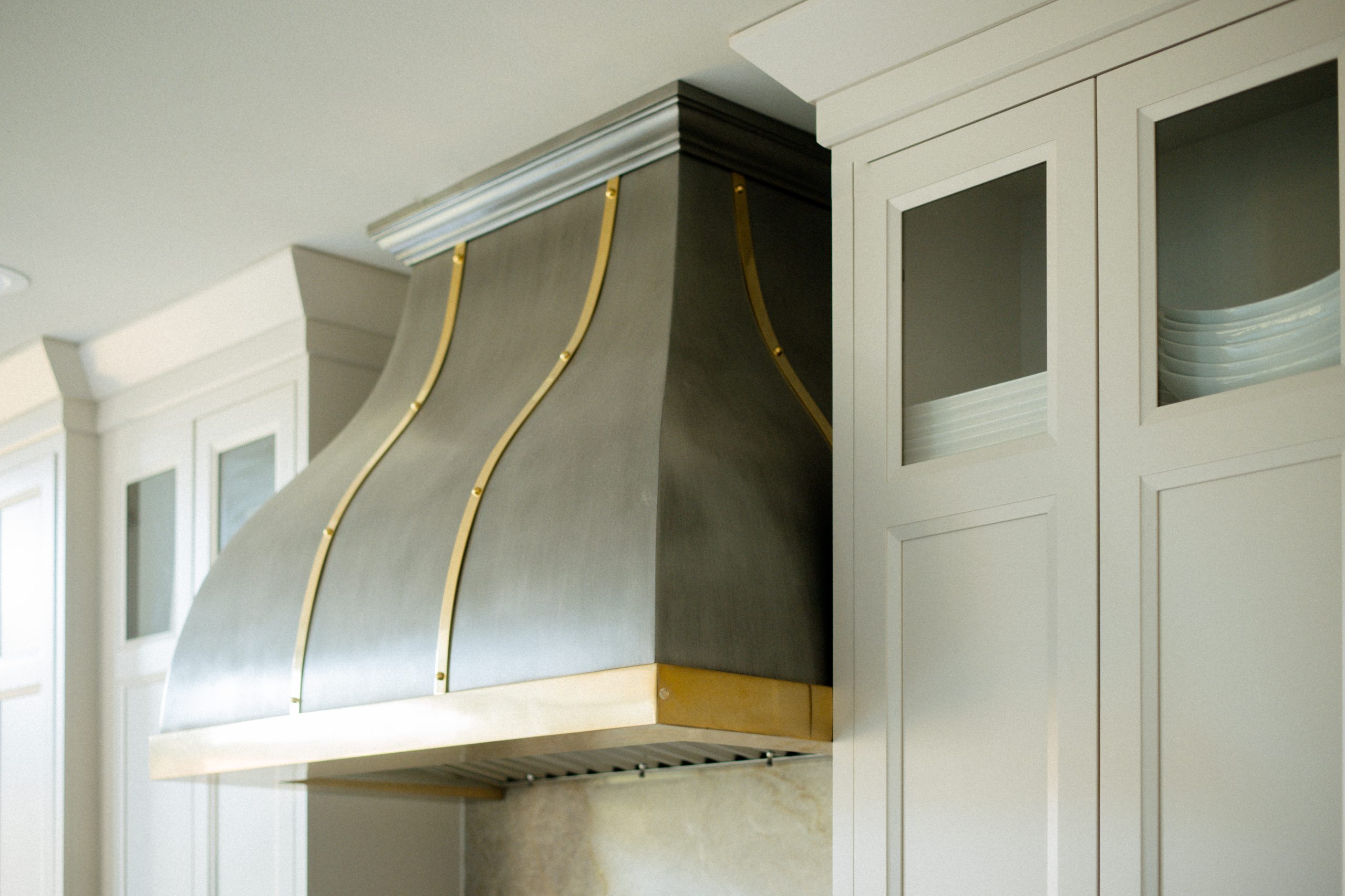
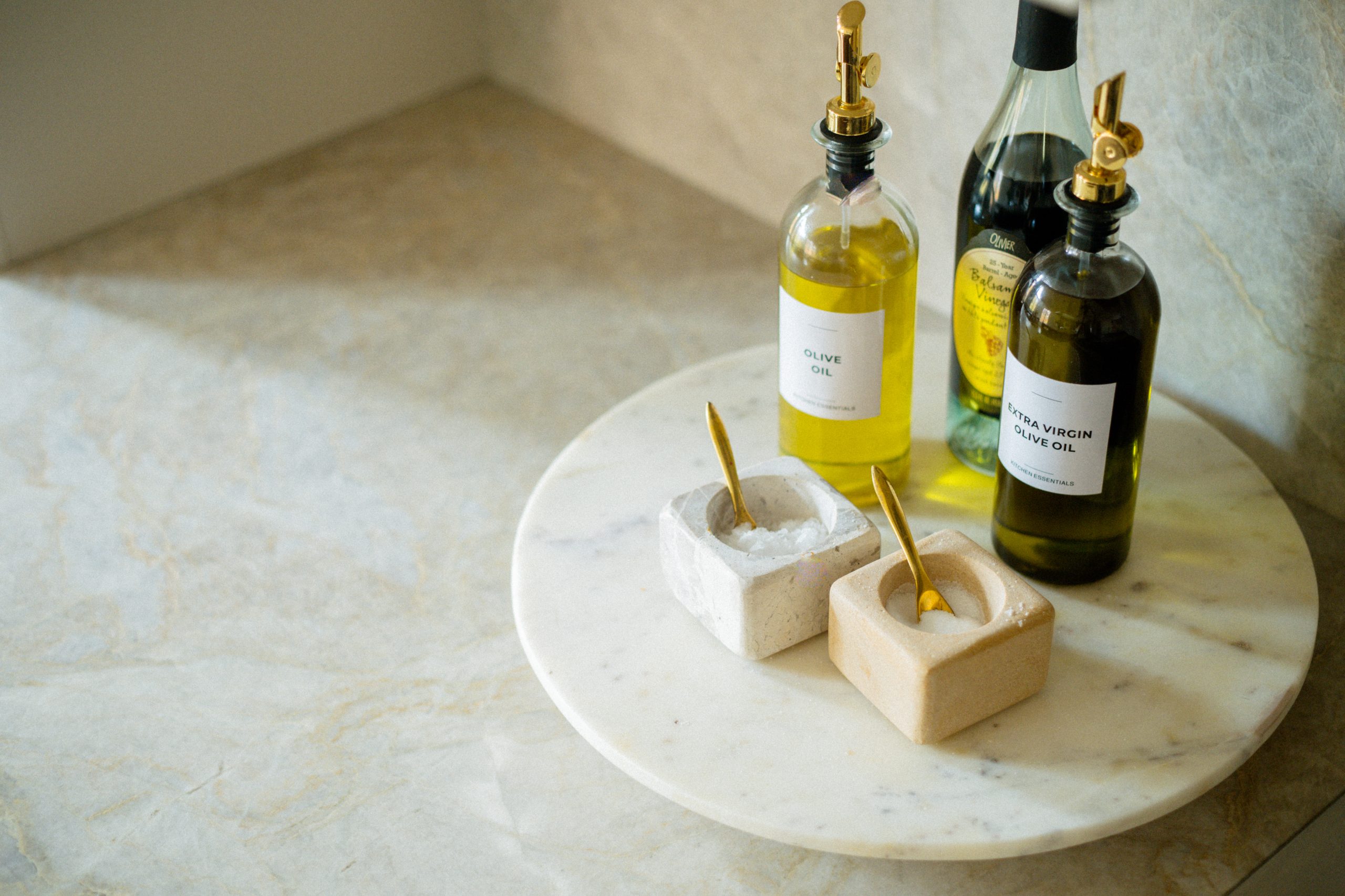
The grand island in the middle of the kitchen is the center of it all, featuring a classic bridge faucet as well as a prep sink off to the side, with plenty of paneled over storage cabinets. With all the tonal creams and taupes through the home, we took the opportunity to contrast by wrapping the island with the same cabinet profile in a dark wood stain. Simple ceramic pendants repeat the color palette across the space without stealing the show. But can we talk about those counters? They are the most gorgeous warm tonal quartzite counters so we had to continue them up the far wall all the way to the ceiling behind the hood. And that hood?! A stunning brass-trimmed feature. Can you imagine the space without it? It’s the cherry on top of a workhorse kitchen.
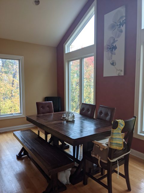
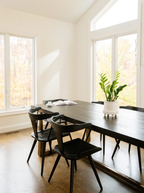
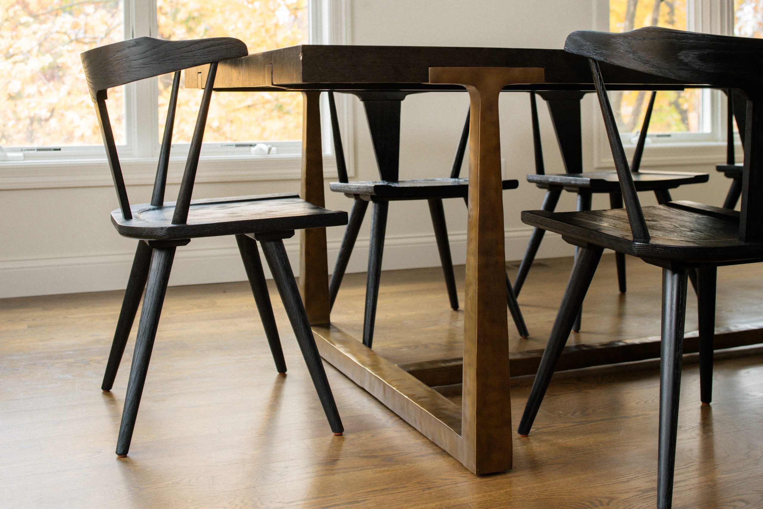
Off to the side is a large spread of windows and a peaked ceiling where the family has most of their meals together. Its a simple area that gets a ton of use, so the features are practical and sturdy– black wood chairs pulled up to a deep brown table with a modified trestle base in brass. Room to shuffle around chairs and add a high chair if needed. Easy cleanup, space for everyone, light for days!
BEFORE
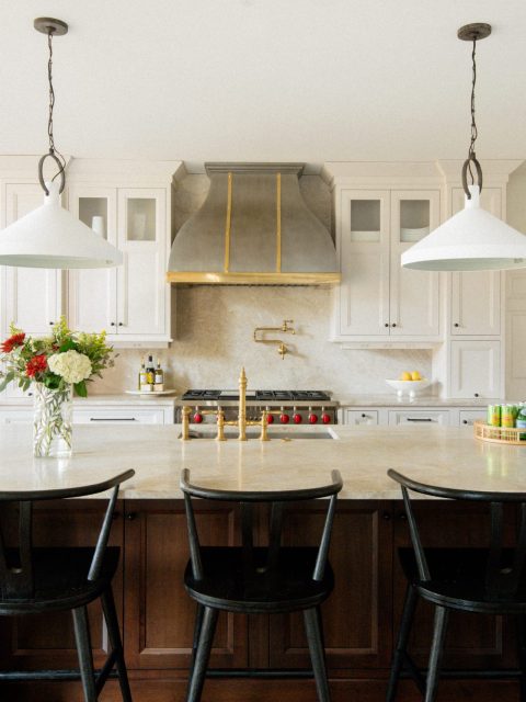
AFTER
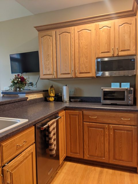
BEFORE
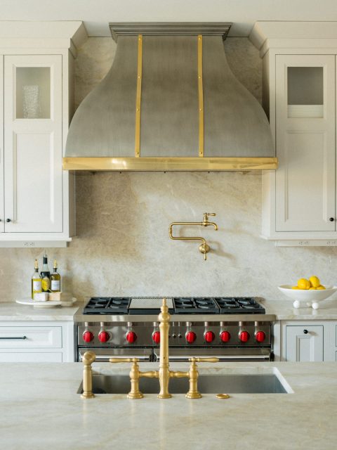
AFTER
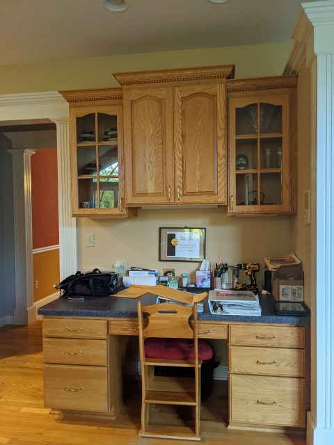
BEFORE
AFTER
BEFORE
AFTER
The Powder Room
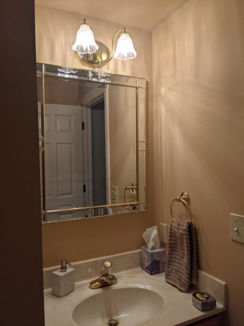
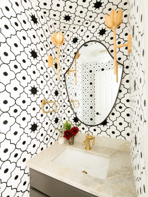
So far you’ve seen the main spaces in the home, which are understated, calm, and comfortable by design. But that’s not the only note we struck! The client also wanted some fun wow moments, so we hit the powder room with the biggest wow of all. We wrapped the room in a black and white trellis wallcovering and accented with gilt floral sconces, a shield-shaped mirror, and warm black vanity.
We take pains to relate spaces to each other, even if they feel disparate in mood, and this is a whole mood! So in here we brought in the same line of brass plumbing fixtures and hardware from the kitchen, the black color from the dining room (just wait!) and mudroom and the floral sconces from the entry fixture. This is one way we create subtle unity in the spaces we design.
BEFORE
AFTER
The Dining Room
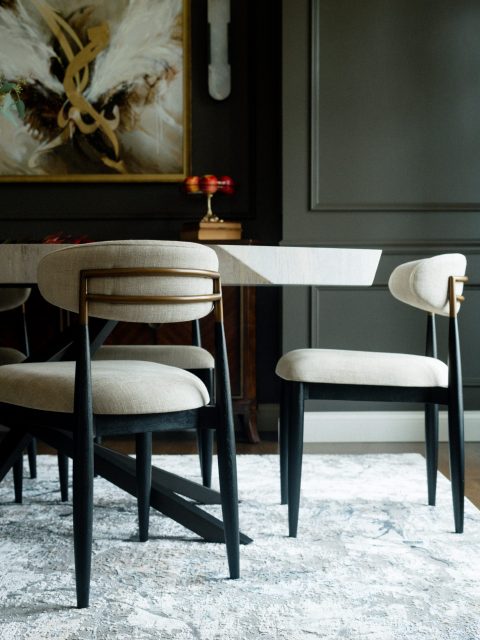
Another heavy hitter of a space, the dining room went from stuffy traditional to classy stunner! We were lucky to start with beautiful bones in here– the room is decked out with thick baseboards, detailed crown, and a simple chair rail. So we said, “Great, let’s add some more!” And then there were picture moldings and a ceiling medallion too. But doesn’t it all feel like it belonged there all along? The walls drenched in a warm black paint and trim work starkly accented in white? Just off the entry, it definitely catches your eye.
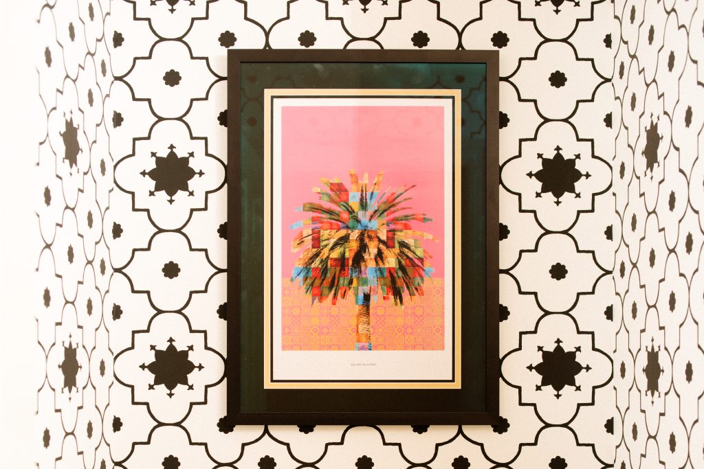
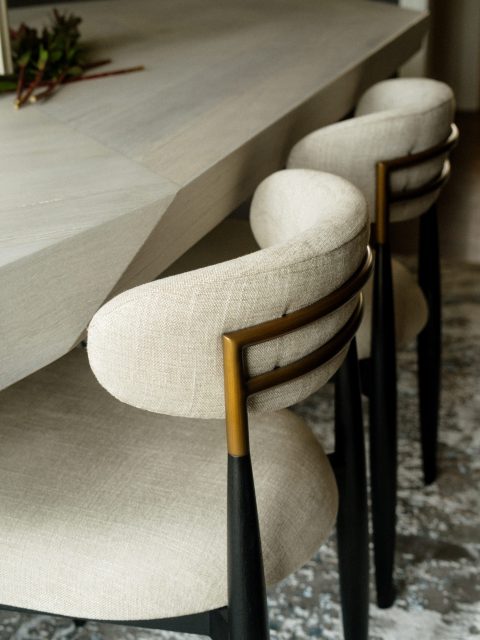
We based the color palette off of the client’s beloved artwork and made sure its presence in the room was felt. We surrounded it with soft alabaster sconces and continued those curves up to the modern black & brass chandelier. The angular dining table was a modern selection that kept the dark room bright, paired with a lighter neutral rug. The dual-toned dining chairs pull all pieces of the palette together beautifully– curves, brass, black, and soft white upholstery.
And peek that credenza! It was in the space originally and it felt like something that we could still use, but doesn’t it have a whole different feel to it now? It just goes to show you that spaces can define the pieces in them just as much as the pieces define the space.
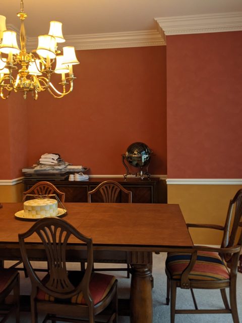
BEFORE
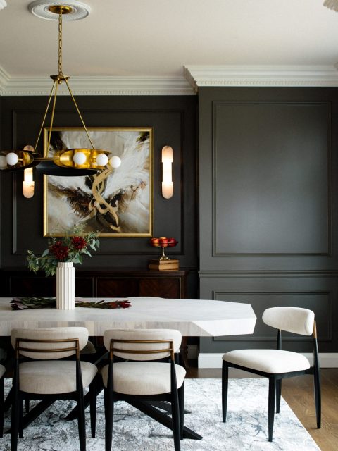
AFTER
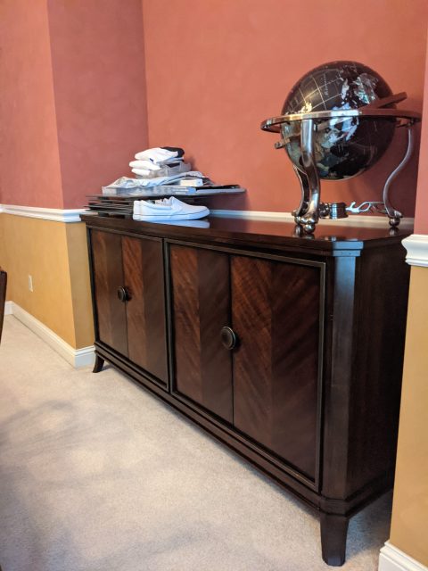
BEFORE
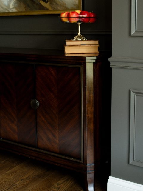
AFTER
What’s Next
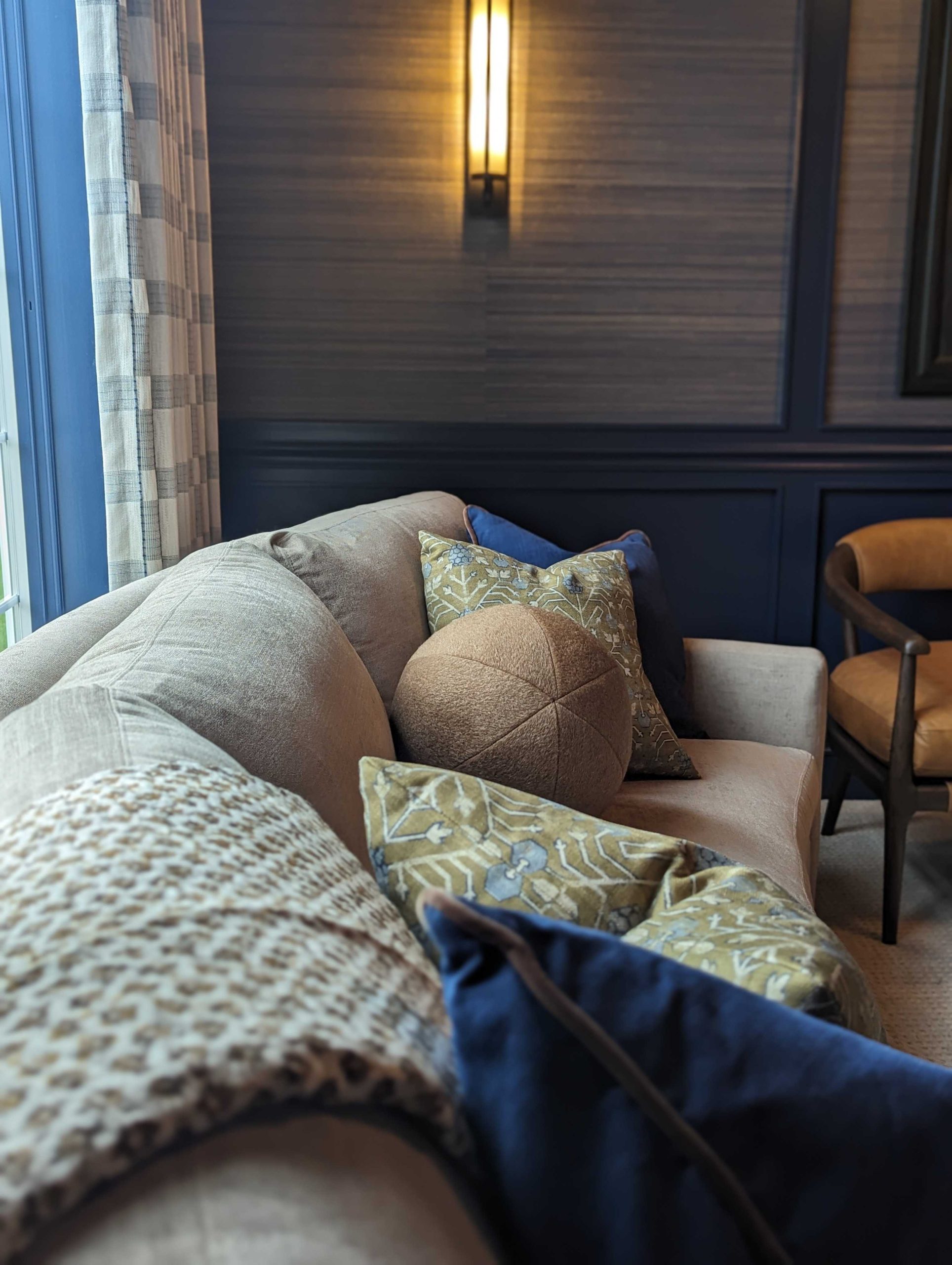
We sadly don’t have photos of every space we touched in the house (sneak peak of the recently finished den below!), but hope to share the love another day. We loved this house, this family, this project, and we think the results speak for themselves! We turned over a stunning home that is still approachable and functional for their family of 5–or 25!
We couldn’t be happier to have helped them make their house a home they love. Next goal: get invited to dinner!

