Pro Tip: How to Shop To Make Your Space Feel Designed, Not Decorated
In this golden era of design and decorating, there are so many beautiful products at our fingertips. We have access to an innumerable amount of products, a mind-boggling library of design styles and trends. A fast-paced seasonal decorating calendar. And I’m sure you, as well as us, get sucked in to all the beautiful new collections released from your favorite retailers every couple months. They keep us buying, but the questions is—How do we shop to make a room look and feel designed, not just decorated? How can we maintain the aesthetic we want, not just fill a room with things we like? What do we say yes to, and why? We want to give you the tools to put design power in your hands!
MODG Buying Guide
Knowing how to evaluate our needs and our style are important tools to help us buy the right items and keep us from two things:
1. Doing the constant dance of buying and then removing, always replacing.
2. Polluting our spaces with things we like but don’t fit the aesthetic or add the to design in any way.
This second part can leave our spaces feeling like a collection of decor instead of a designed space, with every piece having a purpose.
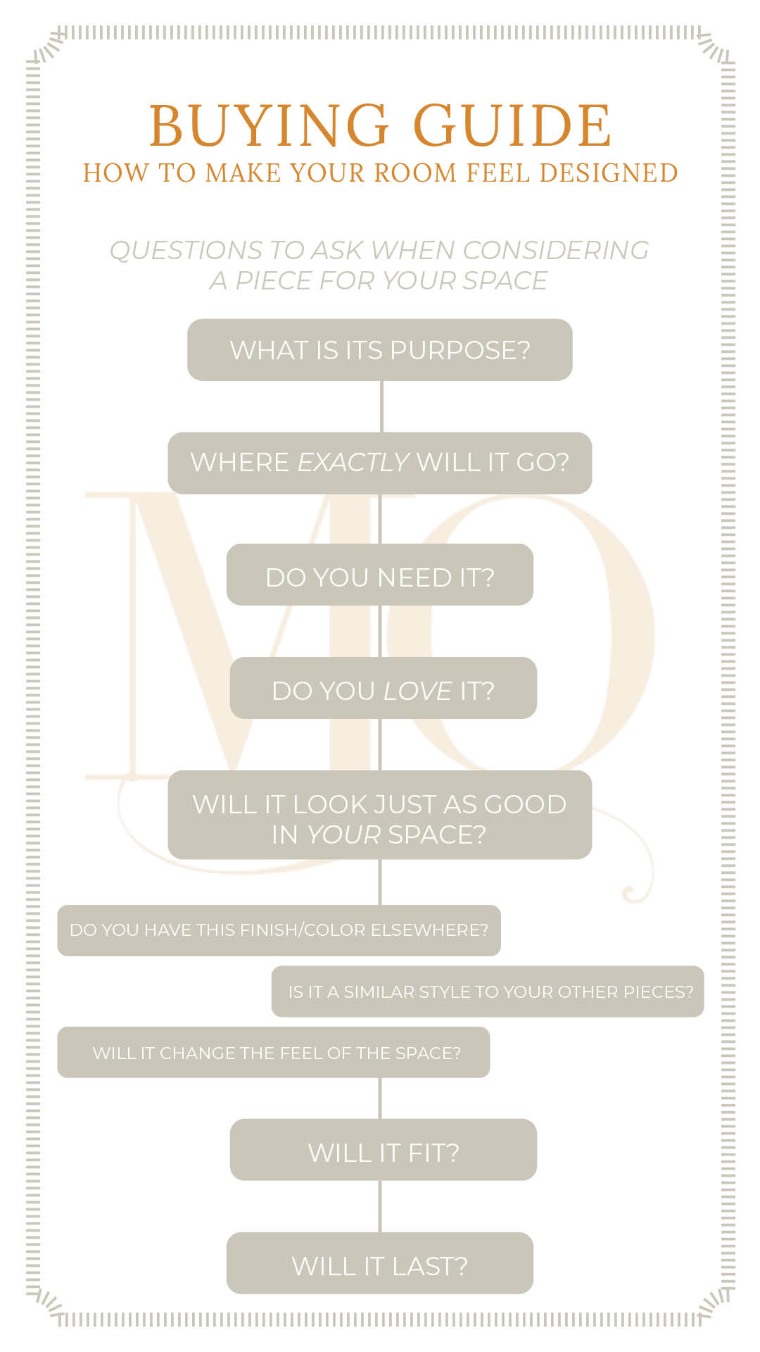
There are about a billion ways to evaluate any given piece for your home: color, scale, finish, quality, fit, and we discuss many of these things below. But we think the most important question to ask when you are drawn to an item is: What is its purpose? Start here, and mull that over before throwing it in your cart.
So you are shopping. You see a throw pillow that you are drawn to. You pick it up. Ask yourself a few questions:
Where exactly will it go? When seriously considering a piece, let this be your first filter. It will keep you from buying lots of little things you like that you end up finding a space for but don’t contribute to the design. If you feel like you are trying to find a spot for it and can’t quite hack it, then it might answer the next question.
Do you need it? Will it make your life better or easier? Maybe it gives you storage you need, seating you’ve been looking for, or fills an empty wall that you’ve been thinking about. Think about what happens if you don’t take it home— will you even notice, or will there be a problem that you keep running up against that this could fix?
Do you love it? Its great to fill your home with things you like, but these are much easier to move along later if you don’t love it, and then the cycle of buying and removing keeps going. You can go back later if you can’t stop thinking about it.
But what if you said yes to loving it, but no to knowing exactly where it will go? Well, is this something you have the space to store for the next right space? Are you willing to spend your $$ now on something you love, hoping that down the road you will have a place to put it?
Will it look just as good in YOUR space? It’s super easy to think something is beautiful when its in a styled collection at a store or a designed room in a photo. But what about when you put it with your stuff? A couple helpful things to check first:
-
- Take said item to an empty shelf, away from the collection or look at a product photo that is not styled into a designed room. Do you still like it by itself?
- Keep an album of photos of your spaces on your phone. Find the room you plan for it to go in and look at that picture while you have the item in front of you or on your screen. Does it work THERE?
Do you have this finish/color elsewhere? If it is a color already in the room, usually that makes it safe to incorporate, but ratios also matter. Generally speaking, it helpful to have about 60% of a dominant color, 30% of a secondary color, and 10% of an accent color. If its not already a color in the room, where else can you incorporate this color? Maybe its the accent color you need, or maybe it starts to muddy up the palette.
Is it a similar design style to your other pieces? Whats the primary style of your furniture and fixtures? Maybe you lean Midcentury Modern, or you love the Farmhouse aesthetic. Maybe you a Modern Minimalist or a fan of Cottagecore. If you don’t know, take time to evaluate what you are drawn to so you have a better grasp on what things will look good together.
Often our personal aesthetics are a mix of different styles, but its easiest to mix styles that have more similar lines. This is not an exhaustive list, but Modern, Midcentury, Industrial, Scandinavian, Contemporary, and Coastal styles favor straight, linear lines and simple, striking pieces. Farmhouse, Traditional, Boho, Glam, and Cottagecore aesthetics favor flourishes, turned edges, and more detail.
Eclectic and transitional designs tend to be a lot of mixing and finding just the right balance or layering in surprise, so be ready to spend more time trying things until you get the right feel with these–they take a practiced hand.
Will it change the feel of the space? This new piece you are considering might be a perfect spot-filler that just disappears once its in. These supporting roles are so important and make a room feel cohesive and calm. Think accent pillow in a solid color that you have elsewhere. But maybe this piece is a stunner and will bow to no other pieces. There’s room for that too, just make sure you consider if that is what you want it to do. Maybe is a bright yellow and white striped vase in a room with just a few touches of yellow. That bright color and strong contrast will draw your eye, so make sure you want it to be a focal point, and place it somewhere you want people to look, instead of somewhere you may want to avoid attention.
Sometimes, though, we can add a piece we love that checks all the other boxes, but maybe it takes the room to a different overall feel than we are looking for. Like adding a fur throw to an industrial space–it could take a turn towards lodge instead of urban loft.
Will it fit? If it’s checking the boxes above, make sure its actually the right size & scale. Sometimes you can take an item home and try it without having to do the math, knowing you can return it to the store if it doesn’t work. But if buying online, that shipping cost is going to bite you in the rear if it ends up a bit big or too short.
Pro- Pro-tip: Keep a note on your phone of the items you are looking for and their dimensions for quick reference. I.E. Living Room Ottoman: Max 20″Wx 18″H x 18″D. This, along with a measuring tape in your purse, is an invaluable tool!
Will it last? Is it a long-term or short-term purchase in terms of quality? If it is not a quality piece, are you okay with replacing it or swapping it out later? If you are trying to get away from cheap pieces in your home and move towards longer-term quality items, remind yourself that an inexpensive piece may have a higher replacement cost later. Maybe its worth it to wait for a solid, quality piece to come along.
BUT….What if its a great deal!? The red clearance signs can really turn all this on its head when you are shopping. LISTEN! A deal isn’t really a deal if you don’t need it, love it, or it won’t work. Its money spent that could’ve been used for something else. Try to keep your head and run through the questions above anyway. Remind yourself that you want the right pieces, not just something that is a good deal.
And to make it a bit more condensed, here it is in graphic form! Your very own buying guide, to help you make decisions to design your home and not leave it looking like a collection of decor.
We just threw a ton of info at you, and sometimes a visual is helpful too! So let’s do a case study on this living room.
Its still in progress, but as the space is slowly developing, the owner is considering adding more seating for guests as well as a more useable seating solution for the desk that sits just at the bottom of this room (see the third photo). The antique desk is intended to be a piece that fits the room and conceals her kids coloring station. Currently the large, slipcover chair that sits at the desk hasn’t proved as useful as the owner thought. Her little kids find the chair hard to pull out, which means they often don’t go to the desk to color as much as they used to. It also is a little taller than she’d like, which makes the area a bit more visually cluttered.
She has been on the lookout for two ottomans that can nest under the desk instead, providing seating for two kids at the desk or two guests in the room. She keeps the dimensions of what is needed handy and always has a current photo of the room on her phone for reference.
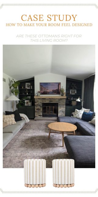
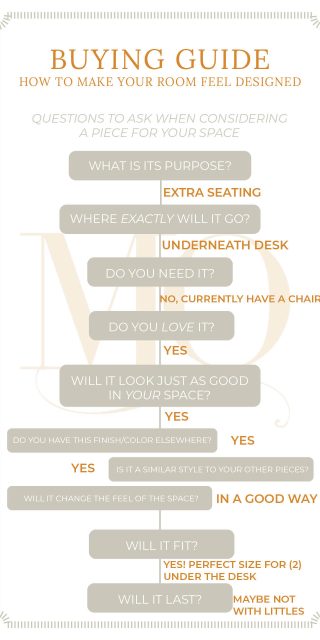
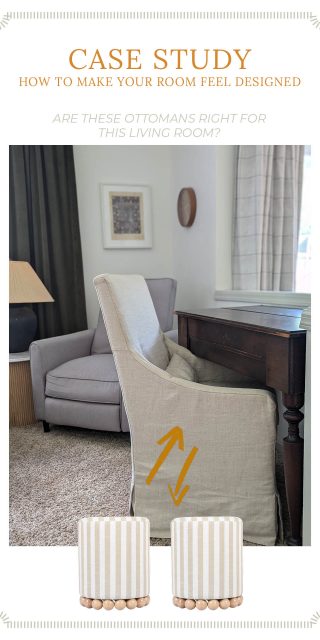
The owner is still considering if this is the right ottoman to pull the trigger on, but having the right tools have helped her recognize the the quality/wear factor is the biggest piece of this decision. Will she be able to keep up with the wear and tear of kids? Is it something she will be ready to replace later? For now, she knows what she is looking for and won’t be making any impulse decisions on ottomans any day soon.
Meanwhile, we hope we’ve equipped you with a starting tool belt of what to consider when you are shopping for your room. Whether we have designed a room with you that you are adding a piece to, or you are making all the design decisions for a space in your home, the questions are the same! We hope we’ve helped you stray from buying things you like to buying things you love that have purpose!
Thanks for tuning in,


